PBS Kids bids farewell to ‘Dash’ character in logo, branding update

Weekly insights on the technology, production and business decisions shaping media and broadcast. Free to access. Independent coverage. Unsubscribe anytime.
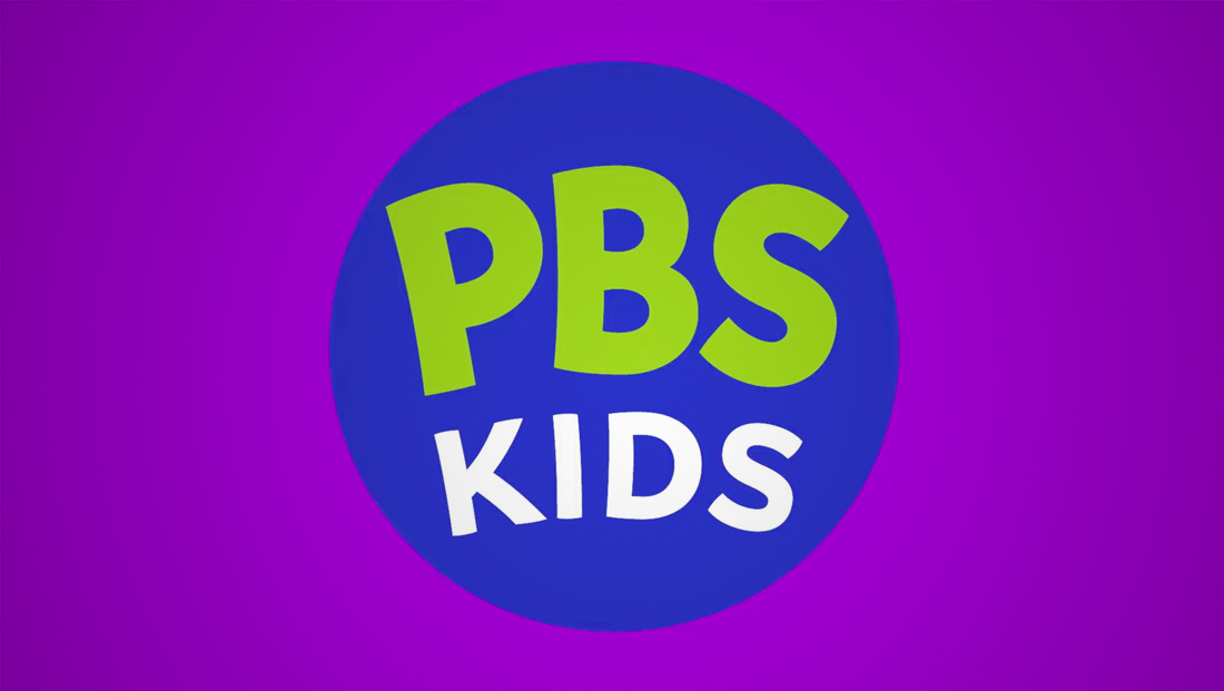
PBS has redesigned the logo for its children’s programming brand that, ironically, no longer features a kid.
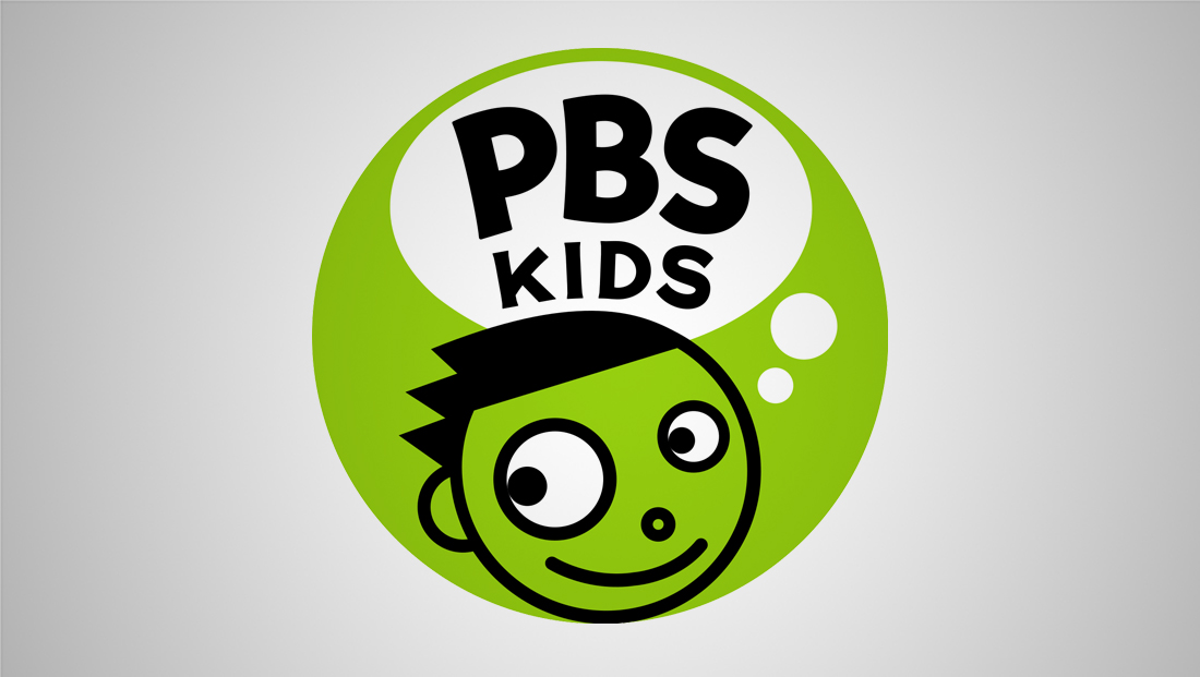
Known as PBS Kids, the brand was first introduced in 1999 with a lime green logo featuring a cartoon-style drawing of a kid named Dash (other variations of the logo included his presumed pals Del, Dot and Dee).
The new logo starts rolling out July 19, 2022.
Dash had two different sizes of eyes and two similar circles formed the path to a thought bubble that served as the container for the name “PBS Kids,” which was done in a custom-drawn, playful sans serif.

The old PBS Kids logo.
For the new look, PBS worked with Lippincott, the same agency that consulted on the 2019 redesign of the primary PBS logo and branding.
PBS Kids’ new look largely mirrors the typography used in the look seemingly conjured by Dash’s brain — though the word “Kids” Has been notably had some its straighter angles switched to gentle curves and the faint suggestions of serifs are gone.
The whole lockup still lives within a circle — set in the “PBS Blue” hue introduced in 2019. Lime green lives on as the color for “PBS” while “Kids” is typically set in white.
While it might seem counterproductive to remove the kid from a network from a network called “PBS Kids,” the reason behind it was simple — while the circle footprint works well in today’s app- and avatar-driven world, having Dash and the thought bubble crammed in there was simply too hard to read at the often small size these applications require.
By simplifying the logo to only using the brand name, the logo becomes significantly easier to read at all sizes.
During the design process, PBS and Lippincott also considered that some of its viewers are too young to read, so switching to a logotype could also seem counterintuitive but found that, to many, the most memorable part of the brand was the logotype’s distinct lettering. Presumably, this meant that younger viewers recognized the shapes of the letters as opposed to what they spelled out.
While the new logo does use the trademark PBS blue to create a connection to its “mother” brand, it purposefully continues the practice of not using the iconic PBS “profile” design that was also updated in 2019.
While Dash is no longer featured in the logo, PBS Kids still has the option to feature a wide variety of character icons from a “kit” that allows elements to be “mixed and matched” to endless iterations.
![]()
![]()
The new characters represent a highly diverse group of people with a wide range of skin tones, outfits, hairstyles and assistive devices. Elements can also be shown in non-traditional colors, such as green or purple skin, a nod to the wide range of ways that people can express or see themselves.
One common aspect, however, is the use of prominent eyes, which was a prominent part of Dash’s personality and also has the added advantage of being a nod to television as a visual medium.
All of the eyes in the kit are at an exaggerated scale, just like the previous characters.
However, there’s still diversity available here — including a variety of eye shapes, options for dichromatic eyes (when an individual is born with two different color irises) and eyepatch and a variety of glasses options, including shaded ones that those living with blindness or low vision sometimes wear.
![]()
![]()
PBS Kids also has the option to combine characters into colorful scenes depicting a wide variety of situations and environments, which goes a long way in keeping the brand fresh and fun.
In some iterations, characters are shown with circles instead of hands, though it appears that more detailed depictions of hands can be brought out to emphasize an action or emotion.
The PBS Kids name was also once used for a standalone network offering children’s programming, but that was shuttered in 2005 that was replaced by PBS Kids Sprout, now Universal Kids.
Since then, PBS Kids has been revived for streaming and digital offerings, as well as a way to distinguish kids-focused programming blocks on PBS member stations.


tags
Branding, logo design, PBS, PBS Kids
categories
Branding, Broadcast Design, Broadcast Industry News, Heroes, Network Branding