‘Saturday Night Live’ returns for 48th season with new logo, open
Subscribe to NCS for the latest news, project case studies and product announcements in broadcast technology, creative design and engineering delivered to your inbox.
NBC’s “Saturday Night Live” returned for a 48th season Oct. 1, 2022, with an updated open that includes a new logo and a continuation of a design evolution that started a few years back.
As it has for decades, the show starts with a “cold open” skit followed by an extended opening sequence featuring on-screen credits for each cast member.
This typically includes a blend of still and video clips of each cast member, with recent years using the trend of depicting them experiencing nightlife in New York City, with the focus gradually shifting to 30 Rockefeller Center, where the show is produced, and Studio 8H, its longtime home.
Each cast member is announced by Darrell Hammond separately, as are each week’s musical guest and host.
NewscastStudio is unable to present the full video version of the new open due to automated copyright claims by NBCUniversal on the YouTube video platform.
Multiple network contacts did not respond to requests for cooperation with this story and the opportunity to showcase the new look from the show’s design team.

In Season 47, the show used a highly condensed and bold sans serif for its logo, using unique spacing and layout for each word that typically resulted in a three-line layout, but other variations existed. The word “Live” was often colored with a bright blue.
This look was introduced 2014 for the show’s 40th anniversary season and the cast names used a matching font and offset layouts that year. That season’s logo also included a “40” designator.
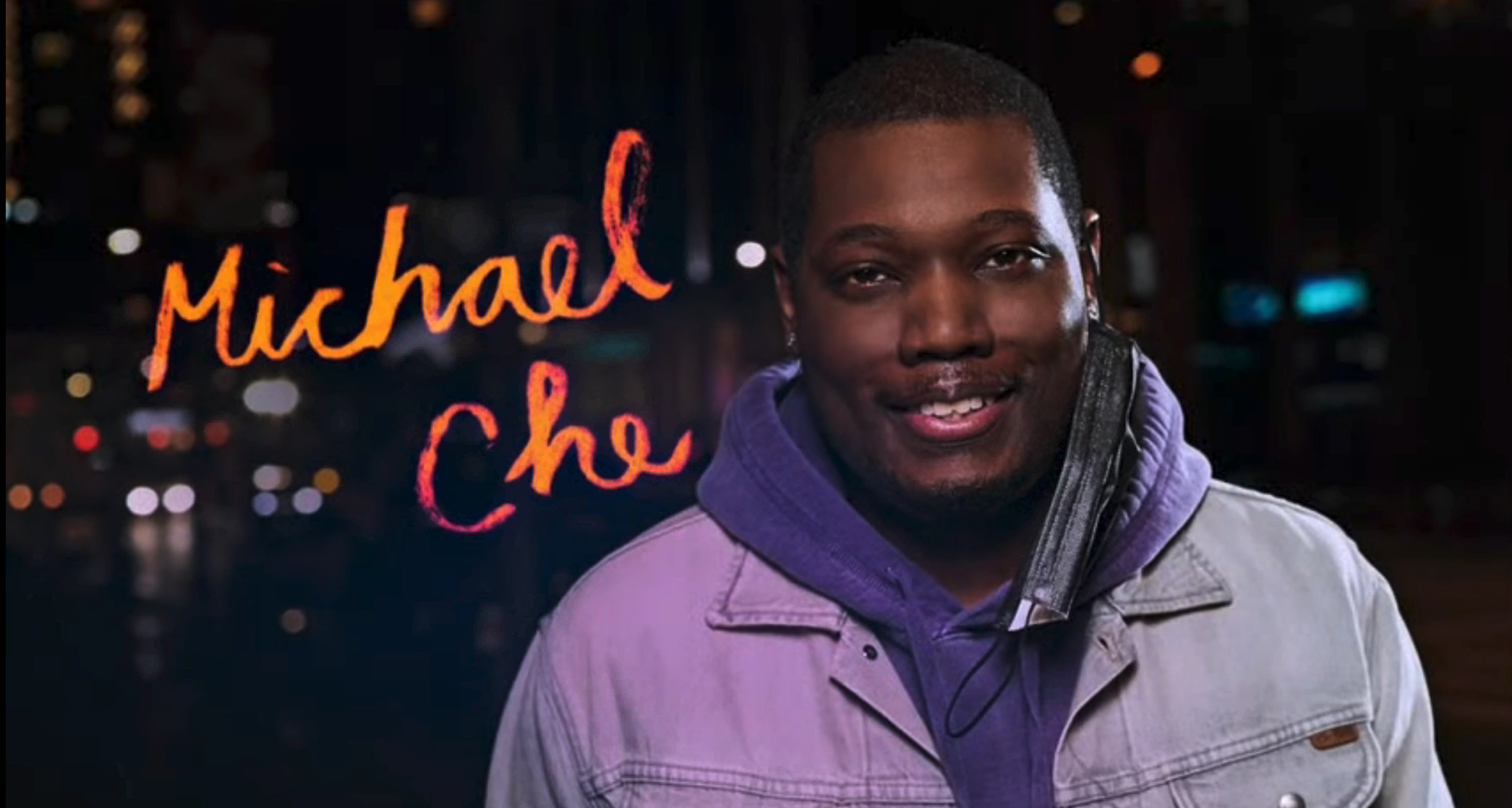
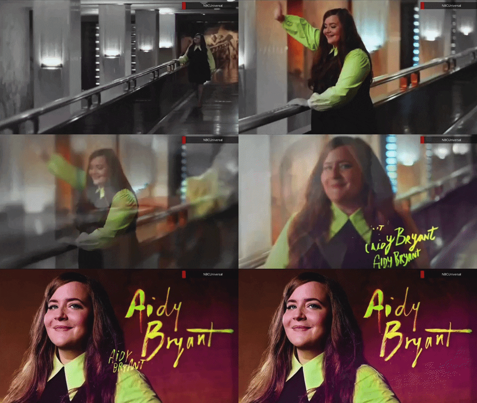
Since after its 40th anniversary, the show started migrating to a softer, more textural look that included the use of handwritten-style typography for cast member names in a variety of bold colors, with repeating variations of names used in on-screen animations with two distinct variations used.
The Season 40 condensed logotype also began taking on a textural look.
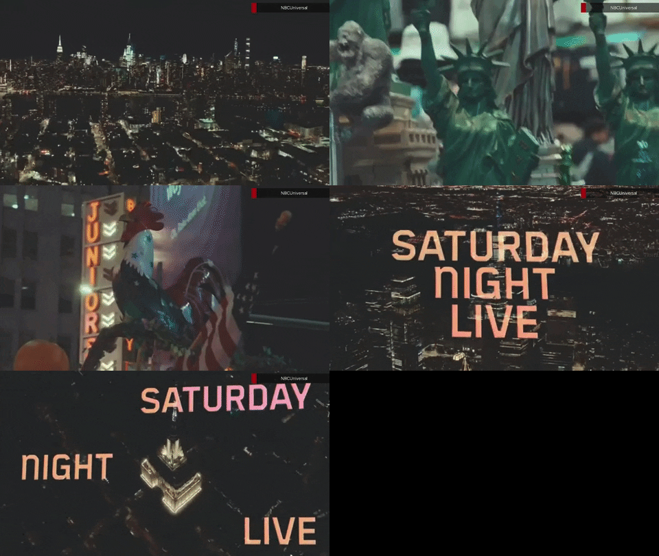
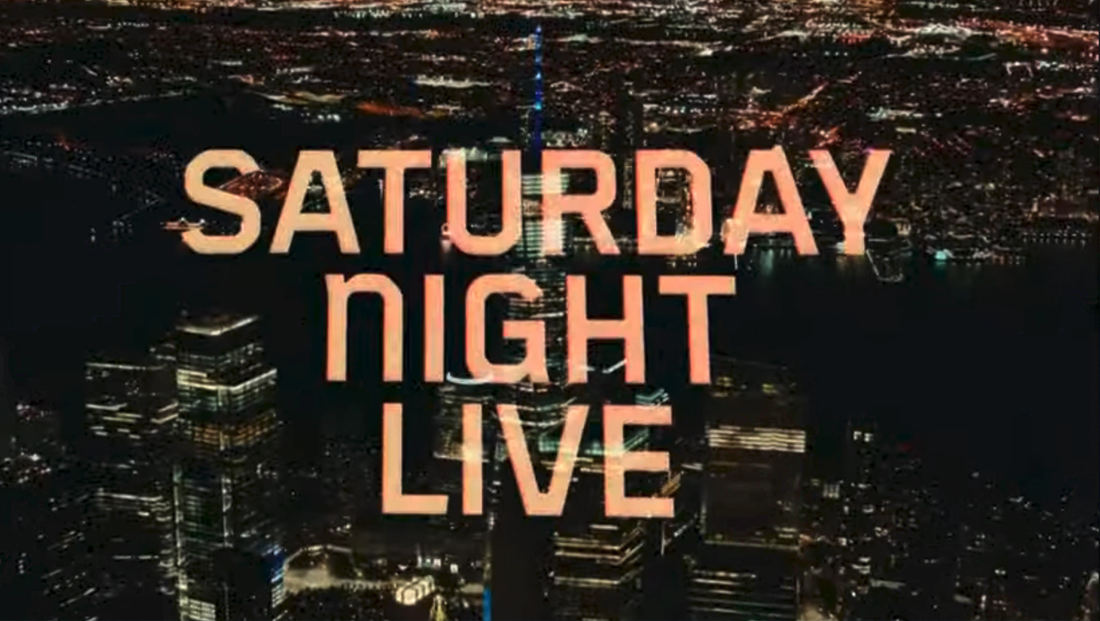
That logo is gone, however, for Season 48. It’s been replaced with a quirky sans serif typeface that features unique corners and angles. The “N” in “Night” also appears to have been customized to use the shape of a lowercase “n.”
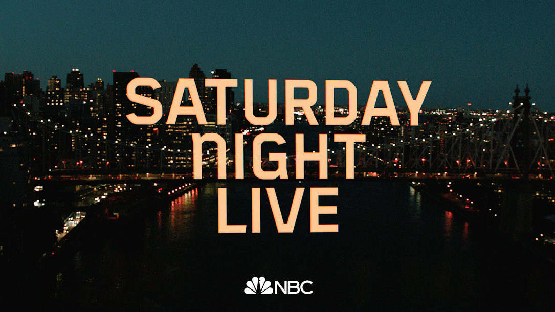
There is also an “SNL” initialism shown on screen that uses the same distinct “N.”
The new logo appears in the open as well as on on-set monitors inside the Grand Central Station-inspired set inside of Studio 8H.
Talent names are now rendered in a mix of sans serif and serif, with an elegant italic typeface used for the latter, a big departure from the highly expressive look from the previous season.

The animations used in the names still use repeating elements, but they are much more subtle and the text appears to flutter on screen.
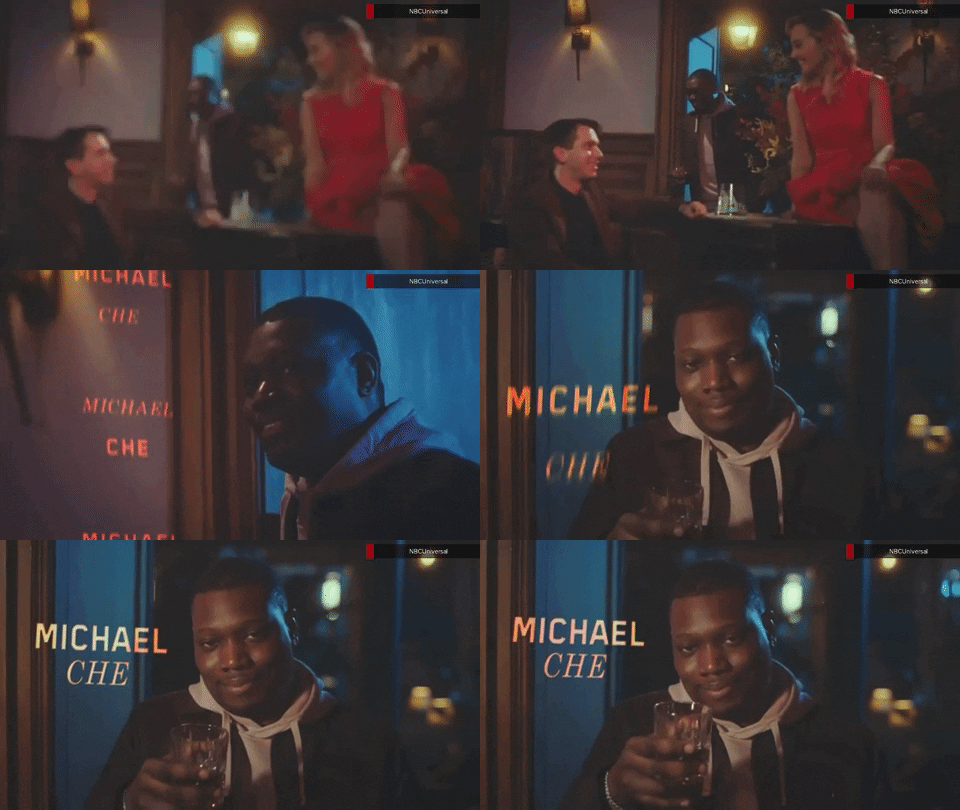
Overall, the redesign also features a warmer look, a feat accomplished primarily by ditching the bright blue in favor of a glowing orange-yellow.
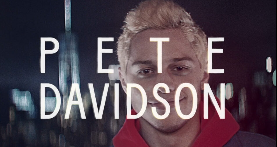
Prior to the handwriting look for cast member names, the show used a light condensed font with forced justification, appearing on top talent shots since Season 44 in 2018 and lasting until Season 46.
Prior to the 40th anniversary, the the show used a stacked, ultra bold geometric logotype.
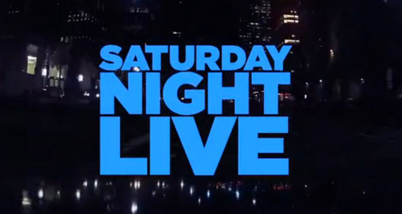
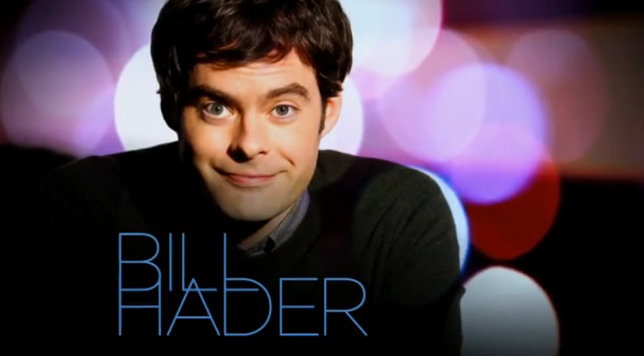
This was contrasted with a very light overlapping look for talent names.
Subscribe to NCS for the latest news, project case studies and product announcements in broadcast technology, creative design and engineering delivered to your inbox.


tags
30 Rockefeller Plaza, logo design, saturday night live, snl, studio 8h
categories
Branding, Broadcast Design, Broadcast Industry News, Featured, Graphics