
ITV rolls out updated branding with new logos, idents
Weekly insights on the technology, production and business decisions shaping media and broadcast. Free to access. Independent coverage. Unsubscribe anytime.
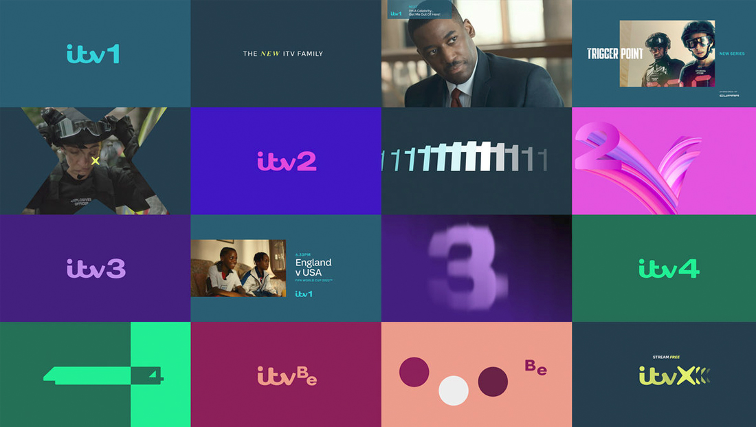
ITV has rolled out a brand update that reimagines the numerals that appear alongside the network’s signature logotype.
The move follows an October 2022 announcement that the channel originally known as ITV1 until a 2013 rebrand would revert to that name, reserving the “ITV” name for the channel’s parent organization, known officially as ITV plc.
The British broadcaster said it would not completely drop the swooping custom-drawn script logotype introduced in 2013 to some criticism, but it would be reimagining the numerical glyphs used.
![]()
The number “1” had to be added back onto ITV1, while sister channels ITV2, ITV3, ITV4, and ITVBe also got updated designs in a similar style.
ITV Creative, DixonBaxi and F37 Foundry partnered to create the updated logos, which include a new look for the new ITVX streaming platform that is slated to fully roll out on Dec. 8, 2022, but has already been integrated with many of ITV’s digital platforms.
In addition, in a first for the organization, a cohesive family of idents has been created for use across all channels and platforms.
These center around using the same basic scene or setting taken from across the U.K. but with differences incorporated through the use of shifts in lighting, texture, tone, characters or animals or action.

Another commonality between the idents is the use of animation to emphasize the numbers’ entrances and exits, something that’s often accomplished with a repeating diminishing effect as well.
Those updated channel numbers are no longer slightly enlarged and offset from the baseline of the letters. Instead, they become slightly shorter and aligned with the base of the logotype, making them feel a bit wider and squatter, though their actual widths are still very similar.
By adjusting the horizontal and vertical proportions, the strokes appear to have more character and personality — the “1” has an exaggerated top with a subtle flourish mirroring the curves in the letters next to it.
Adding that does cause the vertical stroke of the “1” to become physically farther from the ITV letters, which adds negative space to the lockup as well, but given that the top of the “1” appears to pick up the momentum of the right side of the “V” and drive it back to the baseline, the overall composition works well.
The slight upward angle of the underside of the top of the “1” also appears to be crafted to meet the level where the tip of the “V” ends.
![]()
The “2” for ITV2 is likewise wider than before and also has a hint of cheekiness — perhaps a literal interpretation of the curves in the logotype.
Despite that splash of fun, the new “2” feels more solid, perhaps because the ends of its strokes are perfectly vertical, rather than being slightly curved, which more closely aligns with the verticals found in the script lettering.
Arguably, the ITV2 logo works the best of all of them — since the upper right of the “V” naturally morphs into the hook in the “2.”
![]()
Like the first two, the ITV3 and ITV 4 numbers have also been redrawn in the extended style.
![]()

The “3” gets a bit of attitude thanks to the double loops, while the “4” drives home the triangular shape that is formed by the shape of the letter.
![]()
ITVBe shifts away from the rather traditional layout of the other channels by placing its letters at different heights in a stepped format. The newly-drawn “B” and “e” used here are on the wider side, but feel a bit narrow compared to the more exaggerated widths of the numbers.
The stepped approach also creates a bit of an awkward negative space below the “B,” but it also takes advantage of the fact that the eye is already in the upper right quadrant when the “B” appears before going back down again to the “e,” using the up-and-down pattern suggested by the script letters.
The stepped layout also helps clarify that “Be” is meant to be considered a tacked-on designator and not to form a word spelled “itvbe.”
![]()
Finally, the ITVX logo, which is a completely new design, is notably designed to appear as if plus sign (“+”), a common branding element used for streaming services, was rotated 45-degrees, notes ITV.
In this case, it is arguably more of a rendition of a multiplication symbol (“×”) than a lowercase “x,” but that’s mostly semantics.
Either way, the “X” feels a bit like a spark or spiked jack. While the four tips of the shape are curved slightly to pick up on cues from the ITV logotype, the other lines feel more solid, which makes the shape feel bolder and contrast a bit with the more friendly curves found elsewhere — a strategy that helps it stand out.
It’s a bit hard to ignore the odd juxtaposition of how the slightly swooping right side of the “V” counteracts with the wedge created by the left side of the “X,” a likely unavoidable setup that is a bit confusing visually.
tags
Branding, DixonBaxi, F37 Foundry, itv, ITV plc, itv1, ITV2, ITV3, ITV4, ITVBe, ITVX, logo design
categories
Branding, Broadcast Design, Broadcast Industry News, Graphics, Heroes