Super Bowl LVIII logo design gets curved element

Subscribe to NCS for the latest news, project case studies and product announcements in broadcast technology, creative design and engineering delivered to your inbox.
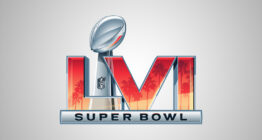
The logo for Super Bowl LVIII scheduled for Feb. 11, 2024, at Allegiant Stadium, Paradise, Nevada has been released — and it includes a notable change from its recent series of looks.
Paradise is adjacent to the city of Las Vegas, so the game is being marketed as taking place in Sin City, which is reflected in some of the landmarks that appear inside the purple and magenta Roman numerals.
Perhaps the most recognizable is the icon “Welcome to Las Vegas” sign, though it shown only in outline and without the actual lettering — but it’s still highly recognizable.
The basic idea follows the past several Super Bowl logo concepts — a silver trophy in the middle with the Roman numerals on either side in color with a silver bar below housing the words “Super Bowl.”
This year, however, the Roman numerals have been rendered as if they are curved around the trophy, as opposed to being lined up in a line behind it. The letterforms are also more condensed in width, especially the “V.”
There could be a lot of reasons for this from a design standpoint.
First, it does add a bit more depth and dimension to the look — so it could be a new element that’s being added no matter the setting.
With five letters, the numeral is on the longer side, so at least some of the strategy could be to break up the wider string of letters in this way (2025’s game will get significantly shorter with “LIX”).
It also could be a nod to the glossy black curved lines of the stadium, though many stadiums have similar oval, curved shapes.
Because all of the Roman numerals also have strong verticals, each of them, with the possible exception of the “V,” could be read as the towering hotels that stick out of the desert that surrounds Las Vegas. Several Vegas casino and hotel buildings also have a curved design similar to the shape shown here, perhaps most famously the Bellagio.
It’s also worth noting that the “V,” which also happens to be tucked slightly behind the trophy based, could be a subtle nod to the “V” in “Vegas,” especially given its distinct diagonals when compared to the other letters.
Super Bowl logos are typically used by most rights-holding broadcasters and also appear throughout marketing and in-venue signage and other materials.
Subscribe to NCS for the latest news, project case studies and product announcements in broadcast technology, creative design and engineering delivered to your inbox.


tags
logo design, super bowl, Super Bowl LVIII
categories
Branding, Featured, Sports Broadcasting & Production