
New PIX 11 graphics draw inspiration from angular logo
Subscribe to NCS for the latest news, project case studies and product announcements in broadcast technology, creative design and engineering delivered to your inbox.
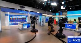
As part of an on-air overhaul that coincides with its 75th anniversary, WPIX in New York City debuted a new set, production and editorial space and angular graphics package.
Produced in-house by Nexstar Media Group’s graphics hub, the package is accompanied by new custom theme music from Stephen Arnold Music.
The design motif leans heavily on an angular look that appears to mimic the lines in the “X” in the station’s logo.
This is interpreted as both simple angled segments as well as arrow-like elements, with much of the animation following a left-to-right path.
Many of the layouts also conjure connections to street grids and the various levels of buildings, while also keeping the station’s longtime “PIX11” branding in the forefront.

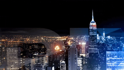
Opens include a combination of regional video footage with nods to various dayparts, including right off the top.

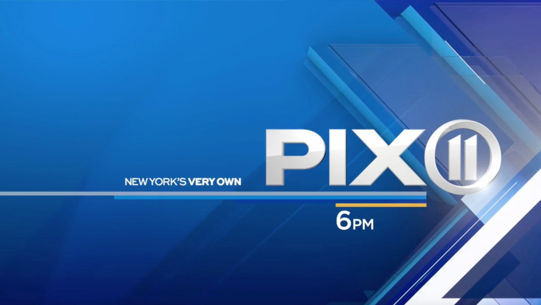
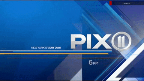
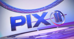
An oversized, glassy and transparent interpretation of the station’s logo appears, along with the “New York’s Very Own” tagline.

An announcer reads, “Live from 42nd Street,” a reference to the station’s newly reconstructed facilities at 220 East 42nd Street. The new opens eliminate the reference to the intersecting 2nd Avenue that were used in some opens in the past.

The open also eliminates mentioning the “Very Own” tagline verbally.
Meanwhile, on-screen text blends in boroughs and suburbs, including “New Jersey,” appear in the upper left portion of the screen neatly framed by a thin box. The example ones highlighted change from broadcast to broadcast, while a line of microtext subtly references more locales.
After the short series of regional imagery, the screen shifts through left-to-right arrow-inspired animation to a brief fullscreen look with a blue background.
The use of violet as a secondary color has largely been eliminated, and much of the look has slightly more refined glassy and 3D than before.
To the right are a series of subtle 3D and flat angled elements, all of which form the rough shape of an arrow pointing right, while the left side of the screen remains relatively clear.
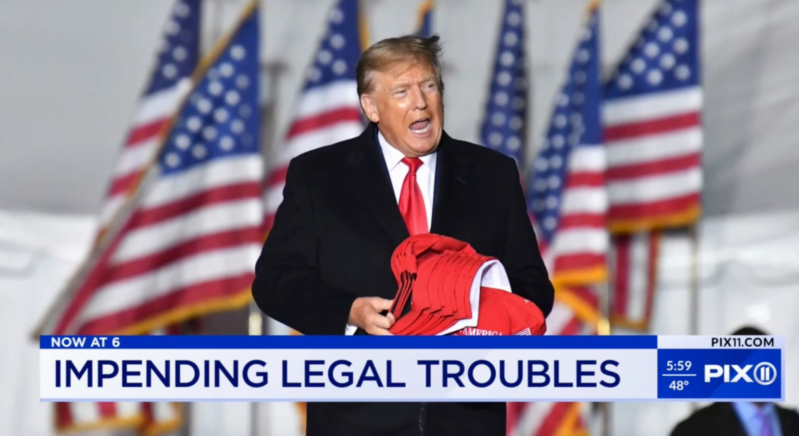
The lower thirds notably eschew using any of the angled elements found elsewhere in the package in favor of simplicity, though they are hinted at in select animations used during stories.
Text has been made significantly larger than it was before, almost to the point of overpowering the space it’s in or large to convey urgency, whereas the old look used more generous padding inside of the rectangles.
WPIX continues to largely used Gotham, though it’s typically not as bold as it was in the previous look.
There’s also an updated bug in the lower left that includes stacked time and temp, space for the station website address and space to showcase a rotating animation of its 75th anniversary logo and the station’s normal “PIX 11” one.
A condensed version includes side-by-side time and temp topped with the PIX11.com address.


Angled backgrounds and animations are also available for bumps, rejoins and stingers.
Some of these looks have a slightly different take on the angular motif, though all typically include the letters “PIX” on-screen in various combinations of geometric mesh and 3D.
In some, the oversized letters appear slightly off axis, extending into the background toward the left side of the screen, which allows the “X” to be positioned to the far right, mirroring the position of these elements in the opens and other looks.
Others take on slightly different perspectives on the logo, with some also changing up how the angled elements look a bit.
Along with the graphics, the channel debuted new custom music from Stephen Arnold Music that works in a variety of percussion elements with an energetic beat aimed at capturing New York City’s eclectic audience.
Subscribe to NCS for the latest news, project case studies and product announcements in broadcast technology, creative design and engineering delivered to your inbox.

tags
graphics package, new york, Nexstar Media Group, Stephen Arnold Music, tv graphics package, tv news graphics, wpix
categories
Branding, Broadcast Design, Broadcast Industry News, Graphics, Heroes, Local News, Theme Music, TV News Music, TV News Music Package