
‘On Balance’ gets thrown off balance with new graphics
Weekly insights on the technology, production and business decisions shaping media and broadcast. Free to access. Independent coverage. Unsubscribe anytime.
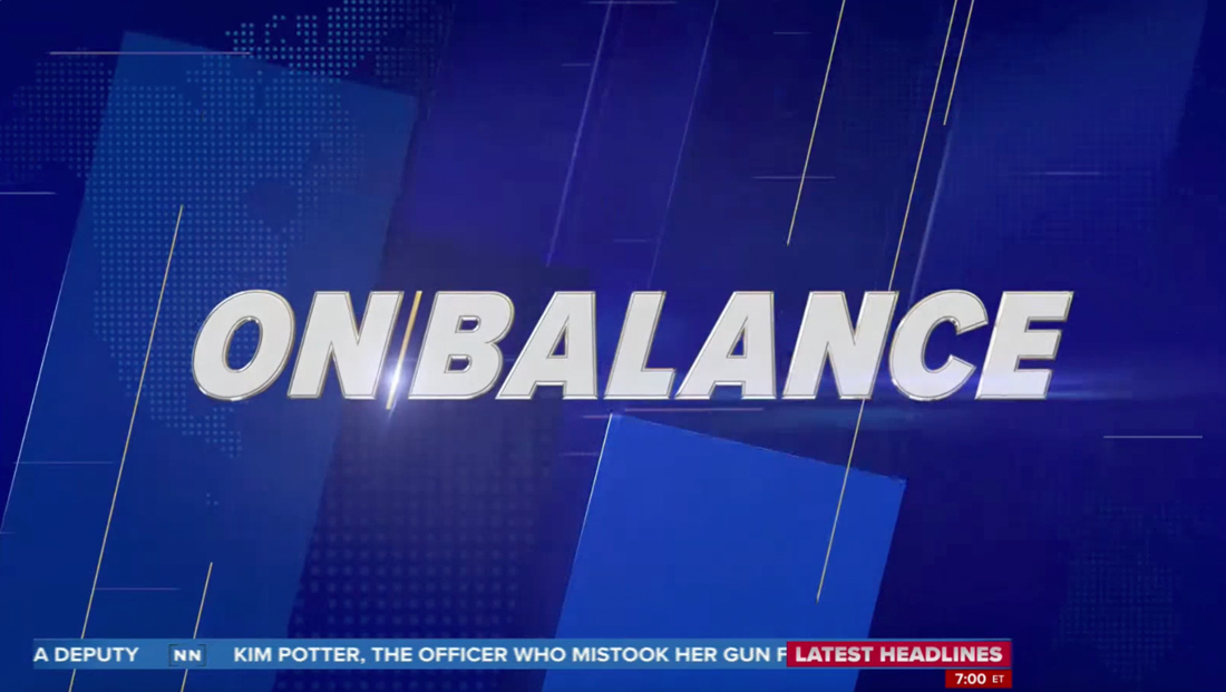
NewsNation’s “On Balance with Leland Vittert” introduced new graphics that have, ironically, a slanted look that seemingly goes against the show’s stated mission of “fairness,” Monday, April 24, 2023.
The updated design corresponded with the show moving to a new set that was seen earlier in the day on the debut of “The Hill.”
“On Balance” got a new logo as well as new animated opens, wipes and other elements.
The new logo design is set in a thick italic typeface with a silver 3D effect and heavy bevel effect. The two words are spaced almost as if they are meant to be one word (or a camel case one) but a thin line that matches the slant of the lettering serves as a visual separator.
Backgrounds appear in various shades of blue and use slanted rectangles and accent lines, which run parallel to the angles found elsewhere in the package.
Farther into the background is a dotted world map pattern, something that’s also used on the on-set video wall graphics.
The design could be viewed, quite literally, as slanted and, even more literally, slanted to the right.
It’s an odd juxtaposition that NewsNation and, “On Balance,” by both its name and “fairest show on television” line that Vittert opens each edition with, both market themselves as bias-free.

Though a bit of a stretch, it’s possible the angular look could also be interpreted as the perceived imbalance on TV, with the show attempting to correct it.
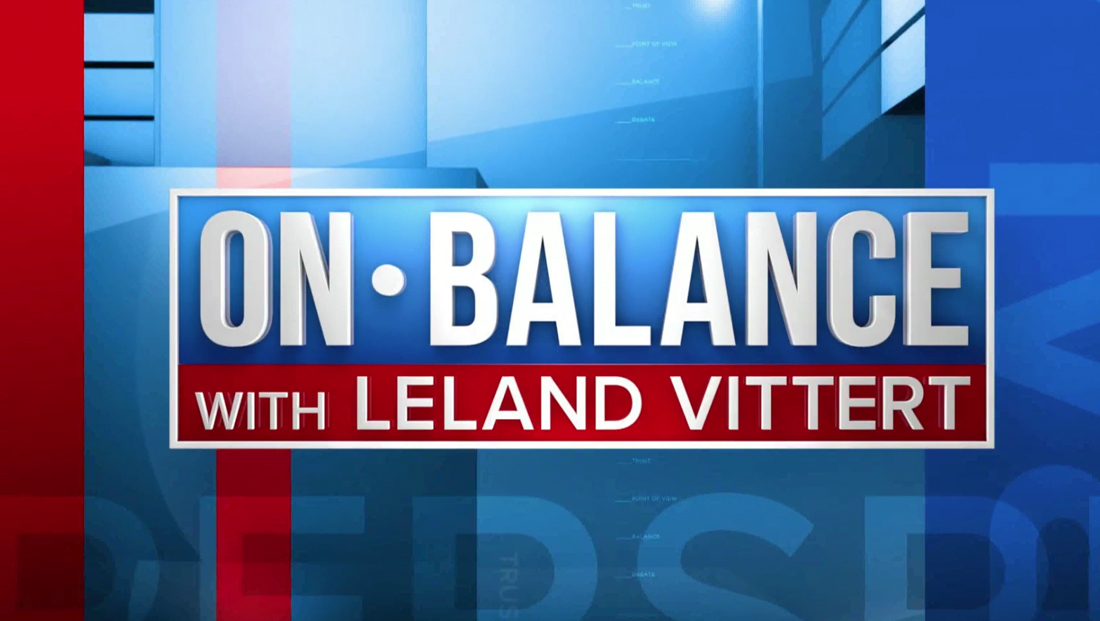
Previously, the show used a boxy logo with the its title words separated with a dot. In this version, the lettering was not italic and thus did not feature any angles.
Although not all that creative and having a bit of an odd mix of two sans serifs, the old logo did, in many ways, feel more “balanced.” Even the bullet point between the letters, while not in the dead-center, still gave a nod to the concept of centrism.

tags
logo design, NewsNation Channel, On Balance with Leland Vittert
categories
Branding, Broadcast Design, Broadcast Industry News, Cable News, Graphics, Heroes