
‘The Hill’ goes cubic to tie in brand with NewsNation look
Weekly insights on the technology, production and business decisions shaping media and broadcast. Free to access. Independent coverage. Unsubscribe anytime.
In creating the look for its new “The Hill” television show, NewsNation was able to conveniently combine elements from both brands and existing looks.
The show, which is sometimes referred to as “The Hill on NewsNation,” uses the same familiar blue box logo that the publication uses. Nexstar acquired The Hill in 2021.
It iterates off that concept with a graphical motif of cube backgrounds with 3D and border effects.
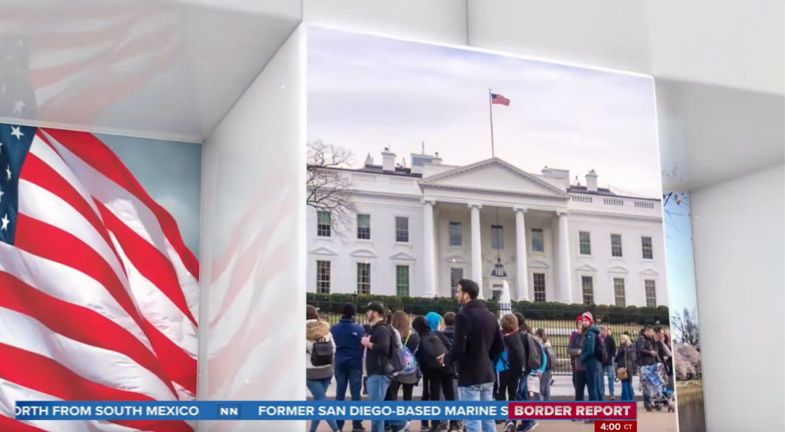
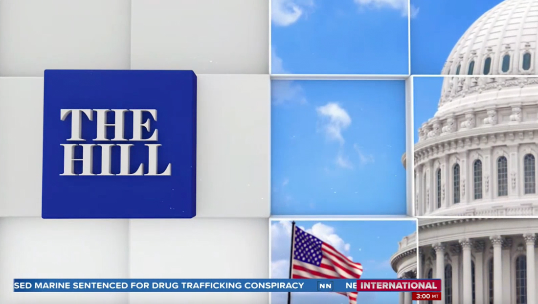
This grid-like pattern features a collection of political imagery on both the faces of the cubes and inside small “alcoves.” Some of the faces have slight borders around photos, while others remain solid white with a blue wash.
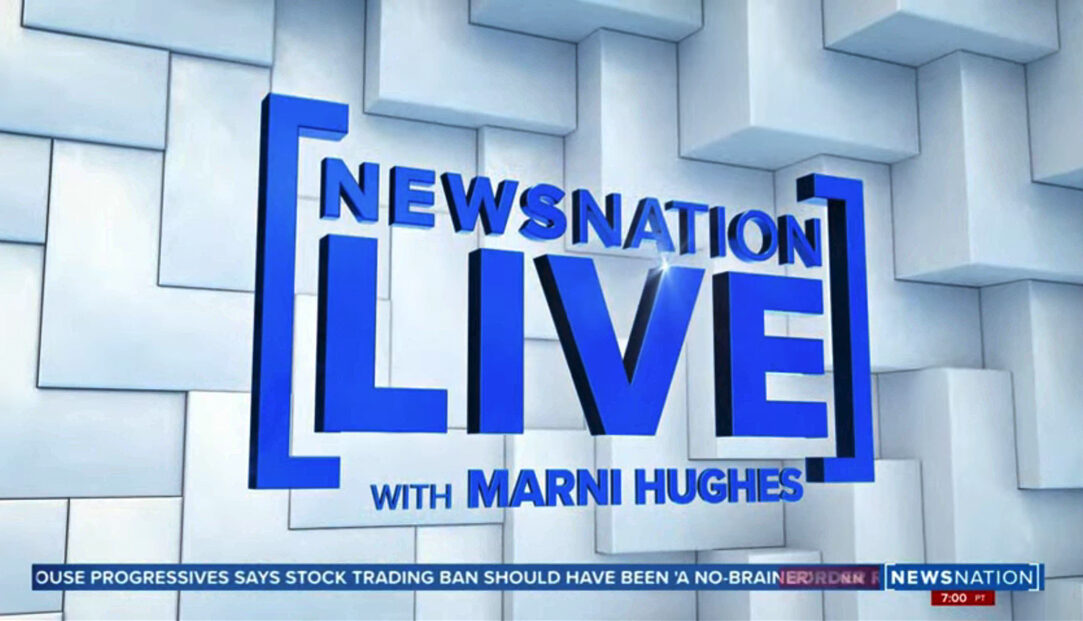
The title screen for ‘NewsNation Live with Marni Hughes’ that uses an L-shaped bracket background as well as the square brackets similar to the ones used in the network logo design.
Overall, the extruded grid motif has a similar feel to the backgrounds for “NewsNation Live” that include L-shaped bracket elements that fit together like puzzle pieces.
That, in turn, can be viewed as a reference to the squared-off brackets in the network’s logo.
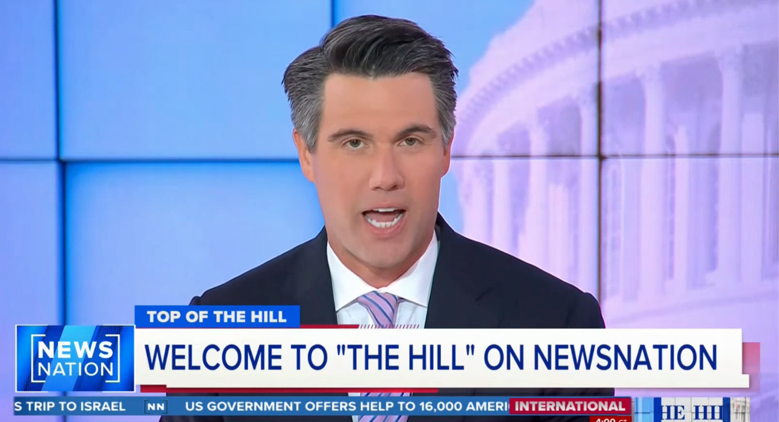
Although “The Hill” graphics don’t directly include any brackets (except with the NewsNation logo appears on screen at the same time), the general suggestion of the element is still present.

Toward the end of the open, a large blue cube rotates in to form The Hill logo, which is placed off-center to the left of the screen.
On-set graphics, meanwhile, include an image of the U.S. Capitol dome with a cube pattern over it as well as more traditional views of Washington, D.C. and branded panels.

tags
NewsNation Channel, Nexstar Media Group, The Hill on NewsNation
categories
Branding, Broadcast Design, Broadcast Industry News, Cable News, Graphics, Heroes