CNN rolls out new insert graphics in conjunction with its 43rd birthday
Weekly insights on the technology, production and business decisions shaping media and broadcast. Free to access. Independent coverage. Unsubscribe anytime.
On the 43rd anniversary of its launch, CNN has introduced a “clean and modern” new look for its insert graphics designed to add flexibility in how viewers get information.
The update, which is the first complete overhaul to the graphics the network sometimes refers to as “fonts” in about a decade, brings in elements such as rounded corners, subtle gradients and shadows, new locations for various information and a cleaner approach to typography.
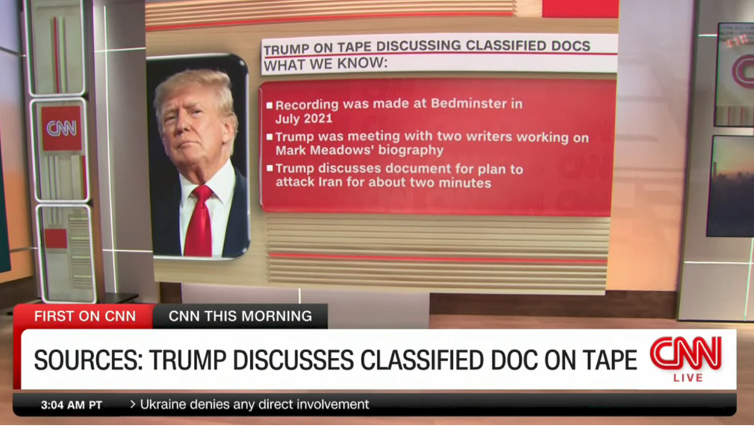
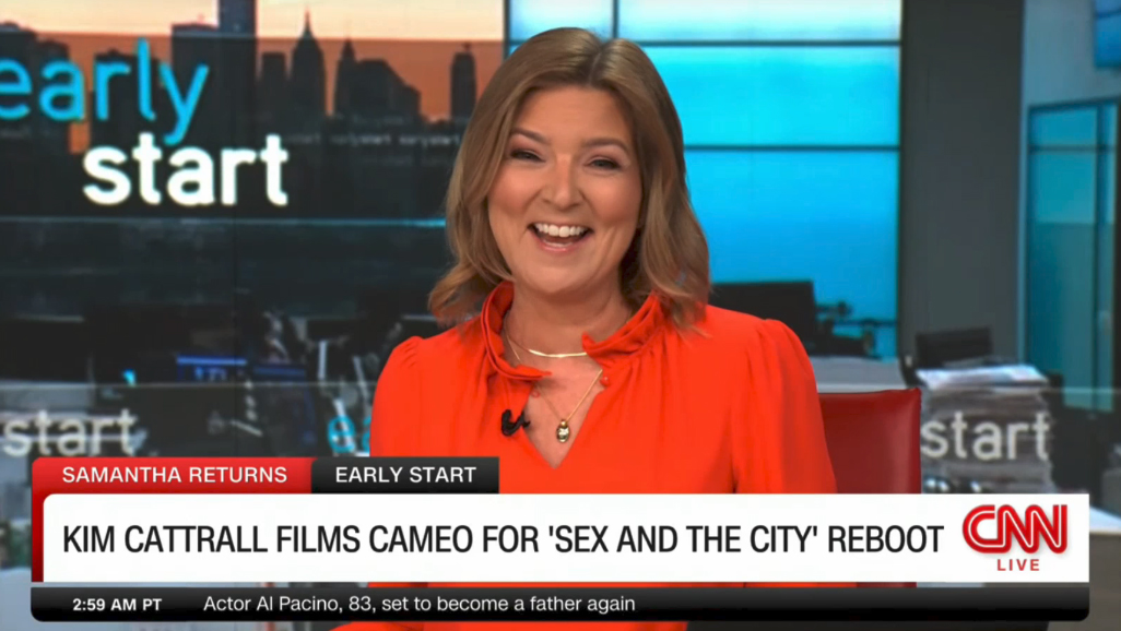
At first glance, the new look has retained many of the basic elements of the previous design: white banners, a CNN bug in the lower right corner and a red “flag” and end cap on the far left.
However, closer examination shows these elements have all been refined in their own way.
In addition, the white rectangle has gained a rounded corner in the upper right, with 90-degree angles still used on all other points.
New York brand studio and production company Sibling Rivalry, whose other clients include CBS and NBC, worked with CNN to create the new elements.
Throughout the package, the choice of rounded vs. non-rounded corners appears to roughly mirror the CNN logo’s general shape; the upper left of elements is rounded much like the “C.” The lower left of many elements is rounded, just like the bottom of the “C” while the upper right corner is often 90 degrees like the sharp corner at the top of the second “N.” Finally, the lower right of elements is often rounded off, just like the lower right of the second “N.”

The red flag is still tucked neatly behind the white bar, but also has a rounded corner in the upper left, giving it the appearance of a tab. Like before, this space can be used for both topical and franchise labels.
An additional dark gray tab can be inserted to the right of this and is typically used to showcase the name of the program airing. This was previously located below the bug.
The program name sometimes moves to the lower left of the screen when no white lower third is used.
The network’s iconic logo still remains in the lower right of the screen inside of a white box that, when shown alone, has a rounded upper-left corner as well. When a banner is inserted, however, the bug box merges with the adjacent white background.
While this approach creates an overall cleaner look, it also slightly de-emphasizes the network logo — though it also feels a bit more integrated with the package.
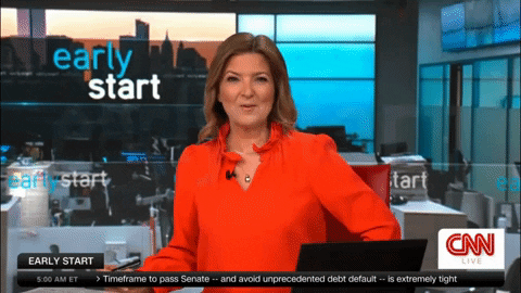
Below the logo, CNN can insert the word “live” in red letters that slowly pulsate. If the live bug is not used the entire logo moves down slightly so it’s centered vertically in the white space.
Previously, a live bug could be inserted atop the logo bug box, with an additional bar below used to display the current time and stock market information.
Both of those pieces of information are now in the lower left of the screen, next to the flipper-style ticker, which sits inside of a dark gray box with a gradient background running along the bottom of the screen.
This element does not directly butt up against the primary banner above. It features rounded corners in the lower left and right. To help distinguish between the ticker text and time and markets element, each headline is prefaced with a right-pointing chevron.
The network also redesigned its locator lines. These appear in a similar dark gray gradient with a rounded end on one side. Multiple tiers can be stacked on top of each other as needed, with a slight space between.
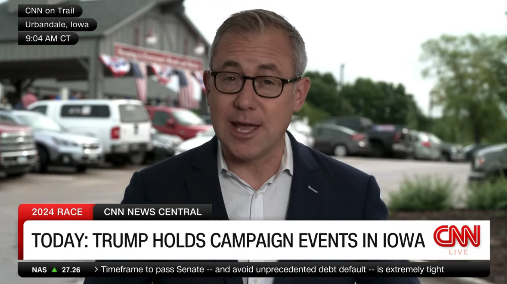
These elements can be inserted into the upper portion of either side of the screen, giving information such as the location and local time of a live shot. The same concept is also used to label non-live video, including file and recently acquired clips as well as for credits on imagery obtained from third parties or affiliates.
CNN has also made key updates to how text is displayed, pulling back a bit on both the weight and size of the text in its primary banners. This change lets the network feature more text without having to squeeze text to fit, something TV news falls victim to all too often.
There is also the option to spread out banner text across two lines, which offers significant aesthetic and clarity advantages.
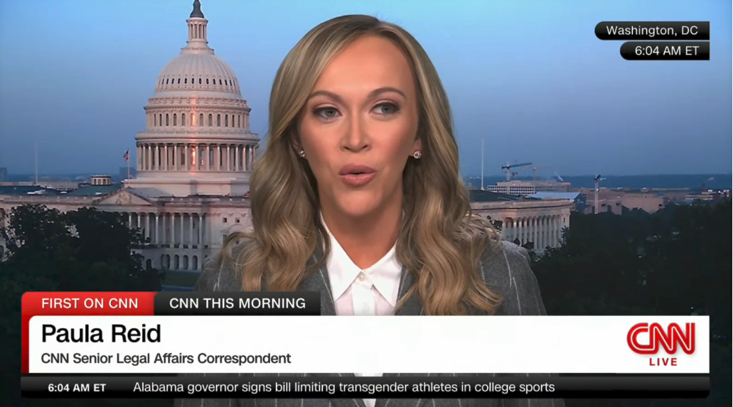
Lower thirds identifying on-screen talent or interviewees no longer appear below the headline, instead taking over the entire banner with the option for either a single line (mainly for anchors) or double line for when a name and title or other identifying information is needed.
This change makes a bit more sense visually because it means the text identifying the person on screen is now more directly adjacent to the person’s face instead of being separated, somewhat awkwardly, by a line of text.
The quick animated effect used to insert the identifier below the headline — causing the latter to scoot up a bit — is now gone as well, another move that helps improve clarity in the banners.
The new design, meanwhile, still uses animation when switching between various on-screen text elements, largely in the form of a brief side-to-side red block that covers the white part of the banner, as shown in the slowed-down animation above.
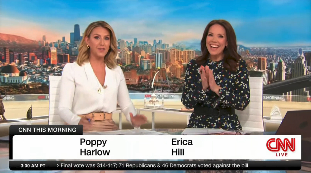
There are also instances where talent lower thirds, including ones identifying multiple anchors, appear without the red flag, so the dark gray show title container takes over the role, adding a dark gray cap to the far left. This typically happens near the top of shows when no specific topic is being discussed.
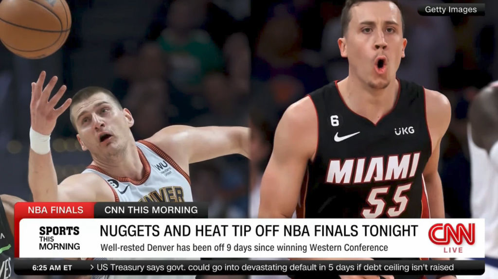

There is also a variation of the lower third banners that allows for a branded element to appear on the far left of the white rectangle. Additional information can be placed to the right of this, on either one or two tiers, with the option to have smaller text on the second one. Select segments, such as sports, can also include sponsor messaging inside the white banner.
Another variation of the banners is the option to insert a promo box to the far left of the primary banner. A light grab tab above it is used to label the promo and is separated from the other elements with a subtle shadow.
The width of this box is aligned with the width of the time and markets element directly below it. By integrating this element directly into the lower third area, CNN no longer has to insert a seemingly random box above its bug to promote broadcasts. So far, it’s not clear if a similar layout could also be used for radar loops, live shots or other topical visuals that cable news networks, including CNN, often insert during programming when a major story is developing.
Much of the on-screen typography no longer appears in bolder variations of the network’s bespoke CNN Sans font, a change that greatly reduces the visual weight of text, especially when, as is inevitable, the screen is forced to feature a substantial number of words.
Overall, CNN’s update delivers significant improvements, increasing readability and reducing clutter.
Moving the time and market box to the lower left and separating it from the bug is perhaps a bit odd since it feels like it belongs next to the word “live” and the logo, though it’s likely one of those changes that will become less obvious as time goes by.
The dark gray tab typically used for the show name often competes with the red flag element for visual dominance. Despite the difference in color, when there is a smaller amount of text in the red area and a longer show title, the dark gray tab tends to carry a bit more visual weight than it should.
It’s also interesting how this tab appears “in front” of the red one, something that is indicated visually with the shadow effect and slight bit of red that goes behind the upper left rounded corner of the dark gray element.
Speaking from a hierarchical standpoint, it could be argued that the show title is secondary to the topic being discussed, meaning the dark gray tab should be “behind” the red one. Making this element a slightly lighter shade of gray could have also helped take a bit of the visual weight off it while still allowing the network to fulfill its need to ensure show branding is prominent.
Most of these quirks, however, are minor and forgivable given efforts to clean up the typography elsewhere.
CNN has not, as of yet, updated any of the graphics for its individual programs, which includes opens, backgrounds, fullscreens or other elements. It’s not immediately clear if there are plans to revamp these, though many of them arguably look a bit dated up against the insert look.
Many of these graphics, including the ones used both on-screen and on-set during the recently launched “CNN News Central,” feel a bit jarring when compared with the new insert design. While there is some argument to be made that each show’s identity should stand out, the idea of two different design approaches creates a sense of inconsistency.
CNN CEO Chris Licht, who has overseen the launch of “News Central” and “CNN This Morning,” both of which have looks that are a bit inconsistent with the new insert look, announced the new look, along with a new image campaign, in a memo to employees.
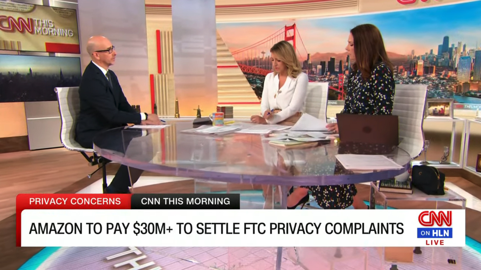
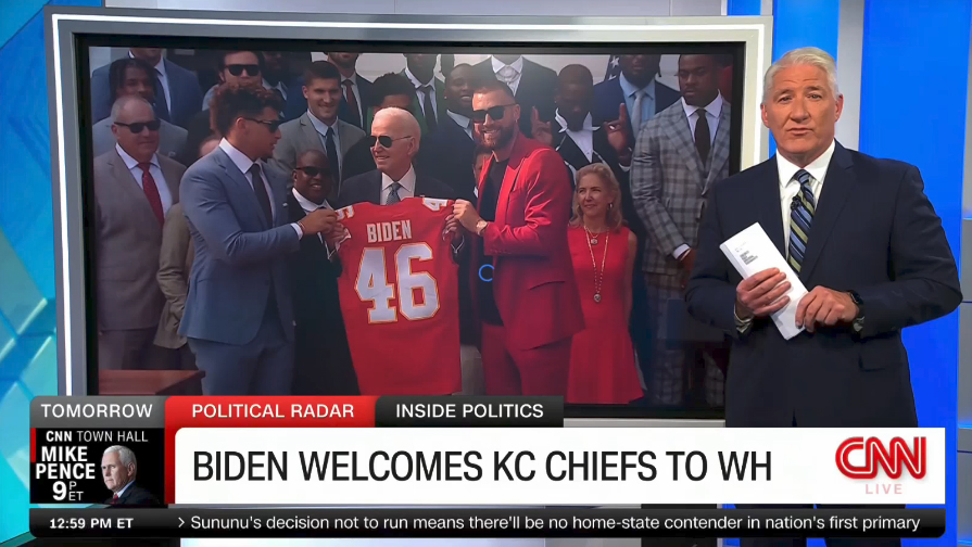
The graphics have slight variations, with a different logo bug being used for newscasts simulcast on HLN, reading “CNN on HLN” as it did before.
CNN International is no longer reversing the bug with a red background and knocked-out white logo, instead having the same layout as the domestic feed.

tags
CNN, cnn international, insert graphics, lower thirds, Sibling Rivalry
categories
Branding, Broadcast Design, Broadcast Industry News, Cable News, Graphics, Heroes, TV News Graphics Package