CNN starts hitting the ‘undo’ key on font updates in graphics

Weekly insights on the technology, production and business decisions shaping media and broadcast. Free to access. Independent coverage. Unsubscribe anytime.
Just 20 days after Chris Licht exited as CNN’s CEO, the network has started rolling back one of his most visible on-air changes.
The changes involve backtracking on the on-screen lower third insert graphics, sometimes known as “chyrons.” CNN itself sometimes refers to the banners using the term “fonts.”
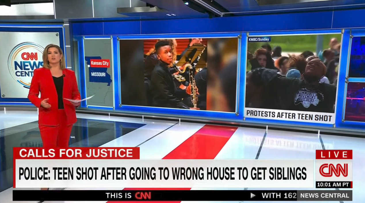
The new look debuted June 1, 2023, the network’s 43rd anniversary and included adding subtle depth effects and, most notably, shifting to mostly lighter typography.
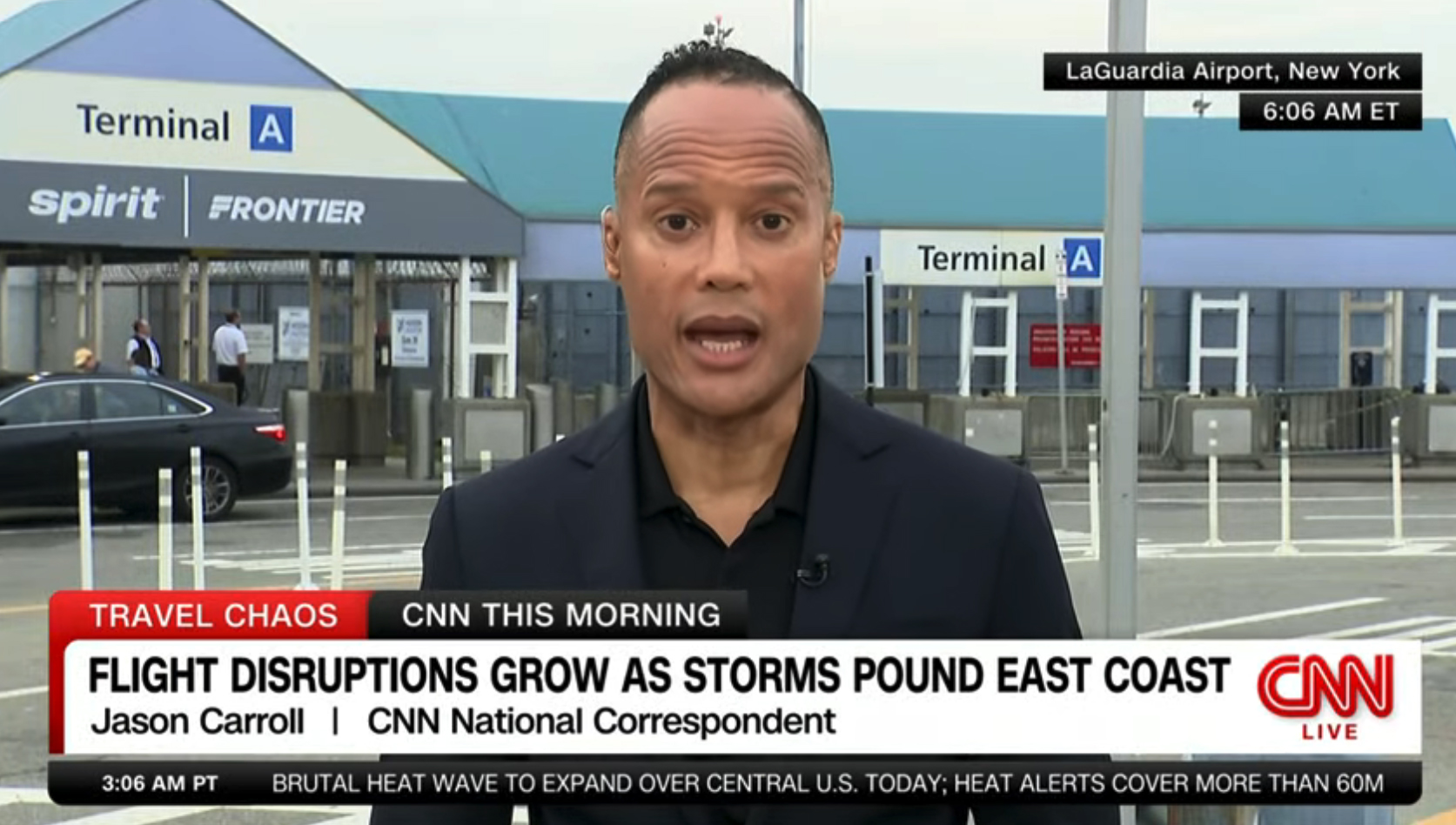
Starting the morning of June 27, 2023, however, the main lower third typography is being aired in a bolder look similar to the way it looked prior to the start of June 2023.
Multiple sources are reporting that both viewers and those inside CNN found the new typography harder to read, which appears to be a key driving point behind the shift.
As of June 26, 2023, this includes making the primary banner text bolder.

Talent, guest and interviewee identifiers have moved back to the bottom of the box, though they are still within the white box, whereas they were separated previously.
So far, there is no shrinking-style animation when a name is inserted, instead all of the text wipes left to right using the red effect.
The change reverts back to the issue of the person’s name being rather visually separated from their image. The practice of setting the name in a non-condensed font also creates a bit of an unbalance between the visual weight the first tier carries compared to the identifier in the second tier.
Scoop @PuckNews: CNN plans to change its on-air graphics back to old style that existed before ex-CEO Chris Licht changed them. Licht’s update, led by ex-comms chief Kris Coratti, did not go over well with CNN execs/journalists. Changes will start Monday, completed in 2-3 weeks.
— Dylan Byers (@DylanByers) June 24, 2023
Puck News’ Dylan Byers tweeted June 24, 2023 that the network plans to change its graphics “back” to the “old style,” within two to three weeks though this report did not make it clear to what extent the network would switch things back.
However, a source told NewscastStudio that CNN’s first round of changes is focused on making the fonts more legible.
The source confirmed that another phase of changes will come soon, but that the network is not completely abandoning the new look. The source did not independently confirm the timeline.
While the June 2023 design did lend a lighter, more elegant feel to one of the network’s most prominent visual elements, it’s also easy to see how lower visibility became an issue.

The old CNN insert banner design featuring a headline that has been ‘squeezed’ to fit into the space allotted by the white rectangle.
However, one of the challenges of making typography bolder is that, typically, unless you reduce the type size, you inherently can’t fit as many characters into the same space. Reducing the size can, depending on the intricacies of a particular typeface, also have a prominent effect on the legibility, so this type of issue quickly becomes a balancing act of sorts.
By reducing the weight of most banners, the Licht-era design did allow the network to fit more letters into the banners without having to unnaturally “squeeze” the characters, a practice that has become common in TV news as networks and broadcasters wrestle with the need to put more information in the same amount of space. It also improved the visual weight that typography carried on-screen and often competed less with the on-screen imagery shown above the banners.
It could be argued that the unnatural squashing of particular font isn’t a good idea — from both an aesthetic or legibility standpoint. Typography purisits often object to the practice because it unnaturally distorts the letterforms. If a more condensed version of a font is needed for practical purposes, then the design should switch to a variation that was drawn specifically for that application, many argue.
One result is that vertical strokes in many glyphs become narrower in comparison to horizontal ones, which can cause the letters to feel a bit unnatural — though often that’s something that only designers notice (at least consciously).

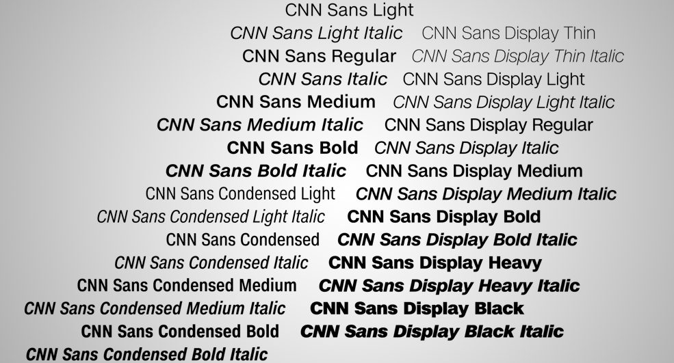
CNN uses CNN Sans, a bespoke font that first debuted back in 2016 and was one of the first prominent uses of a completely custom font in TV news. The typeface is known to have dozens of weights, widths and styles, including condensed versions. It seemed, however, that that variations wasn’t quite condensed enough, as the network constantly needed to use its graphics system to make letters even more condensed in order to fit everything on screen.
Ultimately, CNN could be wise to invest in having the font redrawn in an “ultra” condensed version that is used for applications such as this.
As of June 27, however, the network appears to have opted to essentially mix the old and new look — with the banner container and other shapes remaining the same but swapping out the lighter weight versions of CNN Sans for a heavier look.
In many ways, this could be seen as a good compromise until the issue can be addressed at a high level.
Although typography continues to feel squeezed, it also largely achieves the goal of making the primary banner text more legible.
Other updates include removing the rounded corners from locator and credit lines typically added to the upper right and left of the screen.
This won’t be the first “walkback” CNN has done in recent memory. In April 2022, the network pulled the plug on streamer CNN+ after less than a month of operations. That misstep cost the company hundreds of millions of dollars and put hundreds of people out of work.


tags
CNN, CNN Sans, insert graphics, lower thirds
categories
Branding, Broadcast Design, Broadcast Industry News, Cable News, Graphics, Heroes