
CBS, ESPN collaborate on new shared PGA Championship graphics package
Weekly insights on the technology, production and business decisions shaping media and broadcast. Free to access. Independent coverage. Unsubscribe anytime.
Creating the new graphics package for the PGA Championship took careful collaboration to craft a look that could play into both CBS and ESPN’s on-air design strategy.
Working with Two Fresh Creative, teams from ESPN and CBS Sports collaborated to create an updated motion graphics package that aims to be more “network agnostic,” explained J.P. LoMonaco, vice president of on-air graphics and design for CBS Sports.
It’s been seven years since CBS designed the former PGA Championship package. When ESPN signed on as a co-rights holder in 2020, that existing package was modified to be used on both networks.
The PGA Championship is owned directly by the PGA of America, unlike the PGA Tour, which recently agreed to merge with the LIV Golf.
![]()
With this 2023 redesign, both networks were able to provide input into the strategy and design process, which also included input from the PGA Championship.
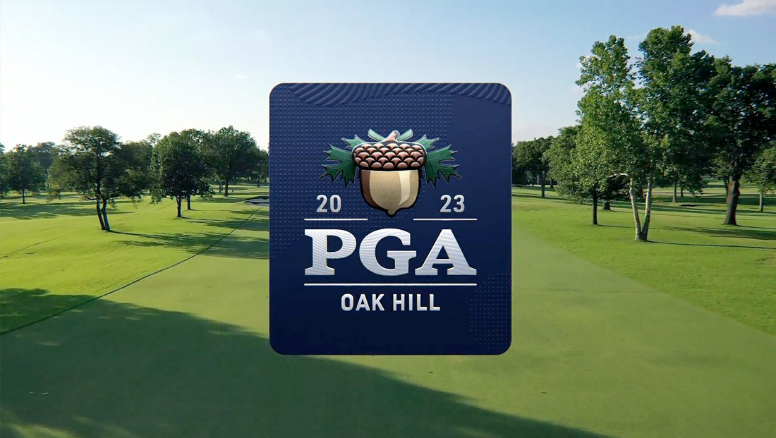
The new design focuses on the blue and gold color palette associated with the PGA Championship, whose acorn-adorned logo is used extensively throughout the look with the “Oak Hill” locale included.
Two Fresh and the network teams did bring a unique color to the mix, however. Known as “mulligan mint,” the sharp, clean shade of green is a nod to the grassy greens of golf courses — but in an unexpected way.

“We went out on a ledge … and it turned things a little more fun and youthful,” said LoMonaco, adding that the new shade needed to be used carefully and strategically. “We used it in the right dosages to really have it do the job that we wanted it to do.”

Although the design has many elements of the flatter looks that are becoming popular at both CBS and ESPN, as well as the entire broadcast industry, the PGA Championship package blends in texture and depth through the use of contour lines inspired by the slopes and pitches of golf courses. Small dot patterns are also used, reminiscent of golf ball dimples.
These often take on an embossed look, but there are also options for displaying them in 3D and outline format.
Using these nods to golf, as opposed to specific golf course imagery, not only separates the look from other networks but also makes the package flexible enough to use when different locations are used.
“This is definitely an event that focuses on which course they’re playing on. In the back of our minds, we really had to think ahead to the future and if we’re deciding on something, we had to think, ‘All right, well, how is this going to look when this isn’t in Rochester?’,” said Lucas Nickerson, an ESPN creative director.
“Anytime we were settling on a decision, it’s like, how do we pressure test this against the future?” added LoMonaco.
Steering clear of city-specific imagery also helped, given that the location of Oak Hill, outside of Rochester, New York, isn’t instantly recognizable from a visual standpoint for most viewers.
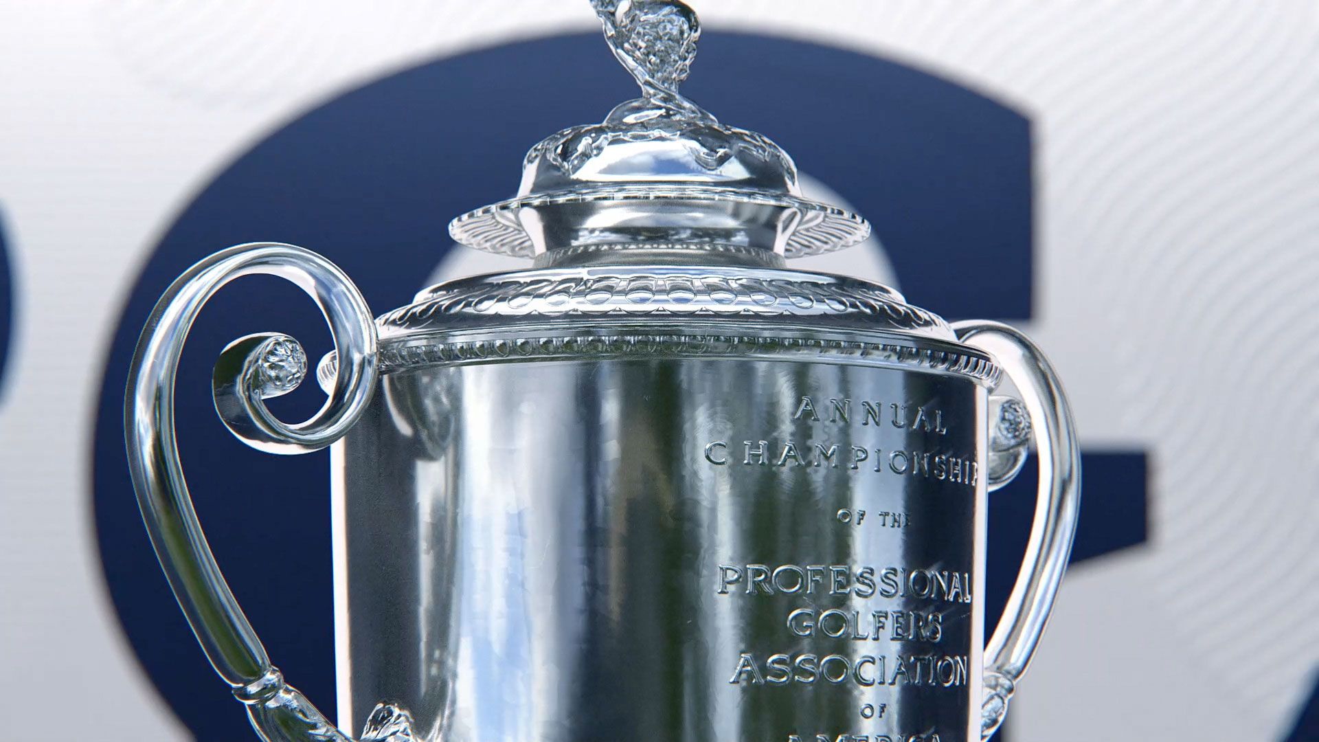
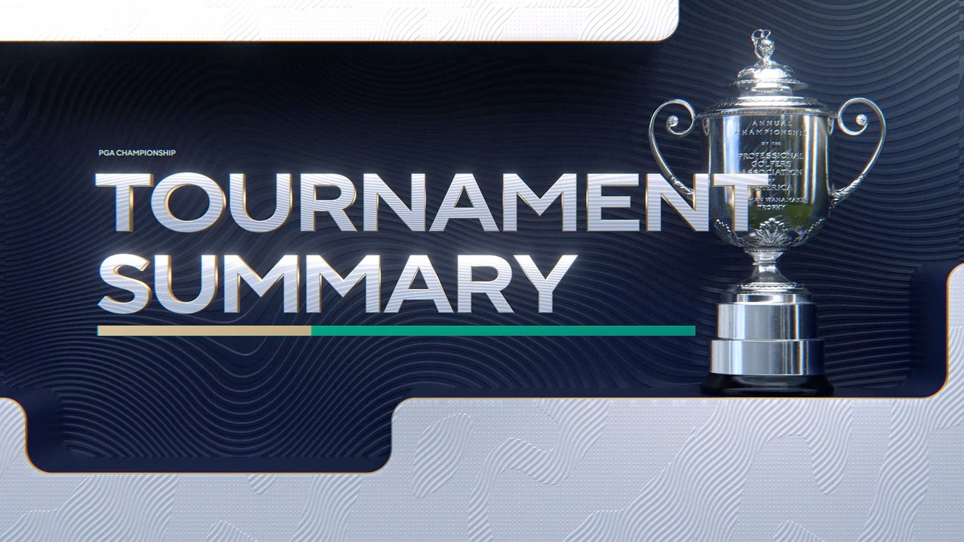
Other effects lend additional texture and depth to the design, including effects on typography and the PGA Championship logo, including elements in both that are filled with patterns. There’s also a shiny 3D version of the champion’s trophy that makes standout appearances throughout the design.


When 3D is used, it’s often more subtle than the glassy, metallic look that has been popular in broadcast graphics in the past, with the exception of the realistic rendition of the championship trophy.
The typography includes the display font Rosella, which has both a traditional and inline version, the latter of which is used more extensively in the look. The bold, elegant shapes of Rosella’s glyphs work well with the subtle embossing and 3D effects applied to typography as well as serving as a visual connection to the curves in the contour lines.
Elsewhere, the package uses TT Norms, the sans serif that is used throughout CBS, including in its news, entertainment, sports and other divisions.
The DNA from both ESPN and CBS shows up in various ways. Some examples include ESPN’s use of blocks of patterns and rounded corners alongside outlined typography and shapes. CBS’s genes are obviously found in the sans serif font, as well as the subtle 3D effects and beveled edges.
The team also had to take care to create a look that would appeal to both traditionalists and younger audiences alike.
“We’re veterans in doing golf, so we have a certain sensibility that we are very used to. We brought that sensibility right from the start, but kept questioning it every step of the way and seeing how we can push the envelope and do things a little bit more youthful,” said Komal Bhukhanwala, art director at CBS Sports.
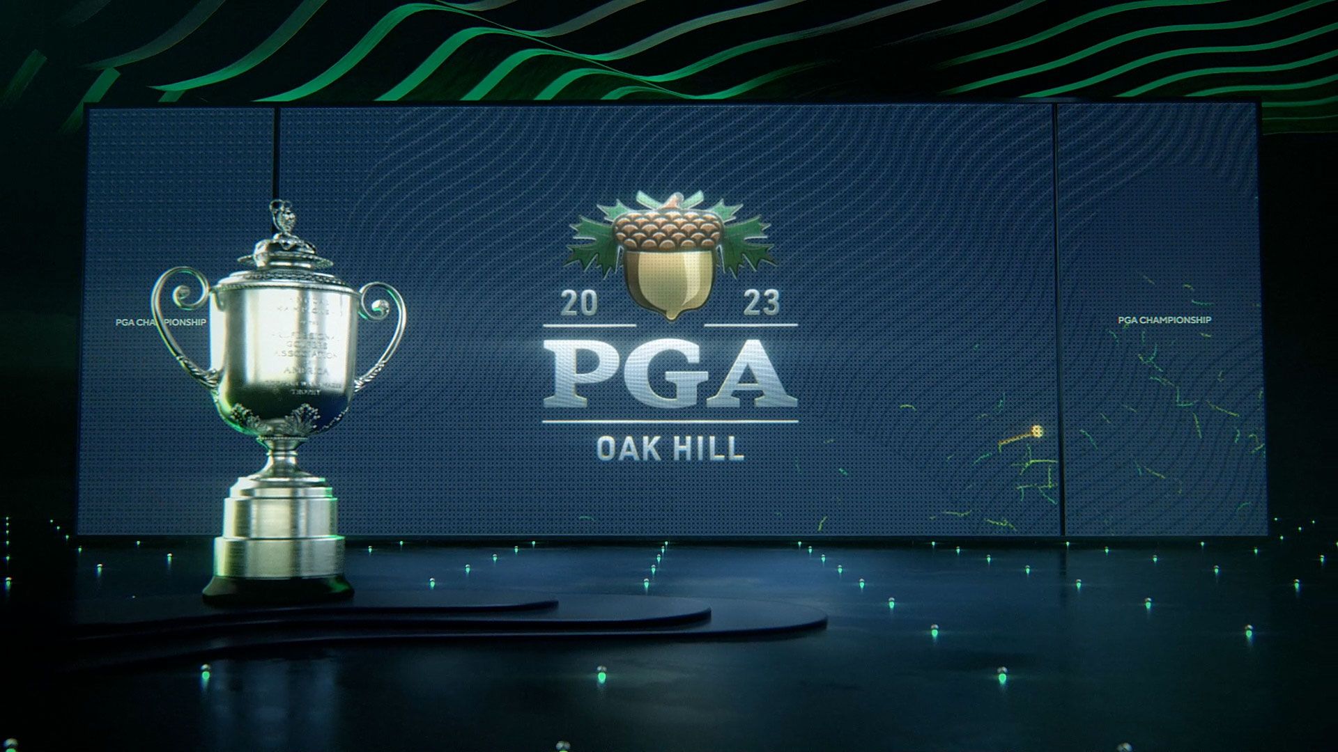
Contrast also played a crucial role in creating select fullscreen graphics showcasing what appears to be a darkened interior-like environment with large, simulated video walls for displaying relevant content.
“When you’re living in a world that is very open air with a broadcast that is very day-lit and you go to a full frame element, it’s really nice to counterbalance all of that light and green grass with a dark environment that still does reflect the color palette and bring attention to the information, namely the font and the video,” said Timothy O’Shaughnessy, ESPN’s creative director for college sports, who lent his expertise to this project.
“It’s basically a way to dimensionalize the contour lines that you saw and use them as architectural balance, if you will,” he added.
In these looks, the contour lines are, again in a nod to contrast, shown as a clean step-like structures with a matte black finish, while mulligan mint finds itself as a field of small green lights on the surface of the space, much like an airport runway.
Above this, the contour lines are used again, this time appearing as wavy green elements that form a ceiling of sorts, completing the sense of 3D space.
The large simulated video panels in these scenes were also intended as a way to showcase historical footage from past PGA Championships.
“I think there was a little bit more reverence to how we framed the video that we were showing,” said LoMonaco.
Archival footage is also showcased in other distinct fullscreen layouts that feel a bit more open and flatter and feature an eclectic mix of textures, shapes and color.
Many of these designs also play a key role in providing visual cues to viewers with information such as what hole is being showcased, when footage or stats from a previous day is being shown for context or explaining the who’s who of the matchup.
That artful combination of the various visuals is also a recurring theme throughout the package — a move that took careful consideration from all sides.
“Designing these packages is always a process. What you get right out of the gate is not really what you end up with, and that’s where each of our perspectives steers it in a way where you bring a little bit of that elegance in,” said Bhukhanwala.
“That’s not to say that the initial frames were not elegant, it’s just there were a lot of ideas in there, and you had to sift through them and pick out the ones you like,” she added.

tags
CBS, CBS Sports, ESPN, J.P. LoMonaco, Komal Bhukhanwala, Lucas Nickerson, PGA Championship, Timothy O'Shaughnessy, Two Fresh Creative
categories
Branding, Broadcast Design, Broadcast Industry News, Graphics, Heroes, Sports Broadcasting & Production