Mississippi Public Broadcasting rebrands with new logo, sonic signature

Subscribe to NCS for the latest news, project case studies and product announcements in broadcast technology, creative design and engineering delivered to your inbox.
Mississippi Public Broadcasting, a network of all PBS and NPR member stations across the state, has rebranded with a new logo and sonic element.
“We are very excited to unveil the new brand identity,” said Royal Aills, executive director of MPB in a statement. “We feel as though the new brand is symbolic of the direction the agency is headed as we look to better serve our audiences in an ever-changing media landscape.”
Owned by the Mississippi Authority for Educational Television, which holds the licenses to the sixteen public radio and TV stations that serve the state.
The rebrand comes on the 20th anniversary anniversary of a vote by the MAET board to make Mississippi Public Broadcasting its public brand name.
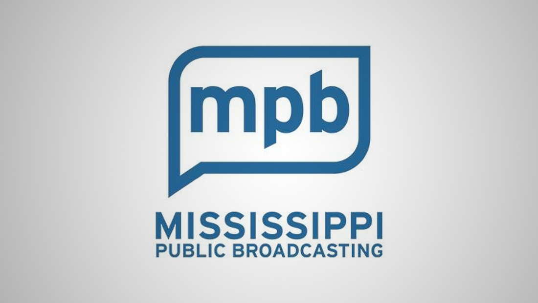
The new logo features a though or speech bubble-like outline with rounded corners in the upper left and lower right and a pointed “tail” in the lower left.
The shape is likely a nod to how MPB communicates and educates through storytelling, the dual interpretations as being spoken word is strong nod to the audio heard both on the radio and TV as well as the network’s ability to spur thought and debate.
A bold sans serif is used for the “MPB” initials, which appeared in all lowercase. The descender on the “p” and ascender on the “b” both have diagonal tips that drive home the angular motif of the tail.
One tiny detail, however, is that the angle of the diagonal in the tail of the speech bubble doesn’t quite match the angle that would be created if you created two imaginary lines pivoting off the lower part of the “p” and upper portion of the “b.”
It’s a small detail for sure and one that not many might notice, of course.
Below the speech bubble icon is the option to spell out the organization’s full name in all caps, with “Mississippi” in larger type above the words “Public Broadcasting.” The two lines are flush with each other on both sides.
The overall width of the full name element is slightly wider than the icon, with the tip of the speech bubble’s tail positioned just above the center of the “M,” placement that may have been meant to suggest the icon is flowing out of the letter.
“The new look and sound reflect MPB’s drive for excellence in a digital age, and its commitment to reach audiences – regardless of the platform where they receive their news, information, or educational resources,” reads the station’s announcement, noting that the new look will appear across all of its platforms, including on-air, its website and streaming offerings.
The general shape of the speech bubble in the new logo also appeared in the three distinct boxes the MPB logo previously used.

In addition to the updated visuals, MPB is also introducing a new sonic brand — a blues guitar lick meant that draws inspiration from Mississippi’s cultural heritage.
“MPB recently celebrated its 53rd year serving the people of Mississippi,” Aills noted in the statement. “We hope to continue to serve the community for the next 50 years, evolving as needed to meet our audiences ‘where they are’ in terms of how they consume their news, information, or programing.”
Subscribe to NCS for the latest news, project case studies and product announcements in broadcast technology, creative design and engineering delivered to your inbox.


tags
logo design, Mississippi Public Broadcasting, NPR, PBS
categories
Branding, Broadcast Industry News, Featured