
Fox’s Super Bowl LIX score bug largely roasted on social media
Weekly insights on the technology, production and business decisions shaping media and broadcast. Free to access. Independent coverage. Unsubscribe anytime.
Fox Sports kicked off a new design for its NFL score bug and insert graphics during Super Bowl LIX, a clean design that managed to stir up quite a bit of criticism.
At its core, the new design relies primarily on typography and boxes (or lack thereof) to keep track of the score, time, quarter and other important gameplay details.
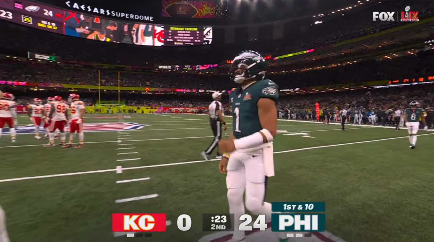
Each team is represented by an abbreviation, “KC” for the Kansas City Chiefs and “PHI” for the Philadelphia Eagles, shown in their respective colors.
During Super Bowl LIX, Kansas City got a red background with a gold outline on the current score, while the Eagles feature the trademark “Midnight Green” and a gray outline standing in for silver. The score bug did not include team logos, a common but not necessarily requisite element in these types of graphics.
These were placed on opposite ends of the newly redesigned FoxBox. Their respective scores appeared to the right of the “KC” and to the left of the “PHI” but without any background behind them. The letters, displayed in a light gray-white, essentially floated over the picture with an outer glow effect added.
Between the two scores was a semi-transparent box used to show the game clock and current quarter. This element, combined with the colored boxes on either end, essentially boxed in the score numerals, creating the suggestion of a box or outline.
For typography, the design uses a bold, extended-width typeface for major elements that appear to be inspired by the Fox wordmark, which combines bold strokes, a distinctive negative space in the letter “O,” and bold angles in the “X.”
The “X” angles, for example, appear in the two diagonals of the “K,” while a shape similar to the middle of the “O” can be seen in the “C,” which also occupies a similar footprint as that letter does in the logo. It’s worth noting that the zero (“0”) has a similar center as the letter “O” but is a bit more narrow and less circular.

It’s common for typography designers to purposefully build distinct glyphs for the letter “O” and numeral “0” as well as elements such as the number “1” and capital “I.” Fox’s look adds a hook and base to the number “1” while the capital “I” is a simple vertical rectangle.
Meanwhile, an additional floating colored box can be added above the team’s abbreviation, in matching colors, to indicate current yarding and play clock, as needed. These elements appear to use an italic, more narrow version of the typeface.
Finally, both team boxes also had three dark, semi-transparent dash marks below, representing time outs. These would turn a similar light gray as the letters and numbers above as they were used.
Behind all of these elements, the network added a dark gradient across the entire width of the screen, which was likely meant to help boost the visibility of the score bug elements.
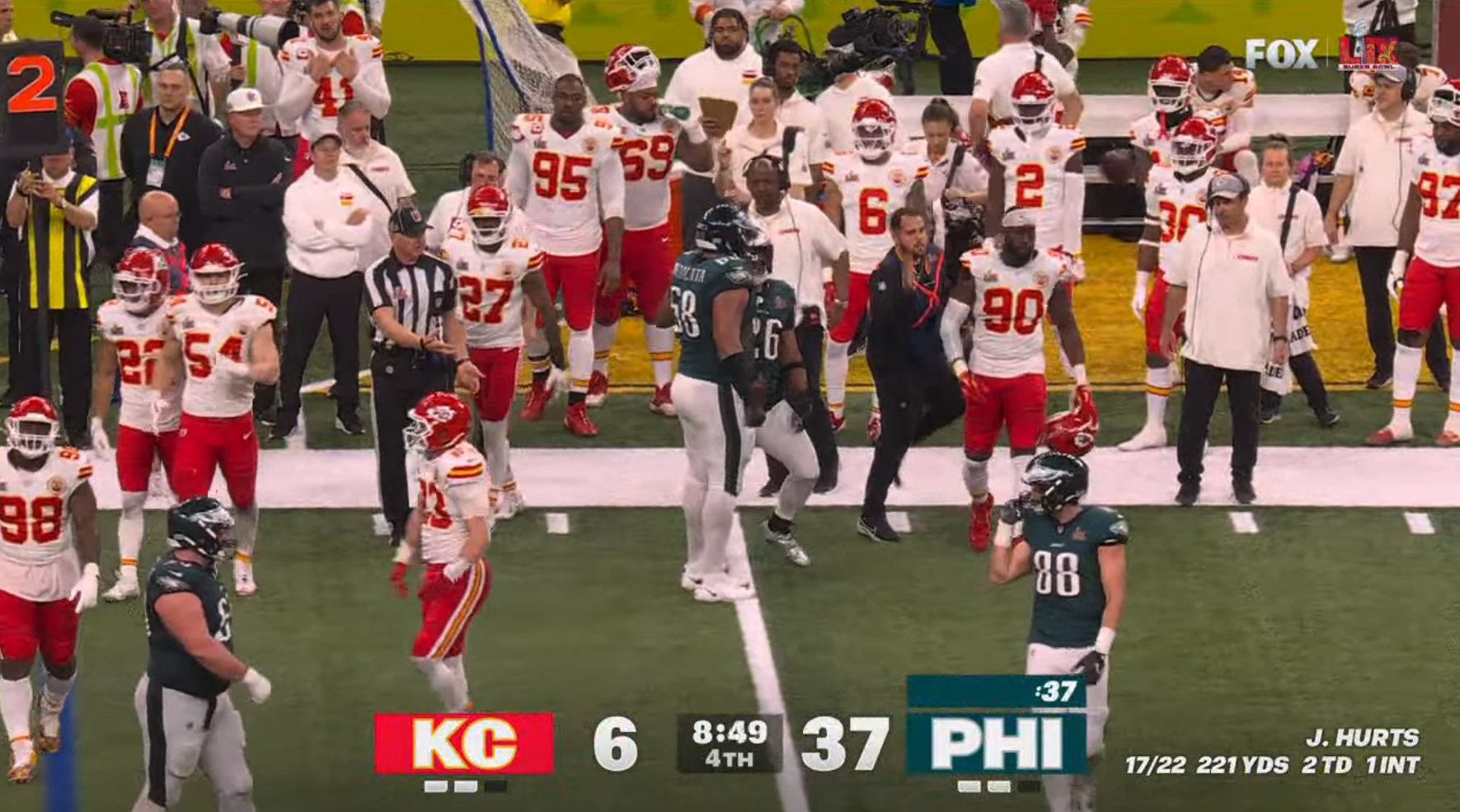
Fox also had the option to insert additional player stats to either side of the scores, which notably falls outside of the square or vertical video “safe area” that the centered graphic was designed to accommodate, though, in many respects, cropping this information off in these formats isn’t necessarily detracting from the viewing experience.
The strategy didn’t quite work out, however, when the lower portion of the screen had a darker color already, such as shown in the image shown above. In these cases, the grayed out timeout markers all but disappeared while the filled in ones often appeared without context of the remaining ones.
This was just one quirk of the new graphics that got attention on social media.
Fox posted a screen capture of the new score bug to its @NFLonFox account, which quickly garnered thousands of comments, most of them negative.
Complaints ranged from users saying the look made their eyes bleed to comments about not liking the look. Some of the comments compared the graphics to ones you might see on a local cable access channel or even football coverage in the 1970s.
At least one user “fixed” the graphics by simply writing scraggly hand-drawn letters and numbers over an image of the field. Another case showed red and midnight green boxes that covered most of the play, a sarcastic nod to the sheer boldness and clunkiness of those boxes.

Users also responded with memes ranging from “restraining order” to “this is the worst” (courtesy of Michael Scott of “The Office”) themes.
Some users were more specific in their criticisms, which pointed out the lack of a graphical element to “tie the look together” or the annoying feature that had the down typography change size when the play clock entered or exited.
All told, the new look is certainly clean, removing many of the components viewers are accustomed to seeing in score bug design. The design feels notably flatter with an underlying minimalist tone. Based on the majority of comments, it appears the design may not have won over many fans.
It’s not uncommon for networks to debut new graphics packages in conjunction with major sporting events such as the Super Bowl, with the same design then continuing throughout the rest of the season—although tweaks are often made in subsequent outings.
It’s unclear whether Fox might roll out some updates for future games, but traditionally insert graphics introduced at the Super Bowl become the standard for the next regular season.
While the score bug is arguably the most prominent part of a sports graphics package, there are typically numerous other elements.
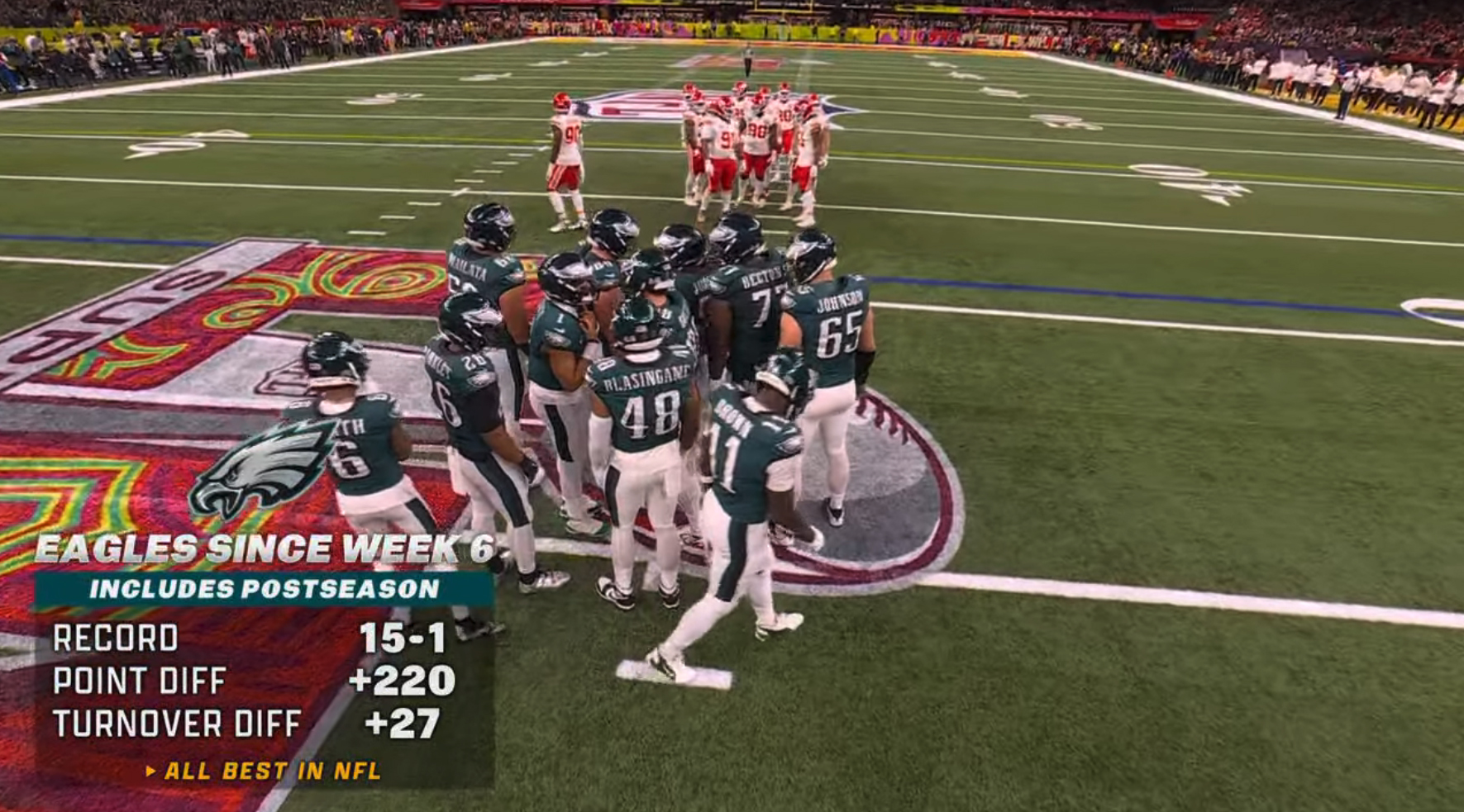
Fox borrowed elements from the score bug look in other on-screen graphics, including season stat boxes which, in a departure from the controversial score bug, did use a dark semi-transparent box to contain much of the data, which was shown in a mix of the bold font and a lighter, more boxy typeface that also appeared in last year’s look.
To be fair, the dark shading element is indeed found in the score bug, but only behind the game clock in the center, so it’s a bit unclear how the designers chose to apply the element across the package. To be truly consistent with the score bug, graphics like the one shown above probably should have used a dark gradient wash behind the text instead of the box, though various arguments for the design certainly exist.
For example, it could be argued that Fox opted to have the most important part of the graphic be in light gray without any box, such as the current scores. It’s fairly easy to say this is one of the key messages the score bug needs to communicate. This usage philosophy holds up if the title of the stat box above is considered “most important” while the actual stats are more in line, at least in a visual hierarchal sense, with the game clock—meaning it’s important but perhaps not the first thing a viewer just tuning in to the game might need to know.

Meanwhile, the cartoon-inspired illustrations of players first introduced during Fox’s coverage of the 2023 Super Bowl returned. Like other parts of the package, these graphics were typically shown directly on top of the video feed behind it without any box or background element other than the gradient.
When used to identify specific players, the team identified could be added running vertically to one side of the cartoon, with the player’s name and important stats stacked to the right in a mix of the bold typeface and more body-copy friendly one set in a variety of sizes and styles.
These graphics, like the stat boxes, relied on a golden yellow as an accent color no matter what team was being referred to.
Also of note is the all-caps italic style used in most “title” elements.
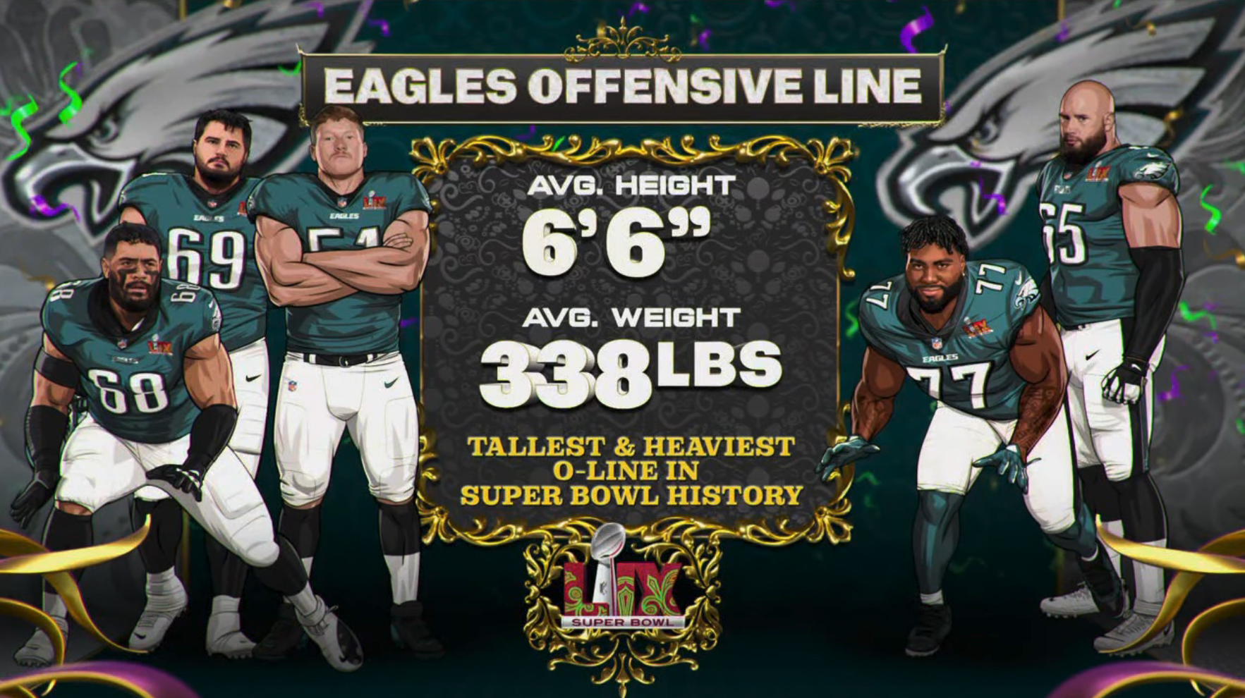
Fullscreen graphics, meanwhile, also used the cartoon-style illustrations with team logos added to the background along with Mardi Gras and French-inspired accents, a nod to the New Orleans locale of Super Bowl LIX, mixed in.
A blocky serif typeface, which appeared to be similar to Clarendon, was also uses in these looks as well as other specific looks.

tags
Fox, Fox Sports, FoxBox, NFL, Score Bugs, super bowl, Super Bowl LIX
categories
Broadcast Design, Graphics, Heroes, Sports Broadcasting & Production