CBC blends previous looks with Asian influences in PyeongChang design
Subscribe to NCS for the latest news, project case studies and product announcements in broadcast technology, creative design and engineering delivered to your inbox.
CBC’s PyeongChang look draws on the heritage of its illustrative, stylized design at Sochi and Rio, but blends in South Korean and Asian influences to craft an impactful open that takes viewers through multiple sports and scenes.
The live action shots of the open, created by the network’s in-house design team, actually match the compositing the network used during the last Winter Olympics, back in 2014, very closely — in some cases down to the exact shots.
However, the illustrative elements surrounding the live-action footage have been traded out for a design motif that incorporates elements inspired by South Korea.

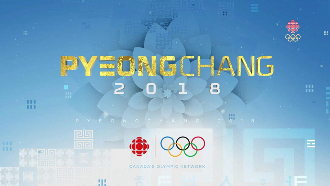
The title slide boasts a flowery pattern created using a combination of rounded geometric shapes and shadowing to create a petal-like design that is indicative of both the network’s own logo and the Korean rose, or Hibiscus syriacus, the nation’s national flower.
A more literal interpretation of the flower concept is seen elsewhere, such as at the beginning of the opening titles as live people “blossom” from the petals of an animated bloom.

In addition to colorful ribbon elements, the design also features geometric “lantern” elements, another nod to Asian culture and, perhaps in particular, the Seoul Lantern Festival.

Subscribe to NCS for the latest news, project case studies and product announcements in broadcast technology, creative design and engineering delivered to your inbox.

tags
2018 Winter Olympics, CBC, CBC Sports, Grayson Mathews, Majoma Music, Marc Cholette, Pyeongchang, PyeongChang Olympics, PyeongChang Winter Olympics, South Korea
categories
Branding, Broadcast Design, Broadcast Industry News, Graphics, Heroes, Olympics