Netherlands public broadcaster debuts new look for flagship ‘NOS Journaal’
Subscribe to NCS for the latest news, project case studies and product announcements in broadcast technology, creative design and engineering delivered to your inbox.
NOS, a public broadcaster in the Netherlands, launched a new look for its news program “NOS Journaal” this week.
The Branding Source writes, “NOS’ previous look was launched in December 2005 and created by the British agency Lambie-Nairn. Based on a concept called “the hub of news”, Lambie-Nairn built the new look around a red ring, also taking the place of the O in the logo. The new look reaffirms the confidence in the red ring, making it the focal point in the intro.”
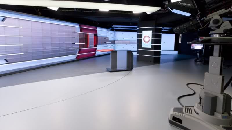
The studio provides a wide open space for anchors, with many standing positions and a small pod.
The most interesting feature of the studio is the large screen. Aside from just being a really big display, the screen has a unique shape with some cut outs and inlayed color changing elements.
This unique design allows for an interesting presentation of visuals, as shown above. In the video below, many examples are shown of how it can be used.
Overall, the studio is sparse compared to most international projects, but it fits with a public broadcaster. It fits the mission and provides a great level of flexibility over traditional studios, as its an open box.
New studio time lapse:
Video showing studio in use:
Subscribe to NCS for the latest news, project case studies and product announcements in broadcast technology, creative design and engineering delivered to your inbox.


tags
Graphics, HD, large display, Nederlandse Omroep Stichting, NOS, Set Design
categories
Branding, Networks, Set Design