
ABC owned stations roll out new Web design
Weekly insights on the technology, production and business decisions shaping media and broadcast. Free to access. Independent coverage. Unsubscribe anytime.
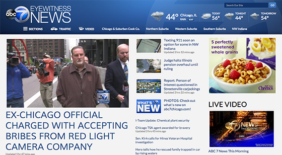
ABC O&O stations debuted a new responsive website design this week. Since it’s responsive, the design adapts to fit all devices including phones and tablets.
The design uses a multicolumn format with minimal ad interruptions. Overall, the design features large typography with a simple blue color scheme.

The columns become a bit too busy on inside page, with the actual story only taking up half of the screen. The fonts all seem a bit too large, perhaps drawing comparisons to Huffington Post-style screamers.
Section fronts are often branded with a subtle background image, including map-themed backdrops for regionalized pages, such as the one from WLS-TV in Chicago shown below.

One nice touch is the redesigned weather pages, which include stylized backgrounds depicting current conditions and a horizontally scrolling hour-by-hour forecast feature.


The fonts used throughout are Muli and Lato, part of the Google Font service.

tags
ABC, ABC O&O, google font, responsive web design, web design, wls, wls-tv
categories
Featured, Local News, Online and Digital Production