
Weather.com launches cleaner look for hompage
Weekly insights on the technology, production and business decisions shaping media and broadcast. Free to access. Independent coverage. Unsubscribe anytime.
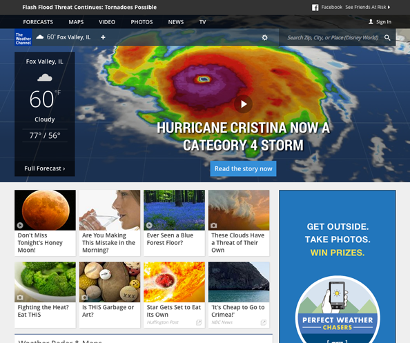
The Weather Channel has launched a redesigned website.
The centerpiece of the Weather.com redesign is a new homepage that boasts a large featured image that also includes a current conditions box to the left. Below this, smaller boxes point users to additional featured content. The remainder of the page includes headline scrapes grouped into categories in white boxes.
The changes come on the heels of an iOS app redesign earlier this year.
The site’s navigation has been moved to a semi-transparent bar along the top of the page — and gives users quick access to forecasts, maps, photos, video, news and TV content. Below this a customizable bar allows users to add current conditions to cities of their choice and search the site quickly.
The main navigation bar also includes a rather small version of the channel’s logo — only 45 pixels across and high.
Overall, the new homepage takes a big step in reducing clutter and making the site more scannable while also making it easier to tell what the most important content is.
However, the interior pages still suffer greatly from clutter and appear to only be partially redesigned, with some areas only getting the new navigation bar treatment while the remainder of the page remains mostly unchanged.


The site’s forecast pages are especially cluttered mainly because the channel is likely trying to encourage users who visit these popular pages to explore other areas of the site. However, the attempt falls flat with an overload of seemingly randomly placed square boxes with photos that give no hints of hierarchy or importance.

The maps section has been revamped to use the entire width of the user’s screen and emphasizes the ability to view different types of weather maps in an interactive approach.

tags
The Weather Channel, weather.com
categories
Cable News, Featured, Online and Digital Production, Weather