
Fans redesign FIFA World Cup graphics package
Weekly insights on the technology, production and business decisions shaping media and broadcast. Free to access. Independent coverage. Unsubscribe anytime.
Large multi-national sporting events usually have terrible TV graphics that broadcasters are forced to use, just look at the OBC’s Olympic graphics.
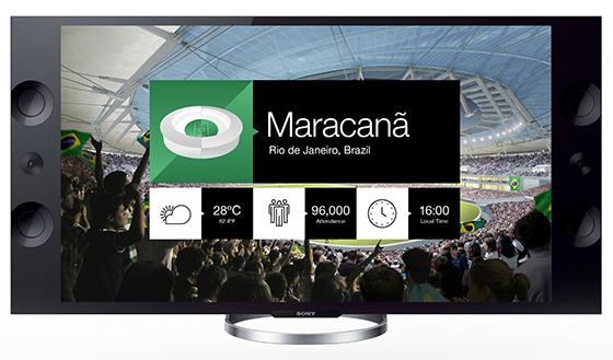
Designers Guus ter Beek, Tayfun Sarier, Jordon Cheung and George Grace decided to do an uninvited redesign of the FIFA World Cup package based on flat design and illustrations.
“The World Cup of 2014 in Brazil is at it’s peak, and so far we have simply been spoiled with great goals and surprising outcomes. But when it comes to the visual way of games appearing on our TV screens, we can’t hide the fact that we’re disappointed in the outcome.”

“Nowadays, we see our score displayed in various shapes and sizes and none of them stand out. ‘That’s a nice football interface!’ — said no one ever.”
“We need good design, especially on television and certainly on channels where drop shadows still roam, and gradients are abundant. Let’s go forward and make football interfaces smart and a pleasure to look at. This way football fans will have more insights in the world cup and gain more focus on the beautiful sport that is football.”
Take a look at the full redesign brief.


tags
ESPN, fifa, fifa world cup, sporting event, Sports, sports graphics
categories
Branding, Featured, Graphics, Sports Broadcasting & Production