CNN launches flat graphics package

Subscribe to NCS for the latest news, project case studies and product announcements in broadcast technology, creative design and engineering delivered to your inbox.
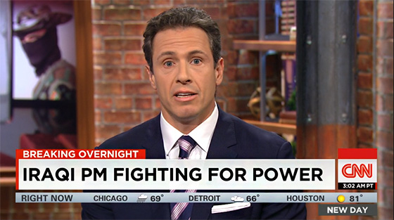
CNN updated its standard graphics package today, debuting a flat look with large typography.
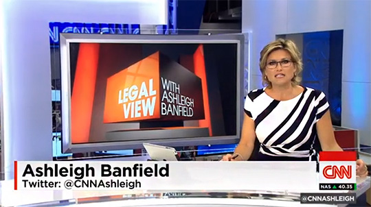
The new design is a change in direction for CNN, ditching the space allocated to plugging the show’s name and logo. Now, a small box shows the anchor’s Twitter handle and show name.
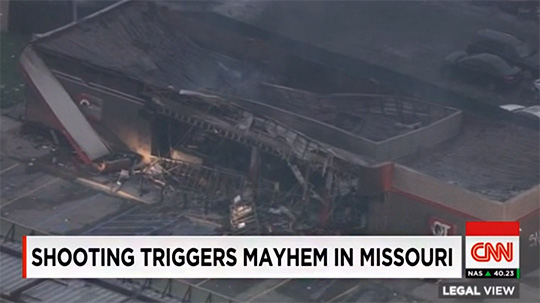
The new design is very flat, with a light gradient used in the lower third and some light glow effects on various text elements. It’s very clean on air… but very big as well.


Inside Cable News writes, “CNN’s move to eating up more vertical space on my TV screen is not just a result of going bigger for going bigger’s sake. It has more to do with branding and blaring headlines. But starting today, CNN is trying something different. It’s keeping the headline/subject theme text on the screen all the time. So this is why CNN’s lower thirds look so damn big…because the network decided to leave its headlines up 24/7 and needed more space to work in the reporter’s ID.”

The overall approach is an interesting one, but the flat aesthetic is ruined by the giant font on the lower thirds. The graphics also have many moving elements, as guest and reporters names fly in-and-out, making the look a bit distracting as well.
Subscribe to NCS for the latest news, project case studies and product announcements in broadcast technology, creative design and engineering delivered to your inbox.


tags
CNN, cnn graphics, cnn graphics package, Real Time Graphics, viz, Vizrt
categories
Branding, Cable News, Featured, Graphics, Real-Time Graphics