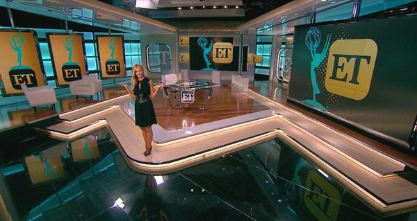
‘Entertainment Tonight’ gets new set, logo, color scheme

Weekly insights on the technology, production and business decisions shaping media and broadcast. Free to access. Independent coverage. Unsubscribe anytime.
In a drastic departure from its longtime bold orange-ish red and gold color scheme, syndicated entertainment magazine “Entertainment Tonight” is set to debut a top-to-bottom makeover.
The changes start with the logo, which is now a simple “ET” contained in a square with rounded corners that’s reminiscent of an app icon. The new logo is a culmination of the show’s logo evolution over the past few years that saw it slowly move away from its longtime circular shape and parallels recent design trends of eschewing highly polished 3D graphics in favor of simplified, “flat” looks.
In addition to a new logo, the show is also boasting a new color scheme — a toned down gold tone mixed with a teal-blue shade.

The show also received a new set as part of its makeover that features a glass and metal anchor desk emblazoned with the new logo, multiple video walls and a row of vertically mounted screens. One of the new set’s video walls has a more freestanding look, while the one located on the rear wall has a panel “missing” from the upper right corner.
Notably, the set also features numerous structural hints of the new logo shape — including the anchor itself as well as the riser it sits on. Large, transparent versions of the logo can also be found in cutouts on the set. Even the chunky white chairs used to create an interview area to one side incorporate square-ish shapes and gently curving corners.
The new look replaces the massive set originally installed in 2008 that featured rotating platforms.


tags
entertainment tonight, logo
categories
Branding, Featured, Set Design