
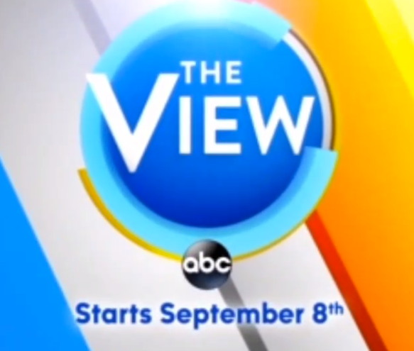
‘The View’ circles around its angles
Weekly insights on the technology, production and business decisions shaping media and broadcast. Free to access. Independent coverage. Unsubscribe anytime.
For a new season and another reboot of “The View,” the show seems to be shaking things up a bit visually.
While the show’s logo has been a circle since the debut of last season (albeit changing slightly several times), the graphics package has retained its angled look. Those angled, wedge shaped blocks of color draw heavily from the shape of the letter “V” in the show’s logo, which is a longtime part of the daytime talker’s look and feel.
However, if the promos for the new season are to be believed, it looks like ABC is adding some additional circular elements to the show’s graphics.
In the promos, various circle and ring-shaped segments are used, mainly rotating around the logo.
The promos also seem to hint at a slightly flatter and perhaps a bit less vibrant look as well as a move toward using a single, repeating right-to-left leaning angle in backgrounds, rather than the two sets of outward leaning angled elements.
[field name=iframe]

tags
ABC, ABC Studios NYC, Branding, graphic design, logo, Studio TV1, The View
categories
Featured, Graphics, MoGraph, Networks