
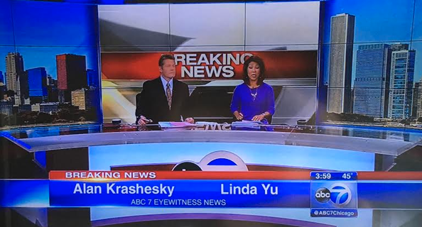
First at 4: ‘Reakin News’
Weekly insights on the technology, production and business decisions shaping media and broadcast. Free to access. Independent coverage. Unsubscribe anytime.
As it continues to break in its new set, Chicago ABC O&O WLS-TV provided a good reminder of how on-set motion graphics should carefully designed and tested before use.
At the top of WLS-TV’s 4 p.m. newscast on Friday, anchors Linda Yu and Alan Krishevsky kicked off with breaking news.
The station, which debuted a new set a little over a week ago that boasts a huge video array behind the anchor desk, decided to drive home the fact it was in “breaking news mode” by putting its breaking news title card up behind the anchors.
A hallmark of the new set is how the station, rather effectively, uses the video wall not only for a changing cityscape image, but also overlays graphics and video over it in floating blue and silver frames.
The problem with this use, however — the anchors’ heads covered two key letters in the graphic, making it appear to read “REAKIN NEWS.”
Did viewers still understand what was going on? Sure. However, the framing of the graphic looked odd and detracted what was, overall, an effective way to enhance the station’s storytelling.
On its previous set, WLS-TV had a bad habit of framing anchors directly in front of the on-set flat panels with the “Eyewitness News” logo dead center — meaning the anchor’s head covered most of it.
Of course, WLS-TV is hardly alone in making this small yet significant slip up — so it’s a good time for a helpful reminder to consider how graphics will be framed in all possible applications — and test them as well. “Reakin News” turned out to be an innocent mistake, but you never know how another combination of letters could end up reading.


tags
Alan Krishevsky, Blooper, Bloopers, Chicago, linda yu, news bloopers, wls
categories
Featured, Graphics, Local News, MoGraph