’60 Minutes’ Australia debuts new look with brighter version of familiar stopwatch

Subscribe to NCS for the latest news, project case studies and product announcements in broadcast technology, creative design and engineering delivered to your inbox.
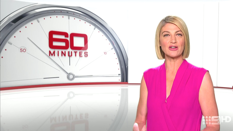
The Australian version of CBS News newsmagazine “60 Minutes” debuted a new look Monday that draws inspiration from its American counterpart but with a fresh, brighter spin.

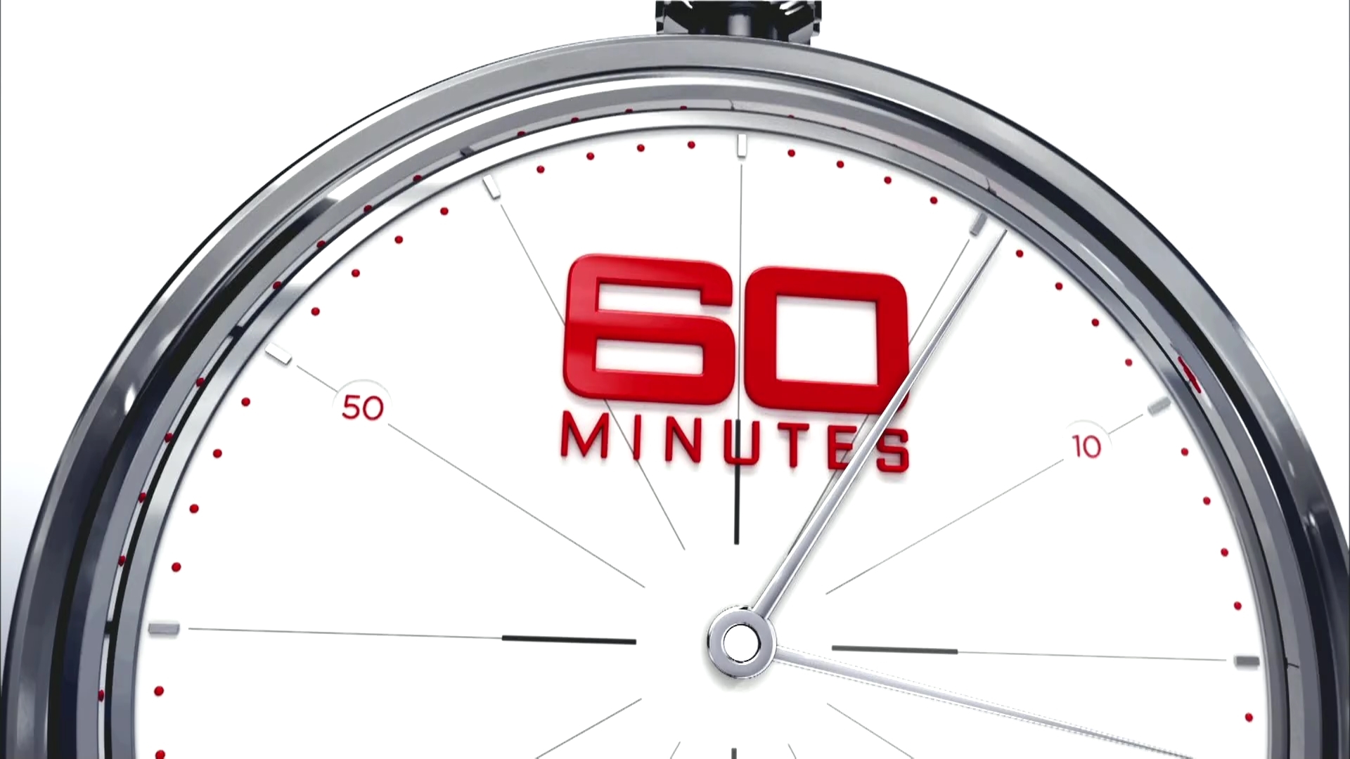
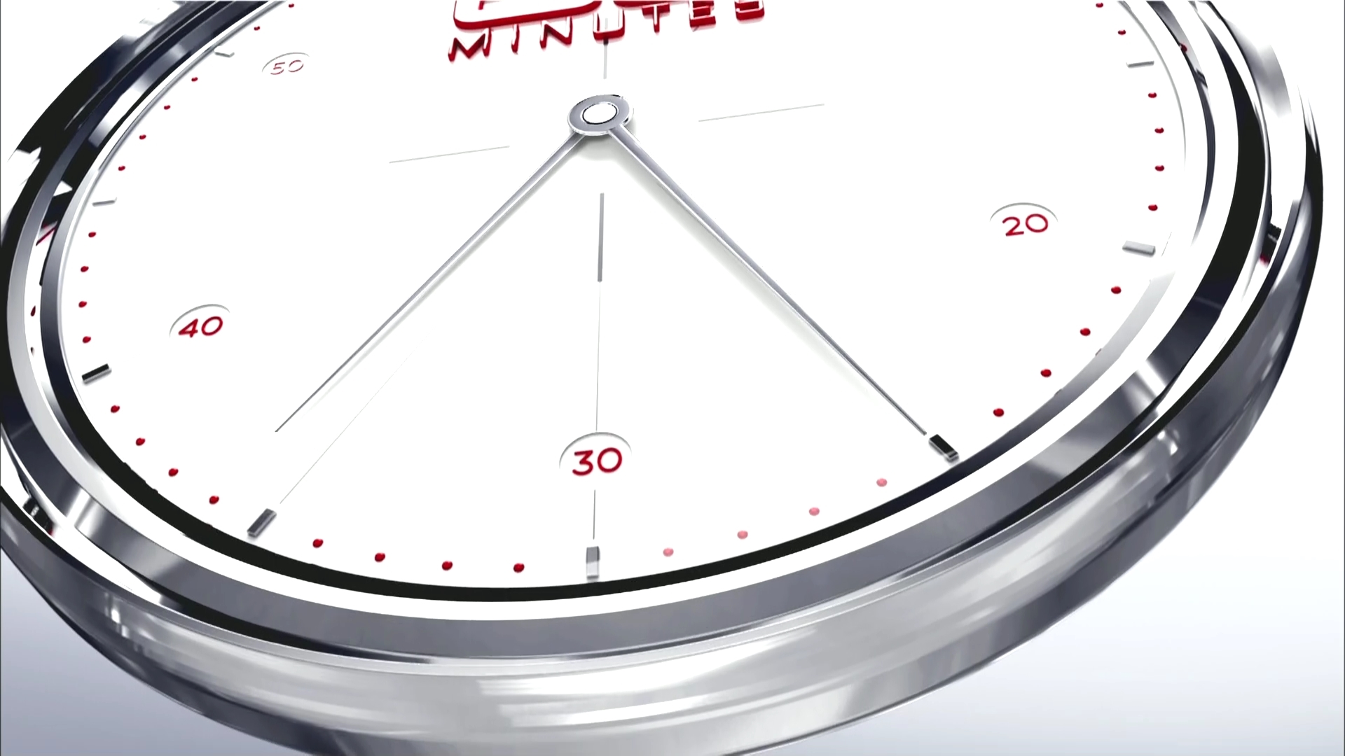
Like the U.S. version, this Nine show makes heavy use of a 3D rendering of a stopwatch as its primary graphical element. However, unlike the American version, much less emphasis is put on the darker shades of gray and red, with the design instead favoring clean whites and silvers.

The design, from DD8, results in a sharp, clean look that’s a fresh take on the American design, though the typography does remain white and very similar to CBS’s version.
The show also uses extreme angles and enlarged versions of the stopwatch throughout its graphics, including placing the dial in an almost sunrise-style arrangement.

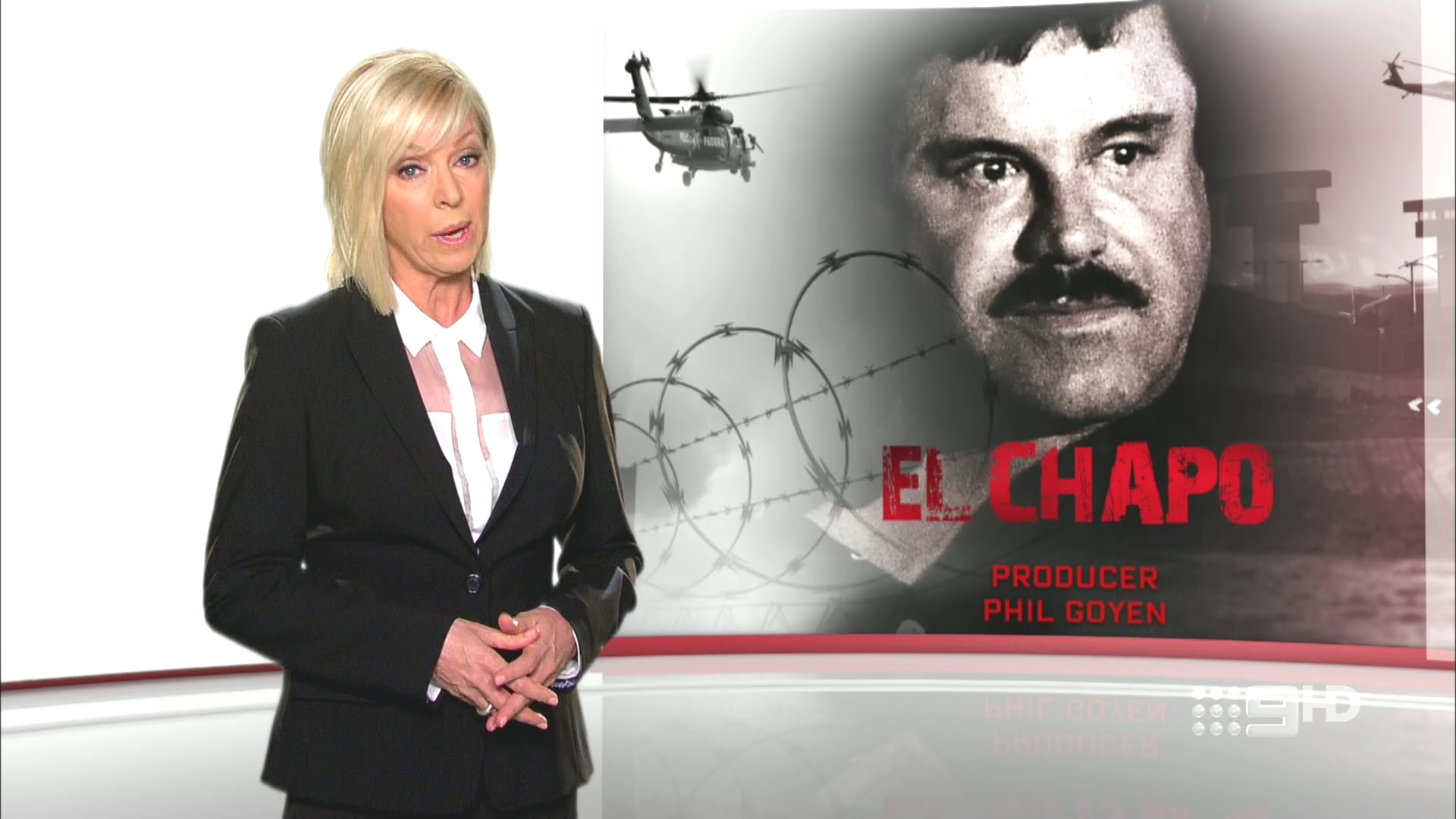
In addition to the new graphics, the show also updated the chroma keyed graphics behind correspondents to mirror the brighter look. It’s also worth noting that the graphics don’t use the literal interpretation of a magazine spread like in the U.S. — instead using a look that appears to be a gently curved glass-like panel.
H/T MediaSpy for the screenshots
Subscribe to NCS for the latest news, project case studies and product announcements in broadcast technology, creative design and engineering delivered to your inbox.


tags
60 Minutes, 60 Minutes Australia, CBS News, DD8, Nine
categories
Broadcast Design, Heroes, Networks, TV News Graphics Design, TV News Graphics Package, TV News Virtual Set Design, Virtual Sets