NYC ABC rolls out flatter graphics

Subscribe to NCS for the latest news, project case studies and product announcements in broadcast technology, creative design and engineering delivered to your inbox.
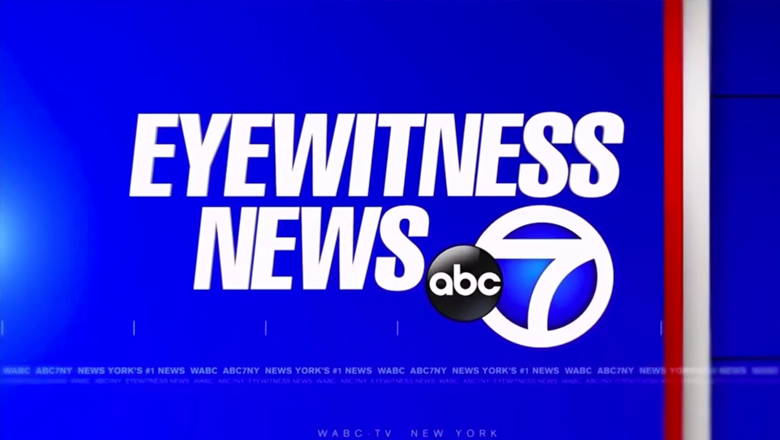
WABC-TV, the flagship ABC O&O in New York City, has debuted a new graphics package that follows the flatter trend that’s working its way into TV news graphics.
The new look keeps the station’s bold blue and red color scheme and logotype, but uses a motif of animated and “unfolding” bars, a rectangular grid backdrop and subtle hash mark accents.
Overall, the new look is flatter than the traditional news graphic look, though there are still instances of extruded letters that fly on and off screen and blending in the bars.


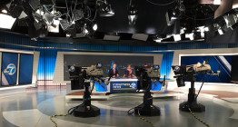
In the opens, bright blue backgrounds with black grid lines that tie in to the station’s on-set video walls provided a unique and cohesive look. The package is also accented with thin, widely spaced hashmarks and an occasional burst of light.
Large typography in clean white lower thirds make the package easy to read both on television screens and mobile devices alike — which could be a key advantage to this look.

WABC-TV’s sister station, KABC-TV in Los Angeles, also updated its graphics along with its set in November.
Though both packages feature the same general strategy of a flatter look, the overall designs are drastically different — with WABC-TV’s following the station’s bolder look and feel and KABC-TV using a blue and gold color scheme.
Subscribe to NCS for the latest news, project case studies and product announcements in broadcast technology, creative design and engineering delivered to your inbox.


tags
ABC, ABC O&O, kabc, kabc-tv, New York City, wabc, wabc-tv
categories
Branding, Broadcast Design, Graphics, Heroes, TV News Graphics Design, TV News Graphics Package, TV News Motion Graphics Design