
Richmond ABC loses distinct logo, gets new graphics
Weekly insights on the technology, production and business decisions shaping media and broadcast. Free to access. Independent coverage. Unsubscribe anytime.
In addition to a complete set overhaul, Richmond’s WRIC-TV debuted a new logo and new graphics package.
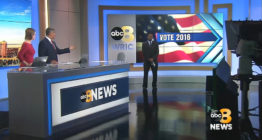
The most prominent change is the station ditching its iconic helix-like logo that NewscastStudio spotlighted in September. Out is the unique, twisted “8” figure and in is a gold, chunky number.
![]()
While there’s nothing wrong with the logo per se, it’s certainly not as noteworthy or distinct as the previous look.
Besides being somewhat bland and generic, the new WRIC-TV logo isn’t all that well refined — for example, going in curves in the “8” could have been drawn to better match the circular shape of the ABC globe, which is parked next to the number.
The logo designers did, however, adjust the strokes in the letter “E” of “News” to include three slanted ends on the right side of the three “arms” on the right side, which match the angle found in the “W” next to it.

Graphically, the station went with a graphic package that first debuted on KOIN-TV in 2014.

The idea of angles is found in WRIC-TV’s overhauled graphics package, drawing on an angular, arrow-like look that manages to mix a flatter motif effectively with beveled edges and deep shadows.
In some places, the angles are used to create “windows” into local imagery, while in the OTS, template, they serve to connect the box with the corner of the screen.

The package’s blue, gold and white color scheme is carried throughout the package, including the weather graphics, which used more of a boxy layout than the angled elements.

WRIC-TV also switched news music, changing to “Guardian” by Stephen Arnold Music.

tags
koin, motion graphics, news music, Richmond, Stephen Arnold Music, WRIC
categories
Broadcast Design, Featured, Graphics, TV News Graphics Design, TV News Graphics Package, TV News Motion Graphics Design