
Readers pick notable Channel 13 logo designs
Weekly insights on the technology, production and business decisions shaping media and broadcast. Free to access. Independent coverage. Unsubscribe anytime.
Here are some of your picks for notable Channel 13 TV station logo designs:
WTVG
![]()
WTVG, the ABC affiliate in Toledo, Ohio, uses a similar look to KTRK in Houston and WHAM in Rochester, New York.

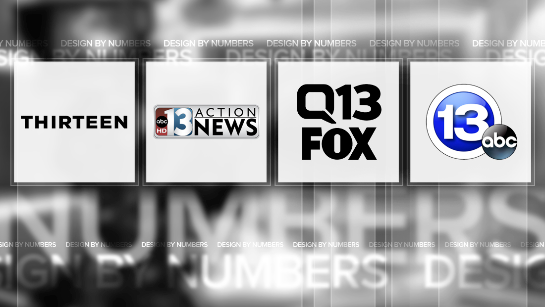
WNET
![]()
WNET, the PBS affiliate in New York City, has a unique Channel 13 logo in that, instead of numerals, it spells out the number “thirteen.”
The station currently uses an all caps version of the word that mirrors the look of the “PBS Newshour” logo. It previously used an all lowercase word with a red globe as the dot on the “i.” The curve of the circle is reflected in the top part of the “i.”
![]()
KTNV
![]()

KTNV, the ABC affiliate in Las Vegas, Nevada, uses a dual-toned logo that uses red on the left side of the “1” and blue around the “3.”
The logo is itself is encased in a rounded rectangle — a shape that is reflected in the lockup of the logo that appears with the “Action News” branding included, as shown here.
KCPQ
![]()
KCPQ, the Seattle Fox affiliate, has one of the more unique logos for a Fox station. The logo emphasizes the “Q” in the station’s call sign, which brands on air as “Q13.” The “Q” is a custom drawn icon that can be read as a speech bubble or TV screen.
The “3” in the “13,” meanwhile, echoes the curved corners of the boxy “Q.” If there’s one downside to this logo, however, it’s that the shapes of the letters, when placed atop the “Fox” logo, have slightly different thicknesses and styles.

tags
design by numbers, kcpq, ktnv, las vegas, logo design, New York City, seattle, Toledo, TV station logo design, wtvg
categories
Branding, Design By Numbers, Heroes, Local News