
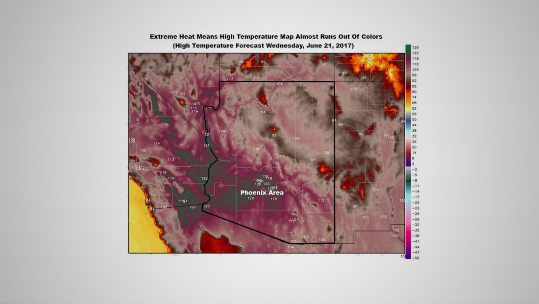
Meteorologists running out of colors to show high heat (again)
Weekly insights on the technology, production and business decisions shaping media and broadcast. Free to access. Independent coverage. Unsubscribe anytime.
It’s so hot in certain parts of the United States that weather maps are almost out of colors to show just how how it is.
Traditionally, the “cooler” colors are used, well, for cooler temperatures, while the “warmer” colors such as oranges, yellow and red are used for the higher end of the thermometer, reports Quartz.
That has caused maps in Arizona to revert to using violets and — inevitably, greens, to illustrate temps in the 120 degree range.
On the map, the colors go from violet to a muddy green-violet-gray shade. While this doesn’t quite make it into the green area of the spectrum mentioned, it certainly is on its way to being there.
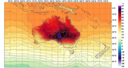
This isn’t the first time this has happened — back in 2013, Australian meteorologists had to jump to violets to illustrate temperatures reaching nearly 130 degrees Fahrenheit.

tags
maps, weather maps
categories
Featured, Graphics, TV News Weather Graphics, TV News Weather Graphics Systems, Weather