
Do not adjust your screen: ‘The Beat’ uses ‘glitches,’ distortion to create unique look
Weekly insights on the technology, production and business decisions shaping media and broadcast. Free to access. Independent coverage. Unsubscribe anytime.
MSNBC’s newest entry into its programming slate, “The Beat,” hosted by Ari Melber, uses a mix of strong squares and rectangles and video “glitch” and distortion effects to create a memorable look for the show.

As NewscastStudio previously reported, “The Beat,” which takes the place of Greta Van Susteren’s now canceled “For the Record,” at 6 p.m. eastern, uses a bold blue boxy logo with slightly jagged edges and an extruded flat shadow.
While the show’s graphics maintain that boxy look as a foundation, the graphics package features a handful of effects that make the imagery appear to be distorted or “glitchy.”
The result is, as shown in this example animation, is that “sections” or “splices” of the graphics become distorted for a few frames, giving the effect of distortion or jitteriness.

It’s worth noting how the design smartly connects the geometric properties of video glitch artifacts with the rectangular and boxy look found elsewhere in the package.
The jittery, glitch effect is also integrated into the corner video wallbehind Melber, who originates from Studio 4E in Rockefeller Center.


While the stylized and cutout New York City cityscape behind Melber does, much like the rest of the show’s graphics, feature smooth, floating blocks, the small iterations of the show’s logo itself occasionally “glitch” — a technique that not only draws attention to it but also could also make a viewer do a double-take, thinking the glitch is real.
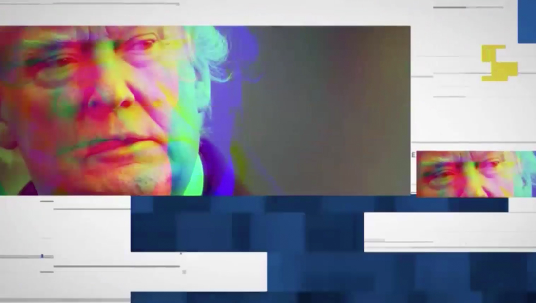
Viewers also see another distortion effect in the open and other graphics — a technique commonly known as an RGB split color — applied to certain imagery in a somewhat exaggerated fashion.

One use of this effect to the extreme is when it appears as a background for some of the show’s full screen graphics, including ones that serve as a base for pull quotes.
The result is a jarring effect that is certain to make viewers take a second look (or question if something is wrong with their signal).

The show’s lower third insert graphics, on the other hand, wisely go the direction of using the cleaner boxy shapes as a base so as not to distract from the information in the graphics.
In keeping with the overall motif of the package, however, the smaller boxes to the far left of the lower third bar to “blink” — those the overall effect is not quite as eye-catching as found elsewhere in the design.
Editor’s Note: An earlier version of this story incorrectly noted the show as using Studio 3A, it broadcasts from NBC Studio 4E.


tags
Ari Melber, MSNBC, Studio 4E, The Beat
categories
Branding, Broadcast Design, Broadcast Industry News, Cable News, Featured, Graphics, TV News Graphics Design, TV News Graphics Package, TV News Motion Graphics Design