
‘CBSN: On Assignment’ unique mix of ethereal, typography and first person storytelling
Weekly insights on the technology, production and business decisions shaping media and broadcast. Free to access. Independent coverage. Unsubscribe anytime.
“CBSN: On Assignment” dropped its first edition Monday, July 31, 2017 with a look and feel that’s not quite like anything else on TV — streaming services or otherwise.
The show, which airs on CBS News‘ OTT service CBSN, was announced in June as a limited primetime series.
The name of the new show, sans the network name, is identical to the name NBC used for a limited series last summer — and resurrected this summer.
The show itself uses a simple, straightforward storytelling approach that’s no dissimilar to “60 Minutes” or “CBS Sunday Morning” — which a slower pace, emphasis on natural sound and longer form interviews.
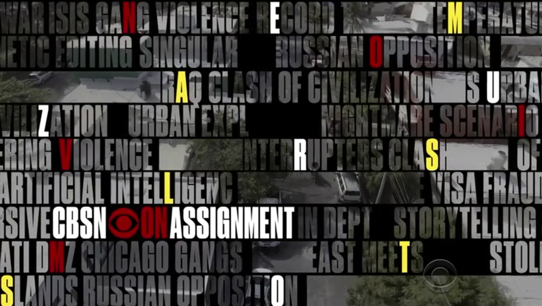
The show forgoes any anchor introductions, instead relying on a typographic collage to introduce each story and give a bit of context before diving into the package.
![]()
These story intros start with a full screen of text, rendered in a condensed sans serif used by “CBS Evening News,” with the letters themselves allowing B-roll video to “shine” through. The words, though they are related to the story at hand, appear randomly placed, until letters become white and the collage of text gradually disappears, making the sentences readable.


This same typographic effect is used in the show open, which used a variety of words related to the content of the upcoming show that flash across screen.
Most letters are “transparent,” allowing imagery to show through, while some are colored red or yellow. In some cases, the letters and added rectangular masks allow differing imagery to peek through over the larger, full screen video.

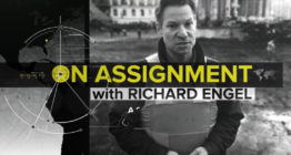
The show’s logo, meanwhile, uses matching typography placed inside a rectangle with a rounded lower right corner.
In the debut episode, video of “fist bump” was used as a hard cut to start the open — with the CBS eye followed by a blinking cursor appearing briefly before the bulk of the open begins.
![]()
Another element used to separate stories are “rejoins” that include a rendering of the show logo into B-roll footage from the story — for example, the logo “floats” alongside a road, with passing vehicles uses to create a wipe effect that makes the logo appear and then disappear.

Other graphical elements include simple, type-only titles in the lower left corner for the show’s teases, while a monospaced typeface is used for “coming up” banners.

The pace of the kinetic typography, meanwhile, manages to be both fast paced and smooth, especially when it’s matched to the ethereal theme music that starts out with slow, pulsing beats before blending to a smoother, faster paced tempo.
Audio and sound are also used effectively throughout the show itself, with reporters appearing on camera pondering the story they are covering. Though the show hardly eschews traditional voiceovers for the bulk of the packages, these interludes from the reporters add a personal, first person touch to the show.


tags
60 Minutes, CBS Evening News, CBS News, CBS Sunday Morning, CBSN, CBSN: On Assignment
categories
Broadcast Design, Featured, Graphics, Heroes, Online and Digital Production, TV News Graphics Design