Sky News updates ‘Sunrise’ design with subtle arcs

Subscribe to NCS for the latest news, project case studies and product announcements in broadcast technology, creative design and engineering delivered to your inbox.
Sky News has rolled out a refreshed look for its morning news program, “Sunrise.”
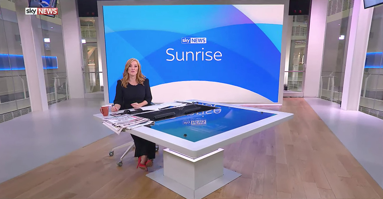
The motion design, from Sky’s in-house creative design team, uses a series of overlapping blue arcs to give the program a gentle look with a nod to the morning sun, avoiding the TV cliches of orange and yellow in morning news.

The arcs use subtle gradients combined with opacity effects to create layering and depth for the package, which is paired with the network’s standard insert graphics.

The Studio 21 video wall also uses the arcs to tee up stories, creating a frame for video or imagery with a safe zone from the arcs for presenter Sarah-Jane Mee to appear.
Around the Sky Central building lobby, the various backlit areas have been colored red and blue for the morning news show with plenty of bright lighting.
Subscribe to NCS for the latest news, project case studies and product announcements in broadcast technology, creative design and engineering delivered to your inbox.


tags
glass box, london, Sky Central, Sky News, studio 21, sunrise, United Kingdom
categories
Broadcast Design, Cable News, Featured, Graphics, TV News Graphics Design, TV News Graphics Package