
Exclusive: Fox News expected to launch updated logo, lower thirds
Subscribe to NCS for the latest news, project case studies and product announcements in broadcast technology, creative design and engineering delivered to your inbox.
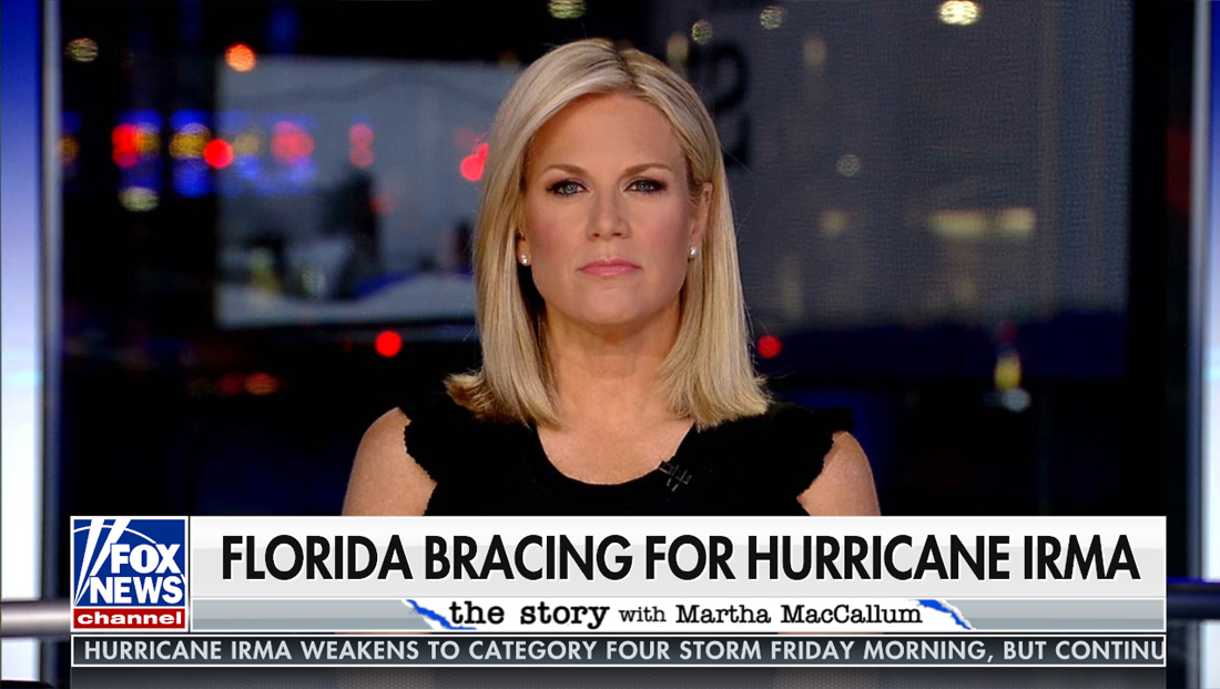
Fox News is expected to launch a new channel logo and ticker as well as lower-thirds and bug tomorrow morning beginning with “Fox & Friends First” (update: the new look has gone live).

As the network prepares to launch an overhaul to the look it launched about a year ago, NewscastStudio spoke with senior creative director Agostino Amato.
According to Amato, the main goals for the redesign include:
- Updating the lower-third with a clean, streamlined and cohesive design that elevates the overall look and brings the network to the next level.
- Incorporating an updated logo to reinforce brand identity.
- Engaging the viewer by making it easier for them to receive information with graphics that naturally guide the eye without overwhelming.
- Optimizing screen space by efficiently using every bit of the lower-third space.
- Presenting information in an intuitive and organized way.
- Creating uniformity to strengthen the brand that can be carried out throughout all the platforms from broadcast to digital.
How the look has evolved
“In conjunction with the upcoming launch of the state-of-the-art newsroom, we are committed to creating a graphics look that reflects the direction of the network and that incorporates the newest ideas. With that in mind, we have evolved the look, first in its modernization and then in its cohesiveness,” Amato told NewscastStudio.

“What we aimed to do was simply update the overall look with a sleek and sophisticated design that can easily translate across all platforms: Fox News Channel, Fox Business Network and Fox Digital. One way we have done that is by discarding the idea of filling the screen with multiple elements that take up too much space. Instead, we’ve eliminated the clutter, opened up the screen space and maximized the real estate allocated to the lower third of the screen. We’ve implemented a more understated approach that doesn’t allow for the graphics to distract from the content while adding a more dynamic functionality.”
How the graphics enhance storytelling
“Guided by the old adage, less is more, we came up with a look that puts the emphasis on the content. Its clean and minimalist style allows us to convey information to the viewer in such a way that the viewer is able to receive it without the distraction of an overly-cluttered lower third of the screen. Simply put, making the information on the screen easy to read so that it’s easy to digest,” said Amato.
“We successfully maximized the lower-third real estate while keeping the numerous amount of information compact and organized without obstructing other components on the screen — which includes a promo bug and video box function that squeezes in on the right side and keeps it in that lower third region whenever needed instead of sitting above the banner as it did before.”
Some of the changes you’ll see, according to Amato, are:
- Squared off both sides of the lower third to allow for video to show through on the left and the right to give it a more open feel
- Scaled down the crawl, aligned it with the banner and sits on a slightly transparent neutral veil
- Simplified the textures by removing digital noise such as unnecessary effects and flashes
- Added more dynamic font change effects
- Aligned everything within the lower third region
“Additionally, we designed the look in such a way that it translates well across both broadcast and digital platforms, further stitching together all the Fox entities as one brand,” said Amato.
Why the bug was changed
“The logo represents the brand. As such, it was important to change the bug with a fresh, contemporary version representative of where the network is headed. We chose to go with a flat version of the logo for the bug as opposed to the cube to give it a contemporary feel. While the cube logo worked in the past, it was time for a more current look that reads better, is cleaner and works across all platforms including mobile and digital,” said Amato.
“For added value, the logo bug contains a sleek intro and outro animation that draws the eye to it when it comes in and out of any commercial break. Also “network” will continue to revolve with “clock” and “live” within the red bar of the logo,” Amato explained.
Why guest names were moved
In the new package, guests’ names are being relocated above the story banners — whereas they had resided just below them.
“Always keeping the viewer in mind, placing the guest name at the top was a logical move in that it doesn’t require the viewer to look for it among the rest of the information. This way, the viewer gets the info they need without taking their attention away from the interview. In essence, what we’ve done is set a hierarchy for the information. Each element is given a level of importance that directs how you want the information to be read,” said Amato.
“Having a guest’s name below the topic banner may, in some instances, cause confusion for the viewer — it can be unclear who that particular font is referring to. For example, if a banner says ‘Terrorist Captured in Spain’ and the guest’s name is underneath that, it may not be immediately clear if the name is that of the guest or that of the terrorist. It didn’t make sense to me why a guest’s name would be tucked underneath a topic banner that may or may not be relevant to what the guest is saying. It felt like a visual disconnect. So the goal was to simply take the guess work out for the viewer. The viewer shouldn’t have to work so hard. Moving the name up eliminates that but still engages the viewer.”
Subscribe to NCS for the latest news, project case studies and product announcements in broadcast technology, creative design and engineering delivered to your inbox.

tags
Agostino Amato, Fox News, logo design
categories
Branding, Broadcast Design, Cable News, Exclusives, Graphics, Heroes, TV News Graphics Design, TV News Graphics Package, TV News Motion Graphics Design