Fox News does the ‘vertical slide’ with new graphics

Subscribe to NCS for the latest news, project case studies and product announcements in broadcast technology, creative design and engineering delivered to your inbox.
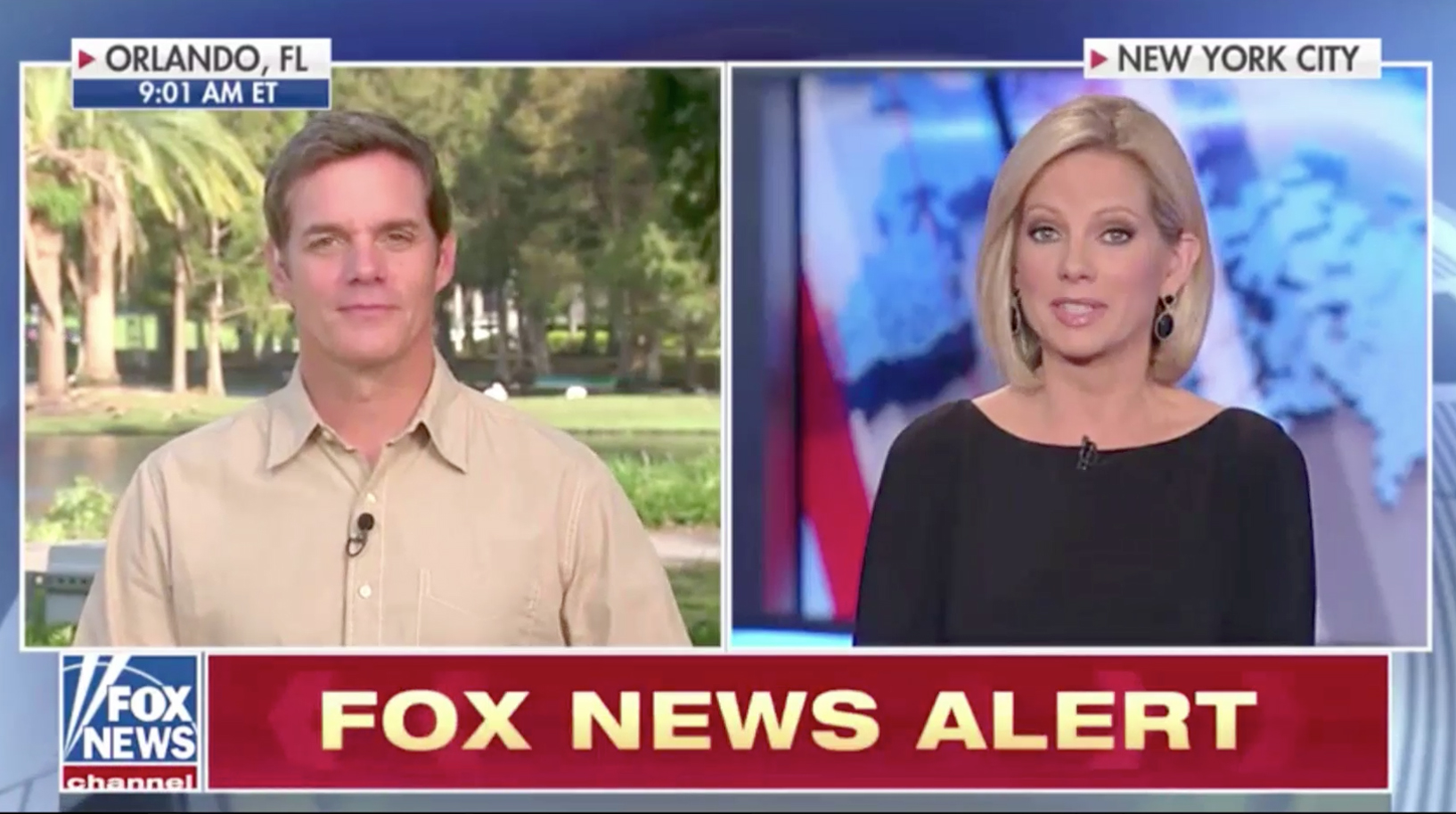
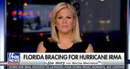
As first reported by NewscastStudio Monday, Fox News Channel rolled out new graphics Tuesday, Sept. 12, 2017 that included a revamped bug and elements that making have use of vertical animation.
The network notably dropped its signature rotating cube bug that had been used for years in favor of a flat design with white border.
The main portion of the logo is no longer animated, except when returning from commercial breaks, though the red bar below is used to display the word “Channel,” the time in various time zones and the “live” bug.
These elements “slide” up and down in a continuing loop during programming.
When returning from breaks, the logo begins as simple angled lines that quickly meld into the searchlights in the logo, while the rest of the logo zooms and fades into view before settling in its spot to the lower left of the screen.
“The logo represents the brand. As such, it was important to change the bug with a fresh, contemporary version representative of where the network is headed. We chose to go with a flat version of the logo for the bug as opposed to the cube to give it a contemporary feel,” Fox News senior creative director Agostino Amato told NewscastStudio.


While the side-to-side animation effect still appears, quite naturally, in the ticker, most of the rest of the new look’s animations are shifted in, quite literally, a new direction.
In the new look, the network uses vertical “up and down” animations to add content on top of and under the story banners, as well as reveal or hide the ticker and other on-screen elements.
For the most part, text contained in the banners does not animate, instead transitioning quickly when one of the vertical effects is triggered.
During morning hours, until 9 a.m. eastern, the ticker extends across the entire screen, tucked under all of the other graphics.


However, during dayside programming, the ticker is dropped, but a similar so-called “Fox Plus” element appears to under the banner but moved over to the right of the base of the logo bug.
This space can be used to display alerts, quotes and facts, as well as headlines similar to the ticker layout, typically with an identifying box to the left.
The result is a sometimes uneven height between the bug and the banner to the right.
The ticker returns from 3 to 4 p.m., with an added stock market element added, and from 4 p.m. to 5 a.m. the next morning.


The tickers themselves have a variety of layouts, ranging from traditional headlines to segmented weather, stock market or sports scores information.
Below the insert graphics, whether a ticker is used or not, is a semi-transparent dark overlay that extends to the bottom of the screen.


Meanwhile, skinny boxes for guest or VSOT names now “pop up” above the banners — instead of below like in the old look.
“Always keeping the viewer in mind, placing the guest name at the top was a logical move in that it doesn’t require the viewer to look for it among the rest of the information. This way, the viewer gets the info they need without taking their attention away from the interview. In essence, what we’ve done is set a hierarchy for the information,” explained Amato.
One element that did remain, however, is the use of what the network calls “slivers” — the short, long branded graphics that contain either the show name or labels such as “Fox News Alert,” which is almost always visible on screen.


The banner can also shrink in width to accommodate an additional graphic to the right, such as a phoner identifier, video windows and promos.
Alliteratively, video windows or promos can also perch atop the far right of the lower third bar — as can labels such as “moments ago.”


Unique layouts are also available for host names, with their first and last names each sitting on a separate line and social media accounts in a bar below.


Correspondents, meanwhile, typically get a full width, single line lower third.
Subscribe to NCS for the latest news, project case studies and product announcements in broadcast technology, creative design and engineering delivered to your inbox.


tags
Agostino Amato, Bugs, Fox News, lower thirds
categories
Branding, Broadcast Design, Cable News, Graphics, Heroes, TV News Graphics Design, TV News Graphics Package, TV News Motion Graphics Design