CBC breaks the traditional broadcast design mold with new ‘National’
Subscribe to NCS for the latest news, project case studies and product announcements in broadcast technology, creative design and engineering delivered to your inbox.
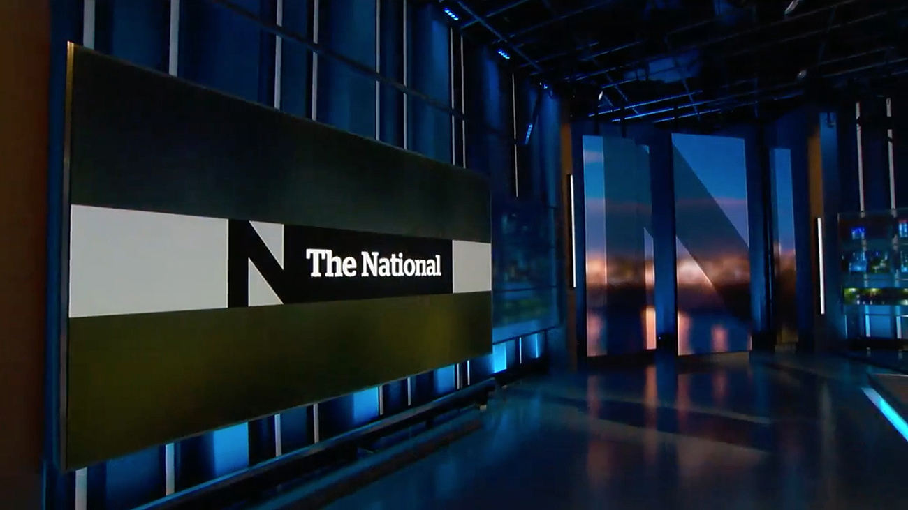
A Look Driven by Stories
Graphically, the show has completely redeveloped its branding, with outside guidance from Ove Brand | Design, a Publicis company.


The refreshed motion design of “The National” is daring, breaking many standard, longheld broadcast norms. The look is minimal, staying away from flash and relying on imagery from the show’s stories as well as clear typography and monochromatic bars.
Even the lower-third has been reimagined, becoming a left-third that appears mid-screen.
For the show, 3 extra Vizrt Viz Engines were added to bring the total to 5, powering the graphics and video walls.

The graphics rely heavily on Gaussian-blurred images to create subtle backgrounds for text and infographics, along with punchy transitions and short audio cues to begin stories and sound bites. New theme music also debuted with the revamp.

A Broadcast for All Platforms
The producers of the show are very upfront in noting the change is about attracting a new audience and creating a newscast for the next generation, a show that works across platforms and devices.
Each edition of “The National” is broadcast on air and online, across a variety of services. The new design is developed to work across them, with readability appearing to be a key focus, along with translatability.

Overall, the relaunch positions the program along a new path in an age of rapid change for broadcasters, as many seek out new audiences.
Subscribe to NCS for the latest news, project case studies and product announcements in broadcast technology, creative design and engineering delivered to your inbox.

tags
Adrienne Arsenault, Andrew Chang, Canada, CBC, CBC News, Ian Hanomansing, Rosemary Barton, studio d, The National, toronto
categories
Branding, Broadcast Design, Graphics, Heroes, International Set Design, Networks, Set Design, TV News Graphics Design, TV News Graphics Package, TV News Motion Graphics Design