Raycom Media gets new logo

Weekly insights on the technology, production and business decisions shaping media and broadcast. Free to access. Independent coverage. Unsubscribe anytime.
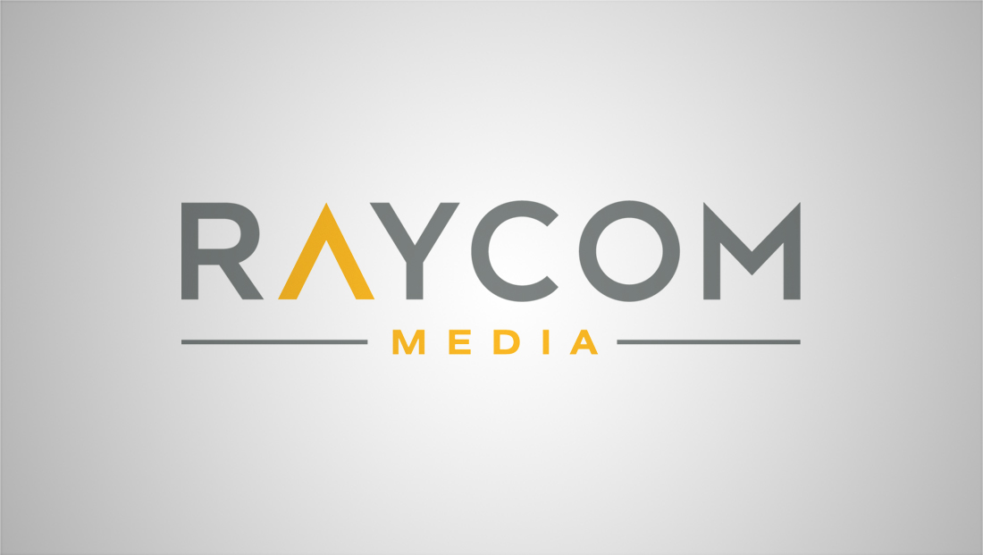
Raycom Media, which owns 65 television stations in the United States, officially unveiled its new logo design and branding during the 4th Annual Raycom Media Camellia Bowl Saturday, Dec. 16.
The company’s previous look featured clunky blue lettering intersected with a horizontal line with a red underline that becomes part of the word “Media,” which was rendered in a brush script-style font.

In the new logo, dark gray lettering with a gold accent color is used on the glyph representing the “A” and the entire word “Media.”
The “A” in the company’s name is essentially an upside down “V,” with the typical crossbar in the first letter of the alphabet removed.

In addition, the wide “M” with eye-catching points at the top of either side is distinctive, though, interestingly, the “R” is fairly simple and unremarkable.
This is particularly notable because not only does the company’s name obviously start with an “R,” but the blue “R” from the old logo was often used for icon uses, such as on the company’s website favicon.
Under the new branding, the “A” glyph is used instead in most icon-based uses.
The distinctive “A” icon could be read as a mountain, upward arrow or even an antenna tower, though there’s certainly a lot of room for interpretation here. The “pointed” shape also mirrors the “tips” of the “M.”
While the new logo is certainly a welcome improvement to the dated look of the old logo, the new design isn’t particularly memorable and also fails to take advantage of the company’s familiar “R” icon or really communicate what the company is all about.
In addition to the new logo, Raycom also updated its corporate website:


tags
raycom media
categories
Branding, Broadcast Industry News, Heroes