CBS applies sports branding to new streaming service

Subscribe to NCS for the latest news, project case studies and product announcements in broadcast technology, creative design and engineering delivered to your inbox.
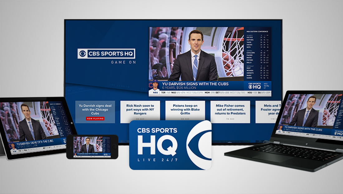
CBS’s new sports streaming service, dubbed CBS Sports HQ, is leveraging its parent brand’s look and feel for its logo design.
CBS launches a 24/7 streaming sports news network, CBS Sports HQ https://t.co/Bt38T0Dijk #TVNews pic.twitter.com/v8XMWT7PVm
— TVNewsMix (@TVNewsMix) February 26, 2018
The network, which switched to a boxy, simplified logo lockup in 2015, has applied this look to its new service.
Since launching, the logo did become flatter, losing its gradients and also developed offshoot versions for the variety of sports and events CBS Sports covers.
The main version of the logo features the word “HQ” tacked on inside the box housing the words “CBS” in the same clear typography.
However, since the service requires an icon-friendly layout and the main lockup is a bit wide, there is also a stacked version that features “CBS Sports” in small letters and “HQ” in much larger letters below.
In many applications, the words “Live 24/7” is also in small, generously spaced type below.
The GUI and graphics package for the new service are heavily tied into the logo look as well, with bold blue and whites in a simple, flat look.
Subscribe to NCS for the latest news, project case studies and product announcements in broadcast technology, creative design and engineering delivered to your inbox.


tags
CBS, CBS Sports, CBS Sports HQ, logo design
categories
Branding, Broadcast Design, Broadcast Industry News, Featured, Graphics, Sports Broadcasting & Production