‘Anderson Cooper Full Circle’ takes a new view on traditional news graphics
Subscribe to NCS for the latest news, project case studies and product announcements in broadcast technology, creative design and engineering delivered to your inbox.
CNN debuted its first foray into exclusive programming for Facebook’s Watch platform — with “Anderson Cooper Full Circle” anchoring from Helsinki, Finland using touches that cater to a mobile audience — with a strong preference to diving the screen into two stacked boxes and placing graphics in the middle.
Like NBC News’ “Stay Tuned,” the twice-daily show it produces for Snapchat, the show is designed for a vertical screen orientation.
Instagram’s IGTV uses vertical first approach as well.
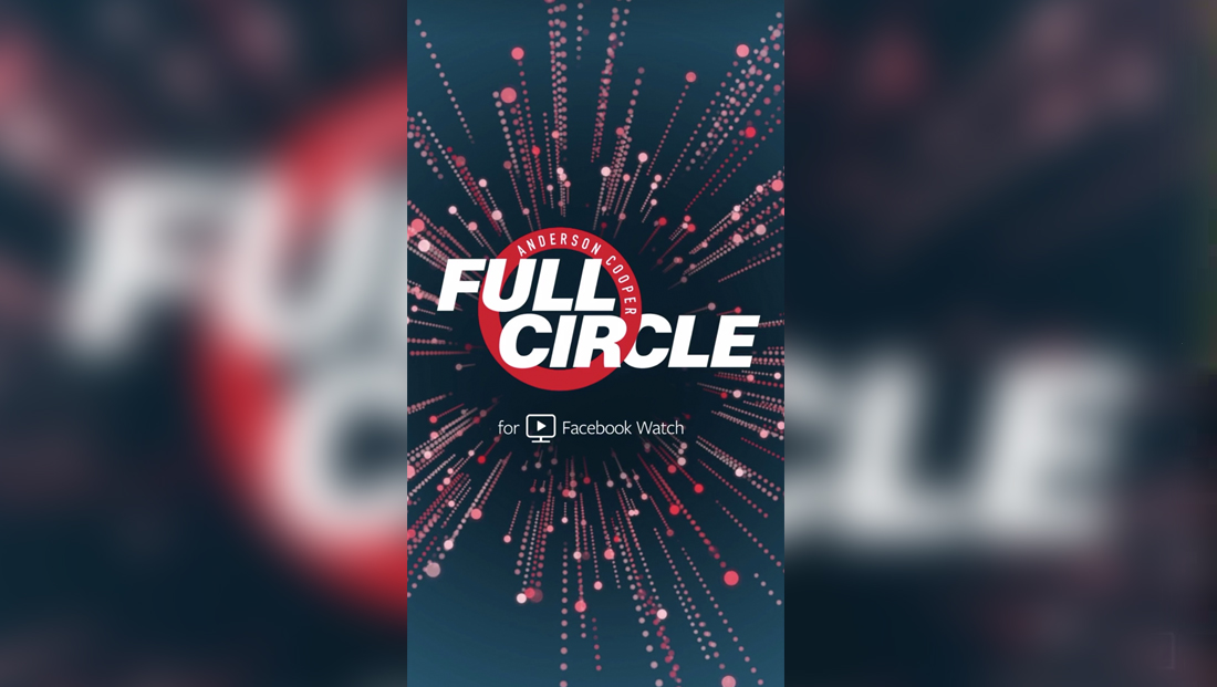
At the top of the show, the previously released show logo appears on screen surrounded by a dark background and series of blurred red-toned dots arranged in a radial pattern jutting out from the center of the logo.
The title slide also includes the Facebook Watch logo below.
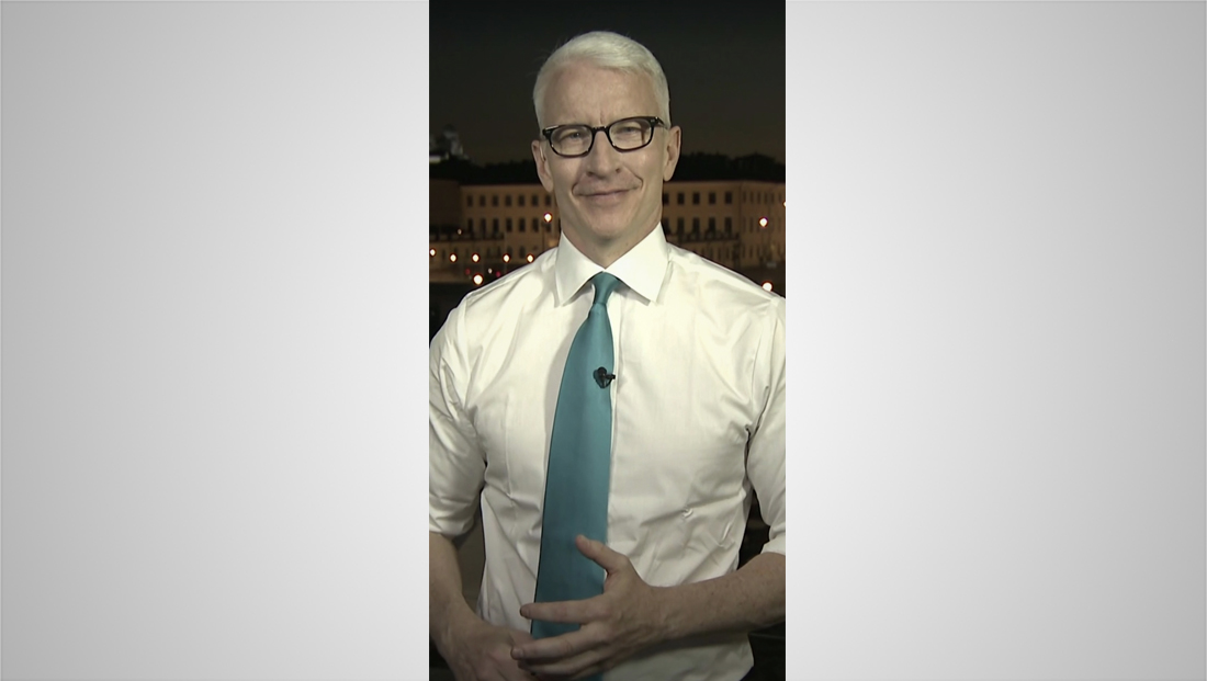
Cooper then appears on screen, with the shot framed to feature him from the waist up, reporting from CNN’s live shot location in Helsinki (the show originated from a small set in New York City the following day).
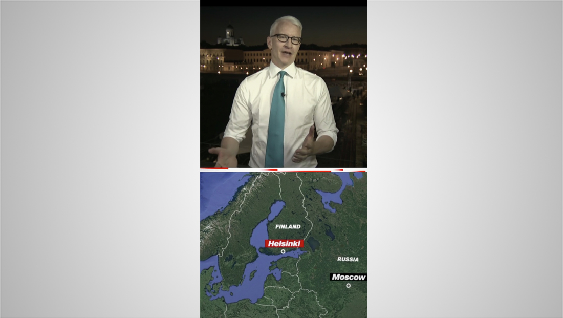

The show also makes use of split screens, such as dividing the screen between a now square-shaped shot of Cooper and a map showing his location.
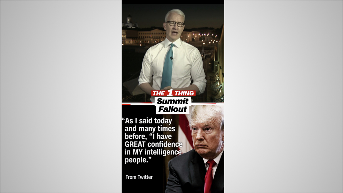
A similar layout is also used to showcase quotes and other graphics while keeping Cooper on screen. The horizontal bar separating the two panes can also be used to include a topical graphic, such as “The 1 Thing” tagline shown here.
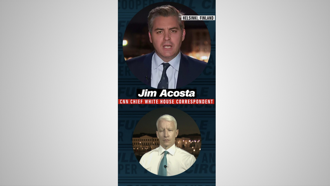
This approach is also used for double boxes — which, in this case, become circular shapes. In these cases, a lower-third style identifier can be inserted in middle of the vertical space.
During these live interviews, the person speaking is generally placed at the top of the screen, with the bubbles swapping places in a look reminiscent of looks used in live video conferencing.
![]()
Additional graphics are parked in the middle of the screen even when Cooper’s image is shown at full screen height, such as the topical “Full Circle Interview” logo.
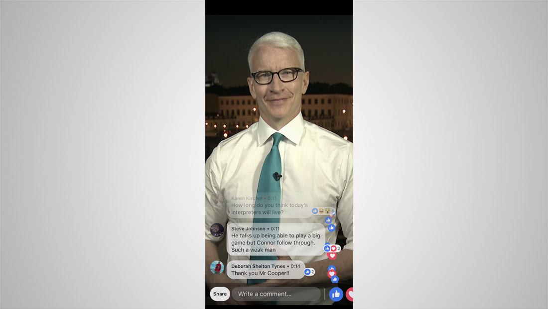
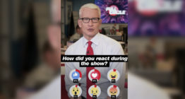
The challenge of designing for Facebook Watch — in addition to using the somewhat unfamiliar vertical canvas — is that, for many viewers, the lower half of the screen is partially covered by a transparent stream of comment bubbles and reaction icons.
All but one of the screenshots shown above show Facebook Watch’s “quiet” mode that hides this stream.
With the comment and reaction stream on, it’s easier to understand why CNN is trying to focus on the upper portion of the screen, including by using the centered logos.

However, it inevitably has to use the bottom portion of the screen for something — which, for viewers not using quiet mode, could result in a cluttered look when maps, quotes and other graphics are shown in the lower part.
Subscribe to NCS for the latest news, project case studies and product announcements in broadcast technology, creative design and engineering delivered to your inbox.

tags
Anderson Cooper, Anderson Cooper Full Circle, CNN, Facebook, Facebook Watch, Trump Putin Helsinki Summit
categories
Branding, Broadcast Design, Broadcast Industry News, Cable News, Heroes, Online and Digital Production