
Eurosport emphasizes texture, distance in Tour de France design
Weekly insights on the technology, production and business decisions shaping media and broadcast. Free to access. Independent coverage. Unsubscribe anytime.
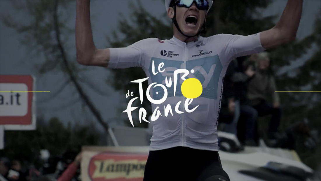
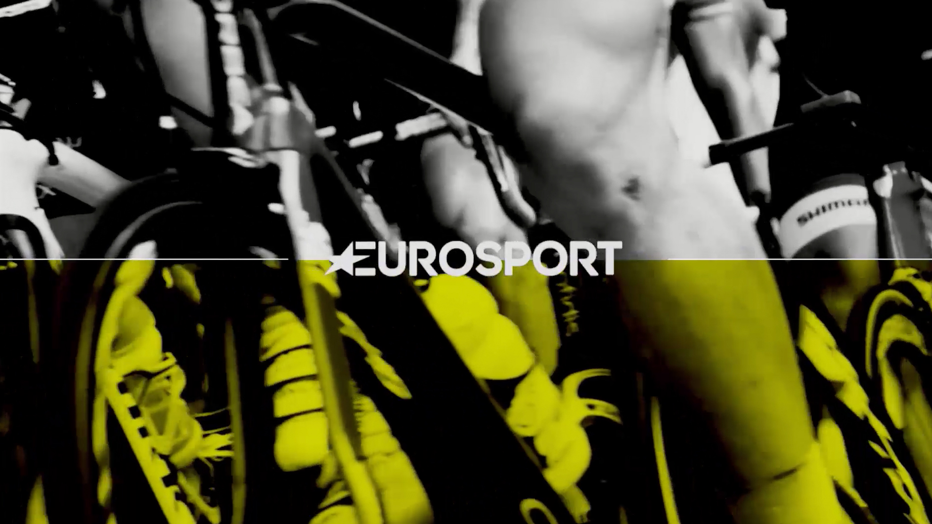
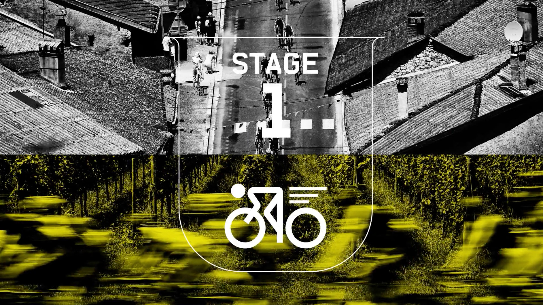
Eurosport’s look for its Tour de France coverage is packed with bold imagery, texture and custom typography.
The look, designed by DixonBaxi, includes a custom font with a texture meant to mirror the feel of hand-drawn fan signs and the roughness of pavement.
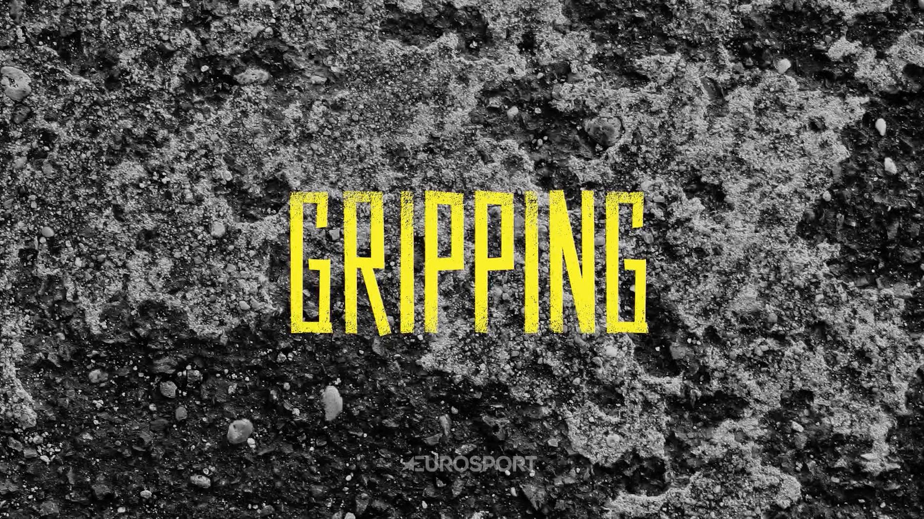
An additional custom font with clean, bold strokes is used in the motion graphics package DixonBaxi developed.
“With cycling such a visually stimulating discipline, there was a wealth of imagery, photography, and experience that inspired the ‘Home of Cycling’ identity,” notes DixonBaxi in its case study of the project.
“From the passion of the fans with their vibrancy, energy and their vivid encouragement on the road; to the classic heritage of cycling, inspired by the badges and crests found on the bike frames; and of course the colors and designs of the race jerseys which have their own historical and contemporary associations.”
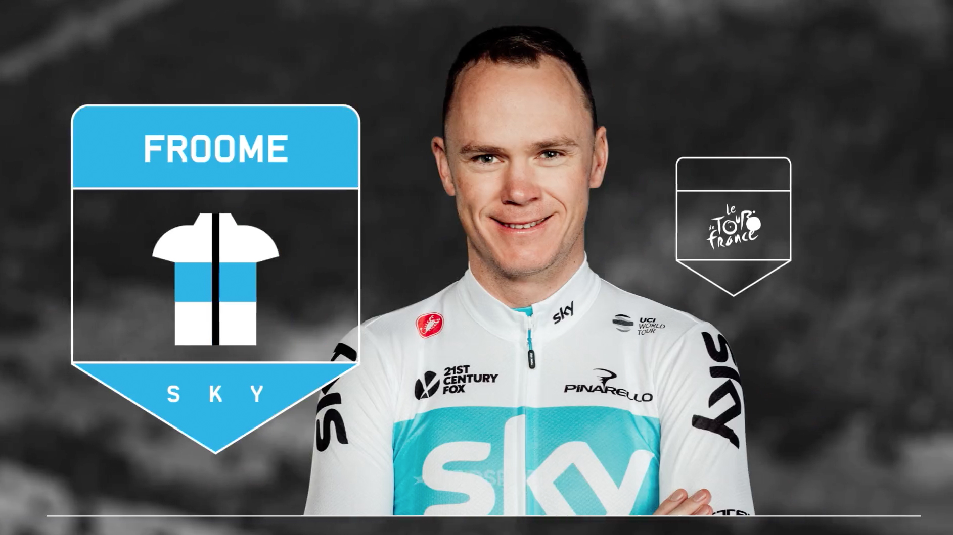

The branding also includes a complete system for displaying cyclist information, with photographic cutouts and iconography shaped like a heraldic shield or a map pin and featuring the rider’s last name, a simple jersey pictogram and an abbreviation representing the primary sponsor.
The shield shape also finds its way into the on-air look through a variety of icons used to signal time trials, leader changes and even falls.
The entire look has been developed around Eurosport’s “Home of Cycling” tagline.

tags
DixonBaxi, eurosport, sports broadcast design, sports motion graphics, Tour de France
categories
Branding, Broadcast Design, Graphics, Heroes, Sports Broadcasting & Production