
ZDF’s ‘WISO’ updates set and graphics with cohesive angular look
Weekly insights on the technology, production and business decisions shaping media and broadcast. Free to access. Independent coverage. Unsubscribe anytime.
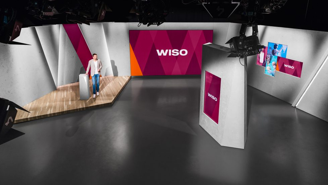
ZDF’s iconic economic and consumer affairs magazine program, “WISO,” has launched a major overhaul of its set and graphics, based upon a unique, angular grid.
A mainstay of ZDF for nearly 35 years, “WISO” worked with CapeRock to redesign the show’s visual look.
The show’s clean, wide logotype was retained, and it provided a jumping off point for the new look.
“Social and financial issues can be complex with layer upon layer of information,” notes CapeRock in its case study of the project. “‘WISO’ aims to make these matters more transparent by breaking them down into easy-to-grasp bits of story. We reflected this approach in the new design.”
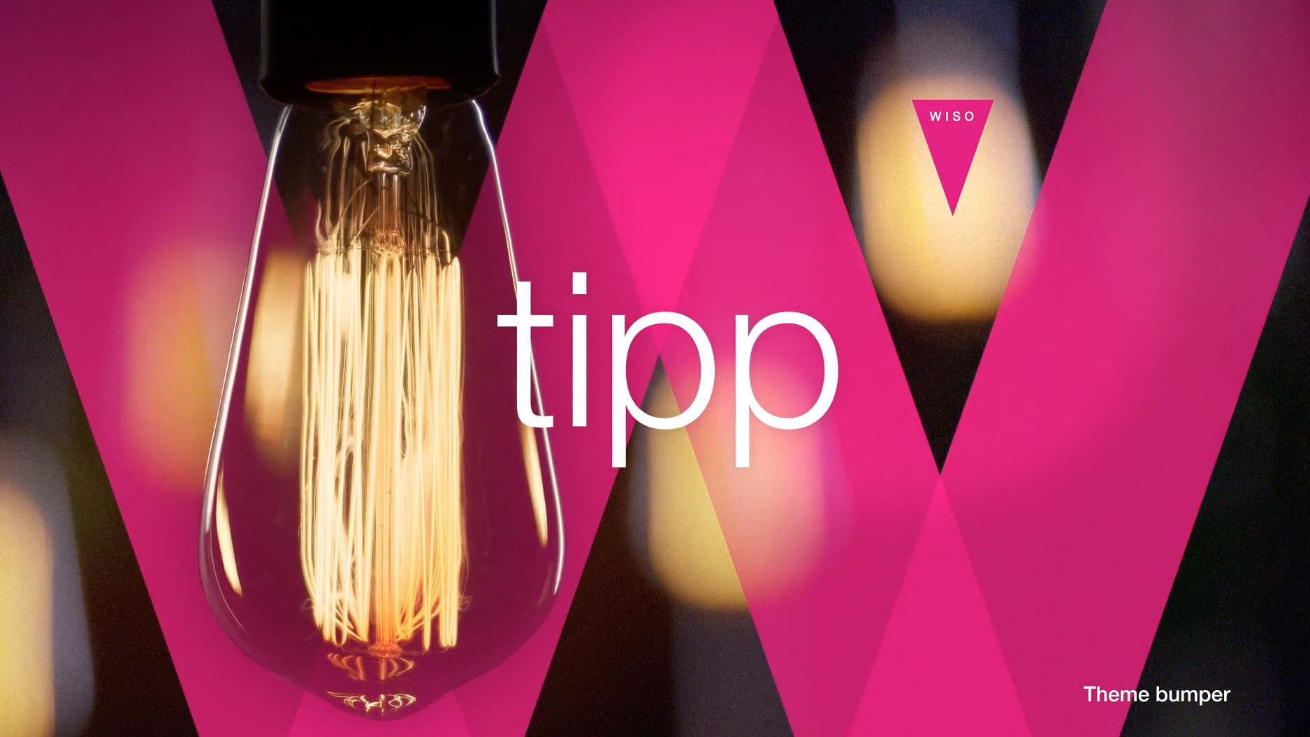
By deconstructing the show’s logo and using the four diagonals of the letter ‘’W’’ as a base grid for all on-air layouts, CapeRock gave the show a solid but unique foundation to build its visuals around.
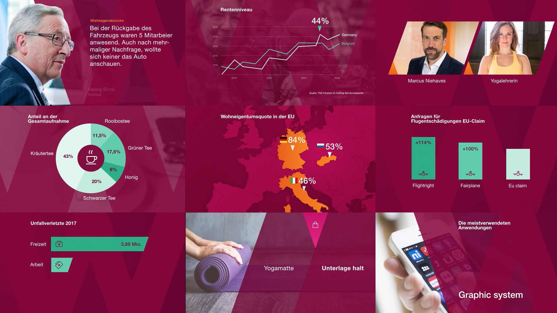
The use of the diagonal panels helps to create depth and perspective reveals content and storytelling elements through the use of carefully designed animation. The overlapping parts of the panels form small triangles that are used to playfully point to information — or suggest the exchange of it.


The new look is also using a color-coded “chapter” approach for specific segments — each of which includes a stinger and unique musical signature, also from CapeRock.
CapeRock has previously worked with ZDF on branding and design for ZDF heute+ and “ZDF Mittagsmagazin.”


tags
Atelier Markgraph, CapeRock, german, Germany, Marcus Niehaves, WISO, ZDF
categories
Branding, Broadcast Design, Graphics, Heroes, Set Design, TV News Graphics Design, TV News Graphics Package