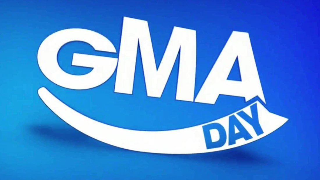
‘GMA Day’ uses ‘smiley’ curves to create fresh new look
Subscribe to NCS for the latest news, project case studies and product announcements in broadcast technology, creative design and engineering delivered to your inbox.
ABC News‘ “third hour” of its “Good Morning America” franchise, “GMA Day,” kicked off Monday, Sept. 10, 2018, using the second level of the network’s second level Times Square studios and rounded animated graphics.
The show, which has already introduced its logo design in the parent show’s bold sans serif font with a “smiley” below it, continued to use this look — with the letters and smile often playfully animated during various wipes and other elements.
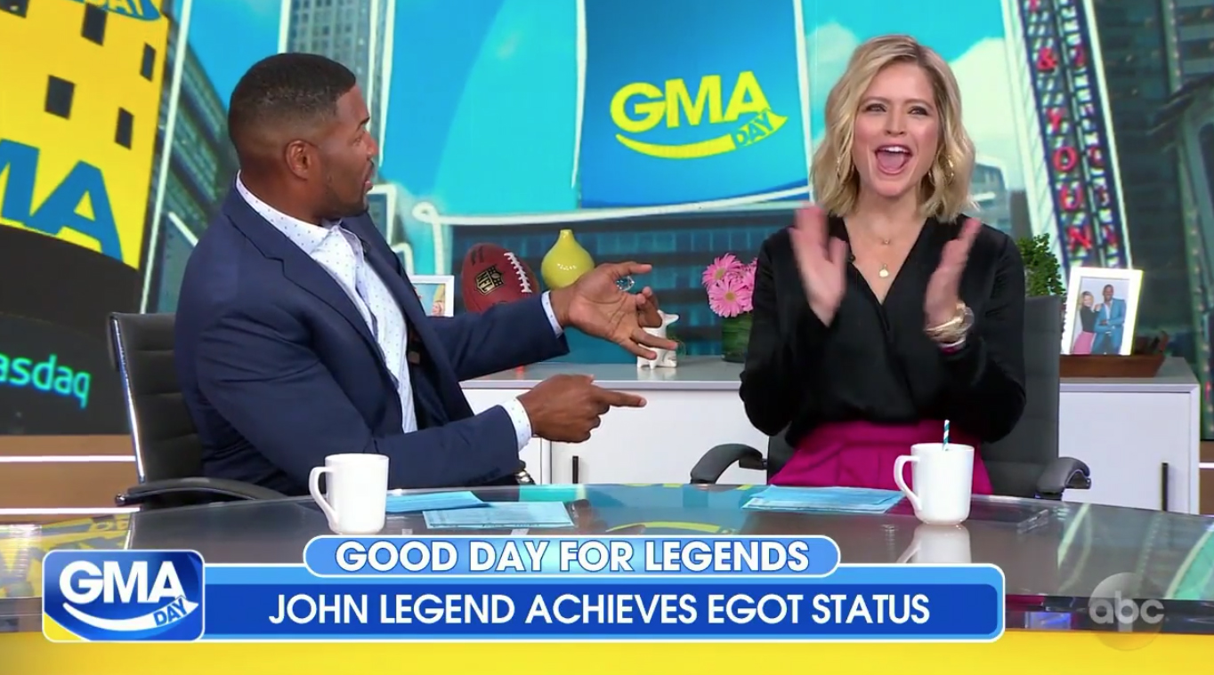

In addition to the new logo, the show also departed from the “GMA” boxy graphics package with a package that made use of rounded corners, including for the bug and lower third inserts.
Review: 'Happy' heavy '#GMADay' debut was just 'eh' https://t.co/ow2UE7lDud #BroadcastNews #TVNews pic.twitter.com/WM6zYTaQgA
— TVNewsMix (@TVNewsMix) September 10, 2018
The graphics themselves are in a shades of blue and yellow, similar to those used on “GMA.”
In many ways, the show’s graphics mesh better with the “GMA” brand — relying mostly on the bold, geometric Century Gothic-esque typeface in shorter, simpler blurbs of text.

Subscribe to NCS for the latest news, project case studies and product announcements in broadcast technology, creative design and engineering delivered to your inbox.



tags
ABC, ABC News, Barco, dennis size, GMA, GMA Day, Good Morning America, Michael Strahan, Sara Haines, Seth Easter, seth easter design, showman fabricators, The Lighting Design Group
categories
Branding, Broadcast Design, Broadcast Industry News, Graphics, Heroes, Set Design, Talk Show Set Design