
‘Up with David Gura’ goes geometric with a touch of fun
Weekly insights on the technology, production and business decisions shaping media and broadcast. Free to access. Independent coverage. Unsubscribe anytime.
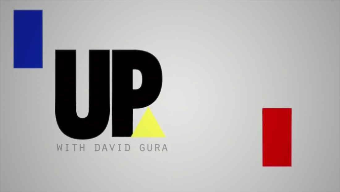
After announcing the revival its “Up” brand with a new host, David Gura’s new weekend show launched this weekend using a primary color palette and geometric animation with playful elements.
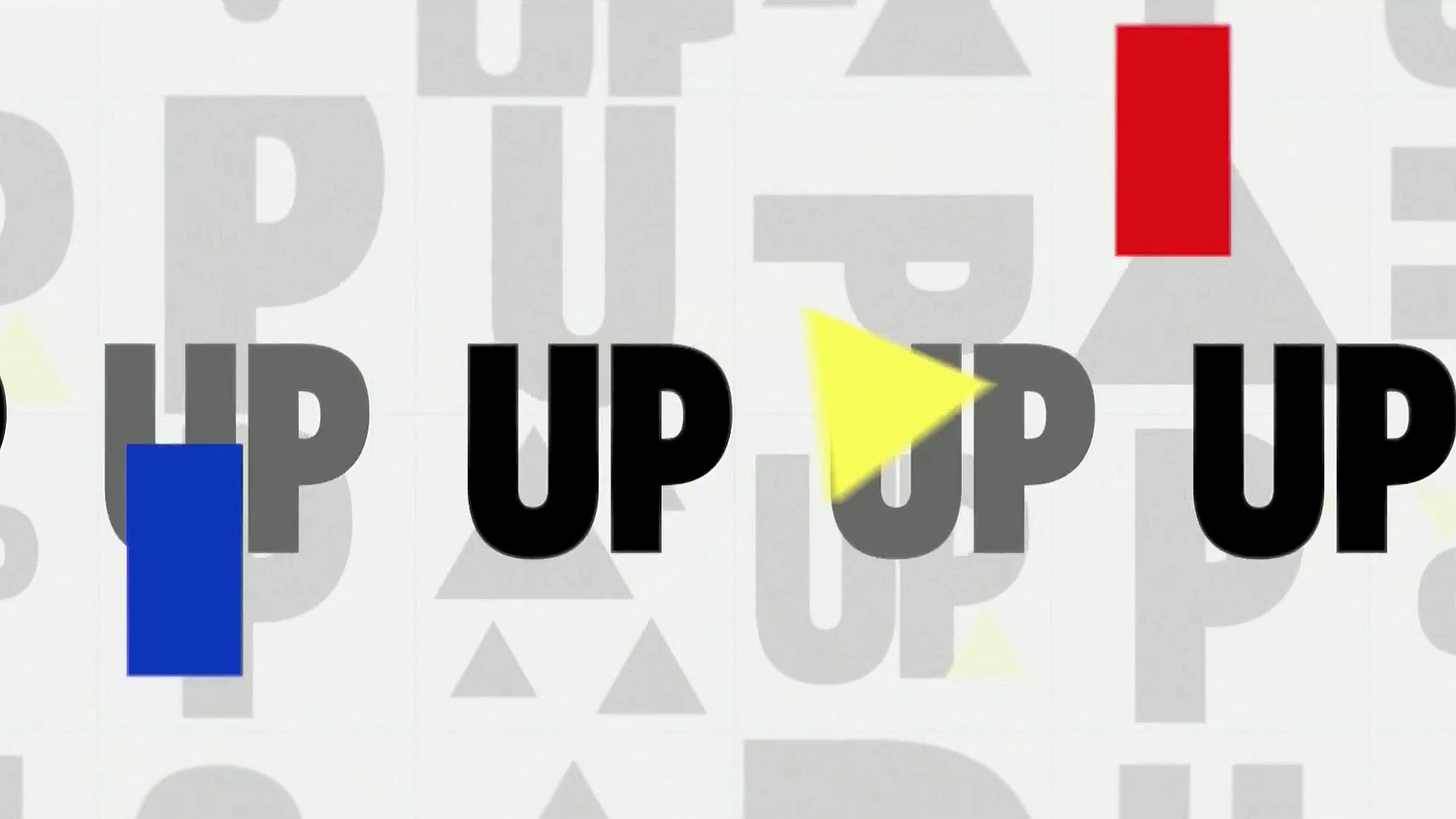
The show’s open incorporates the show’s ‘Up’ logotype mixed in with rectangular and arrow shapes in red, yellow and blue. The animation style features elements that “shuffle” around screen in playful paths.
.@davidgura's 'Up' used this 19-box to showcase all of Trump's press appearances in the past week. #Uppers pic.twitter.com/uOUwbU4yDQ
— NewscastStudio (@newscaststudio) October 15, 2018
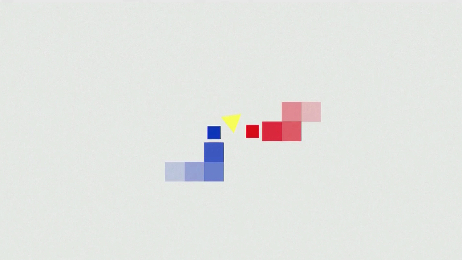
The geometric theme is used to create an oversized ‘8-bit’ pixellated look as both colorful animated elements and a wipe.

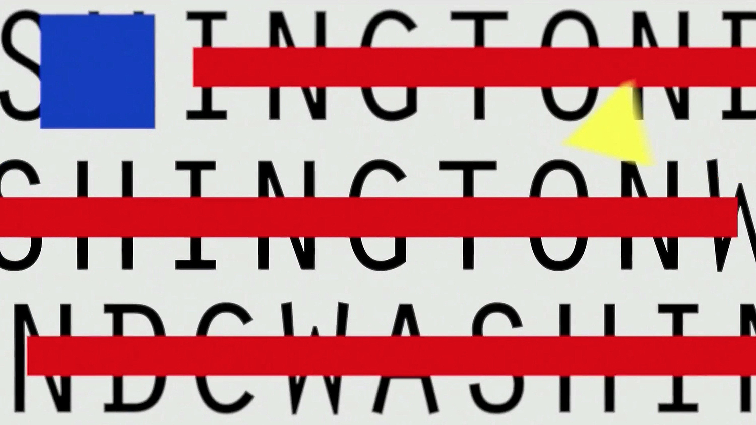
Other elements include political and Washington, D.C. imagery.
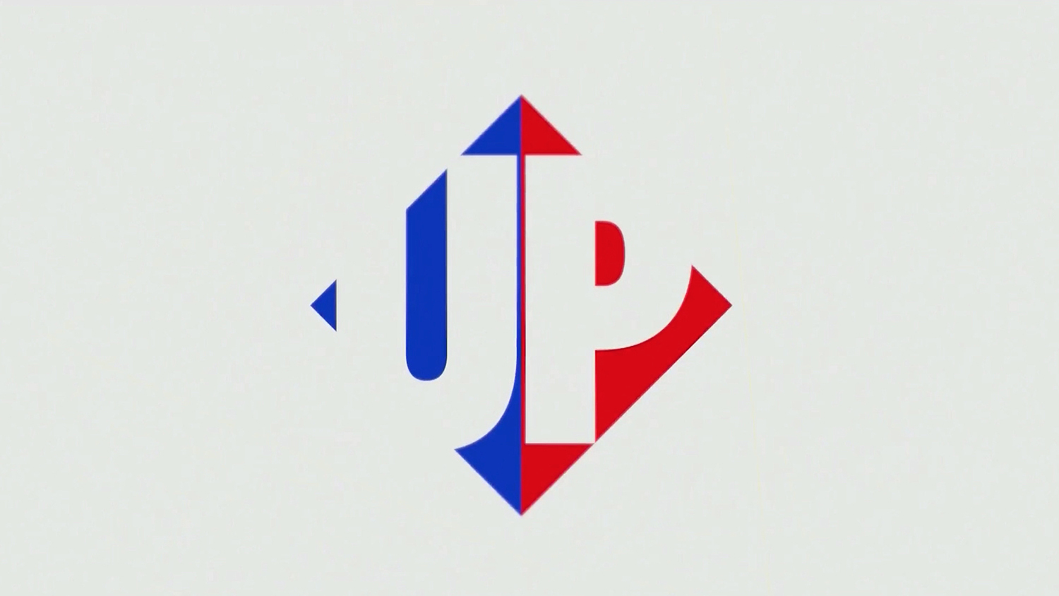
Another take on the upward pointing yellow arrow in the logo design, the show also includes a diamond shaped emblem built using its name in the middle and a leftward pointing blue arrow and red, right-pointing arrow, an obvious reference to both sides of the political spectrum.
The typeface used for David Gura’s name in the logo also appears in the open animation, including in this American flag-esque layout.

tags
David Gura, MSNBC, up, Up with David Gura
categories
Branding, Broadcast Design, Broadcast Industry News, Cable News, Featured, Graphics, MoGraph, TV News Graphics Design, TV News Graphics Package, TV News Motion Graphics Design