ITV ‘crafts’ new layered identity
Weekly insights on the technology, production and business decisions shaping media and broadcast. Free to access. Independent coverage. Unsubscribe anytime.
Britain’s ITV has unveiled a new look for 2019.
The network’s new on air look is actually the combination of two separate initiatives — one that reimagines the network’s script logotype as a series of layers and the other that will allow it to showcase different artists’ take on its logo design throughout 2019.
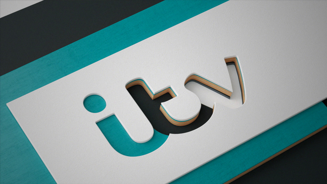
The core graphics package was created by design firm DBLG, which draws inspiration from flat “cards” made from various materials, each with elements of the ITV logotype “cut out” from it.
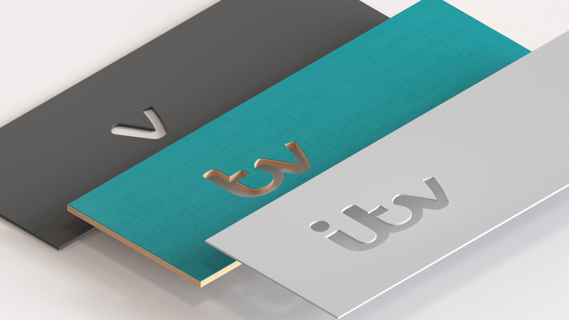
When layered one on top of each other and viewed from a certain perspective, the result is the complete ITV logo, with each letter “made” from a different material or color.
The layers can range from any type of material — wood, metal, paper, plastic and more, which, in turn, gives the network a nearly limitless number of combinations that can leverage different color palettes and materials to create unique looks for each program or need.
DBLG has dubbed this approach as “crafty” — which seems appropriate given that many of the layers are designed to look like any number of materials an artist might use.
Despite the identity’s heavy reliance on rectangular shapes and right angles, DBLG didn’t let that limit how the layers are placed.
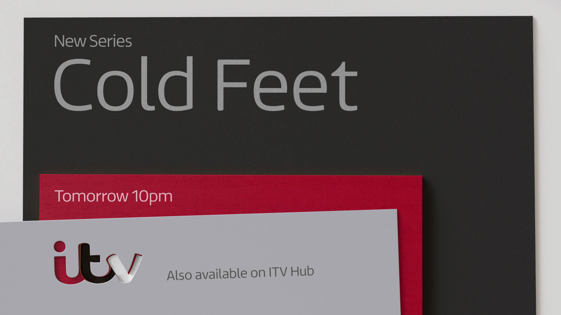
In both animation and the final “resting” place, each layer can have a unique placement on screen — such as this slightly tipped top layer for “Cold Feet.”
Other designs do remain true to the straight lines and right angles — but the three “cards” can be placed in a variety of arrangements.
However, one key element does remain consistent no matter how the layers are placed — the logotype “cutout” always lines up.
This point is driven home further thanks to a variety of animations — ranging from a straightforward look where each layer “folds” into place to applications with more complex or combinations of animations to ones where it looks like layers are cards casually tossed on a surface that come to rest in just the right alignment.
The project included numerous templates for a variety of applications — as well as a compilation of brand standards guides, according to a case study on the DBLG website.
The graphics package continues to use a custom drawn font created by Fontsmith back in 2013, called ITV Reem, with the Prelo font family being a close match that is available commercially.
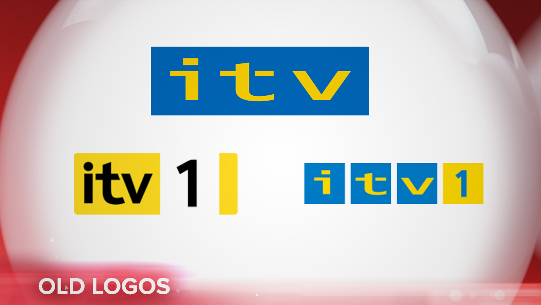
Fontsmith also developed the flowing logotype ITV continues to use to this day, breaking away from the network’s more traditional — and blocky — designs.
In addition to the core new look, DBLG and ITV are also driving home the “crafty” concept by inviting a different artist to design a series of the channel’s idents each week of 2019 through an initiative called “ITV Creates.”
One of those artists, Ravi Deepres created several variations for ITV.
ITV also plans to dedicate a month to student artists.

tags
Bumpers, DBLG, fonts, Fontsmith, Idents, itv, logo design, typography
categories
Broadcast Design, Broadcast Industry News, Graphics, Heroes, MoGraph, Network Branding