
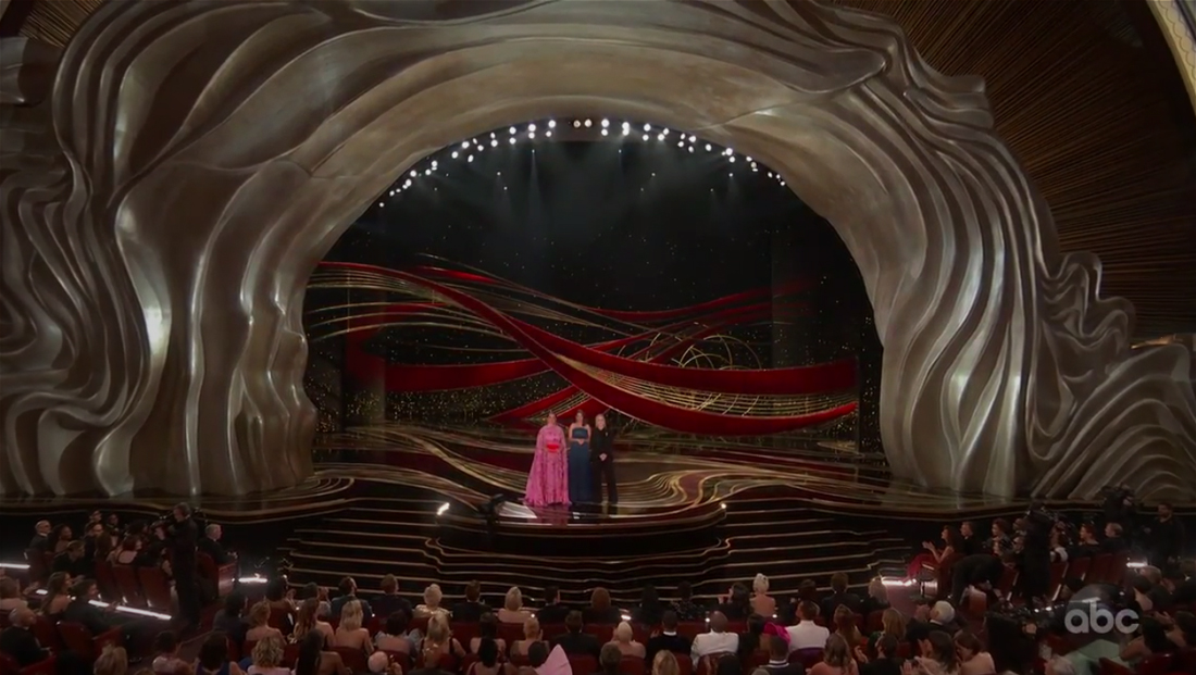
Oscars switch from sparkly look to flowing, organic production design
Weekly insights on the technology, production and business decisions shaping media and broadcast. Free to access. Independent coverage. Unsubscribe anytime.
The motion graphics ABC used during the telecast took on the flowing motif — albeit a lighter and more transparent look that could be done in gold or blue tones. Text in most of the graphics was rendered a deep violet tone.
The curved, flowing look was in direct contrast to the bold, blocky linear look used last year for the 90th anniversary telecast. Notably, the color red — as in “red carpet” — was mostly absent from the on-screen graphics.
Nominees, for example, were shown on screen with an intricate set of layers and curved lines in the lower left of the screen.
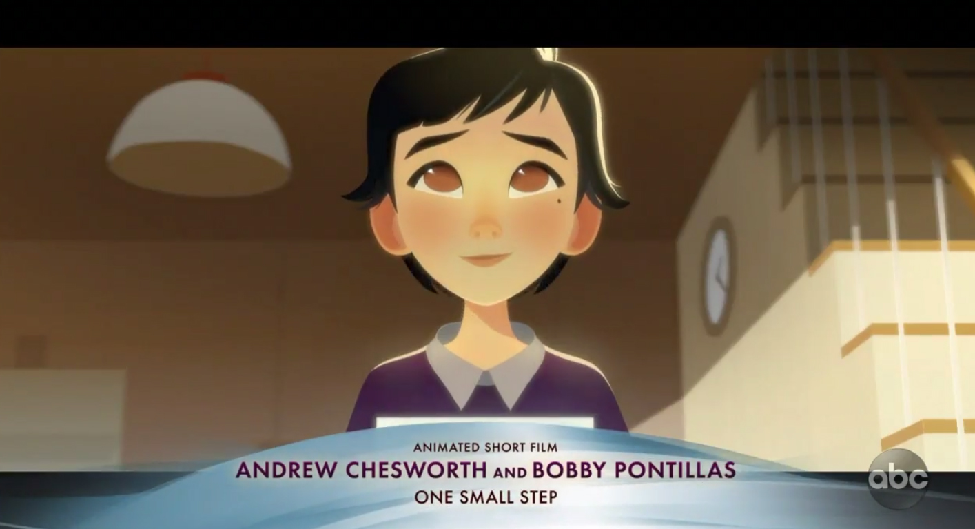
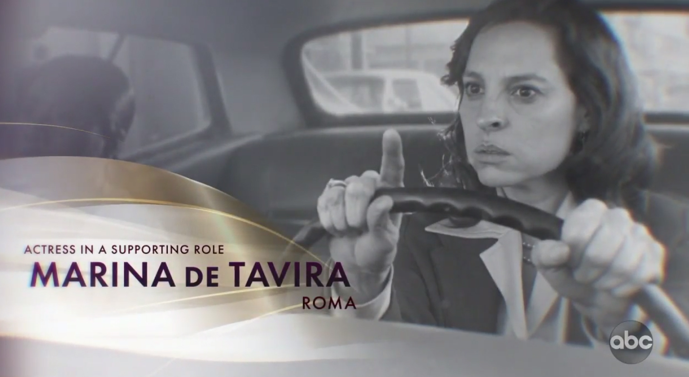
For the lower third-style graphics used under winners and to introduce films themselves, the flowing look was used to create a gentle, slightly asymmetrical carved that could be shown in gold and blue.
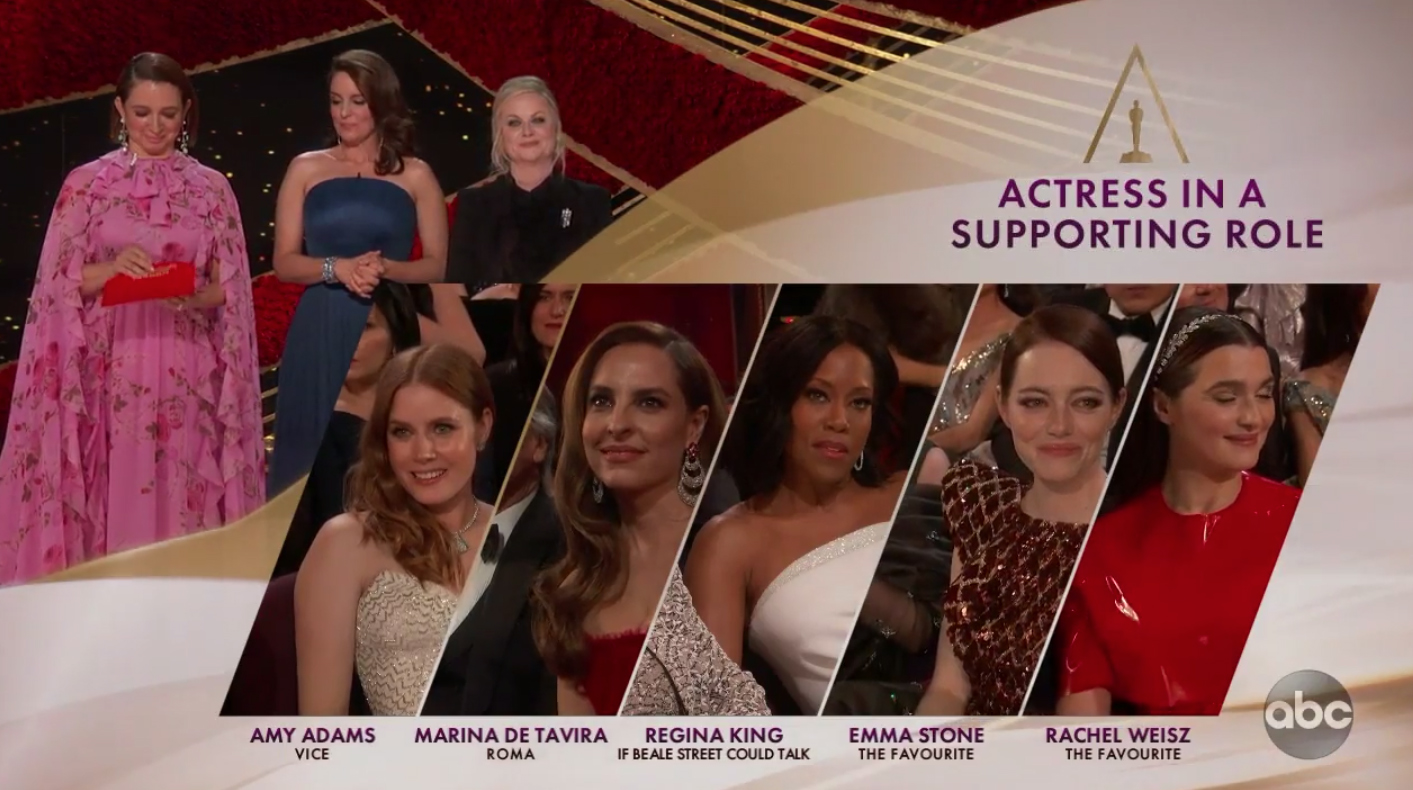
The curved look was also used in the ‘split screen’ design used to showcase simultaneous feeds of nominees. In these frames, the presenters were tucked into an open spot in the upper left of the screen, where each nominee was showcases in a diagonal polygon — a design element that comes from the ‘A’ in ‘Oscars’ — which, for several years, has had the crossbar removed and an outside of the statuette in its place.
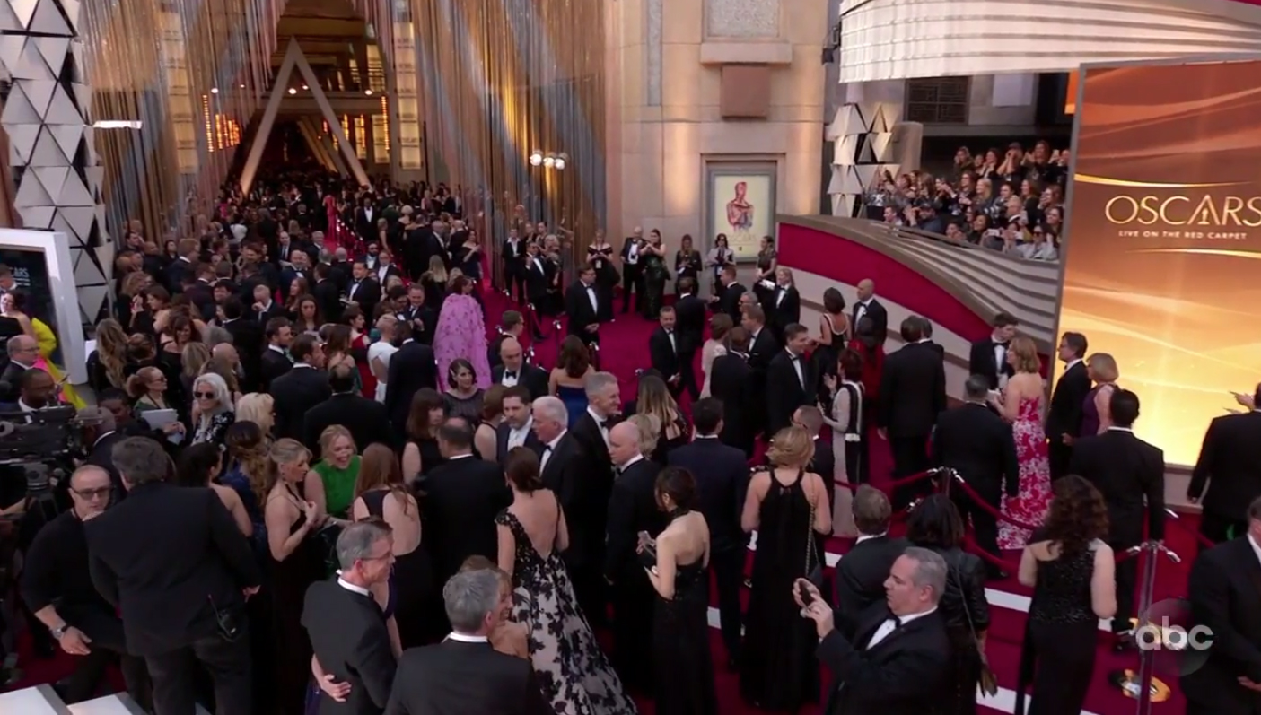
It’s worth nothing the Oscars kept a mix of the curved and angled look on the outdoor red carpet area. The red carpet step and repeat area, for example, kept the triangular segmented look, while pillars with the same structure were scattered outside the Dolby Theatre. The audience boxes, meanwhile, were fronted with curved bases and headers, however, while video towers incorporated the wispy graphical look.
For the ‘in memoriam’ segment, most of the curved elements were shed to keep the look simpler, letting the imagery of the people and typography dominating the look.
The flowing, layered look also quite naturally leant itself to dramatic wipes that were used generous throughout the broadcast — both as a fullscreen element and to animate in and out smaller motion elements.
Here's a sampler of the #MotionGraphics and #ProductionDesign for the #Oscars pic.twitter.com/P4bTYKdqZg
— NewscastStudio (@newscaststudio) February 25, 2019

tags
Awards Shows, David Korins, Goodnight & Co., Oscars
categories
Awards Show Graphics Design, Awards Shows Production Design, Broadcast Design, Broadcast Industry News, Featured, Heroes, TV Show Production Design