
Oscars switch from sparkly look to flowing, organic production design
Weekly insights on the technology, production and business decisions shaping media and broadcast. Free to access. Independent coverage. Unsubscribe anytime.
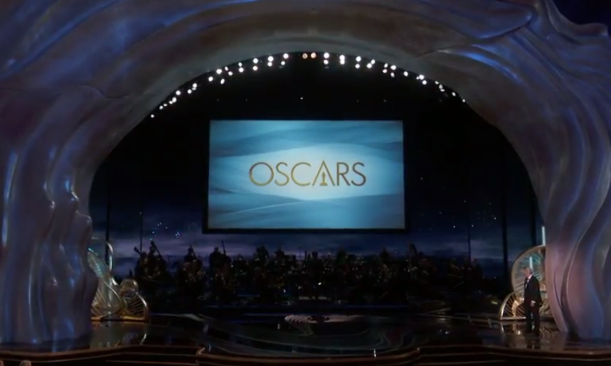
After several years of bringing out the sparkles for Hollywood’s biggest night, the Oscars production design went in a different, flowing direction this year — with a look that emphasized organic shapes with hints of sharp angles borrowed from the logotype — and less of an emphasis on the namesake statuette.
Although ABC’s promos and key art for the Oscars included a glassy pink-violet-blue rendering of the statuette, the actual motion graphics used stuck mostly in the gold and blue families.

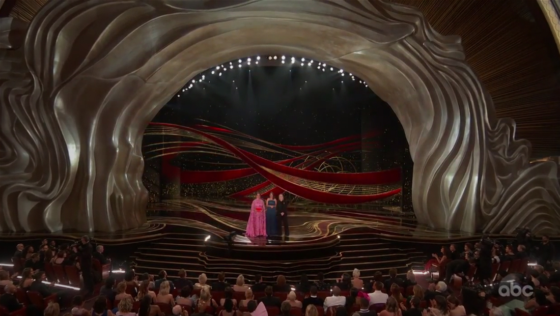
The stage surround, which as for several years been created using elaborate configurations of Swarovski crystals, was swapped out this year for an undulating, flowing, organic look that conjured imagery of ice flows and natural cave and rock formations.
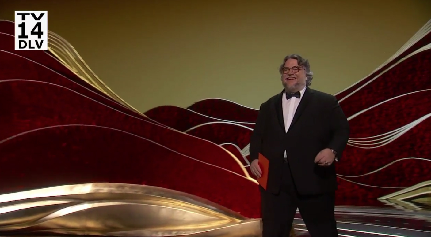
Production designer David Korins created the updated look. Korins’ other credits include “Hamilton,” “Grease Live!” and “Dear Evan Hansen.”
Wrapping around the entire proscenium, the structural elements also “flowed” off stage into some of the lower box-style units on either side of the stage.
Lighting effects could shift the look from various shades of gold and platinum to more frosty blues.
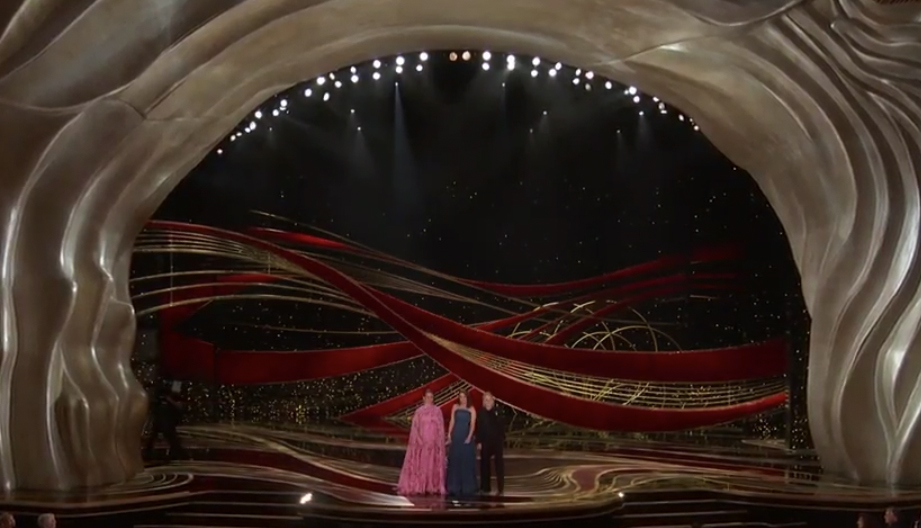
Additional on-stage set pieces mirrored the flowing design — perhaps with a bit stronger curves, such as these flowing ribbon and ring like structures used behind the first set of presenters.
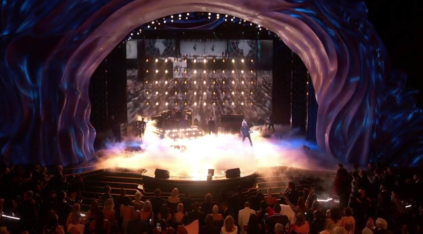
One notable exception to the design motif was the opening tribute to Queen (the band), which was presented in a more concert style look — with bright lighting effects, smoke and more. Adam Lambert and Queen (the singer) appeared on the stage along with musicians during the two-part opener.
A bit of previous year’s looks did make an appearance when a large, elaborate crystal ‘curtain’ was flown in — though, when viewed in a wider sense, the flowing texture of the stage surround was still visible.
Other stage elements included smaller set pieces that could ‘peek’ out from either side of the stage, such as these background elements used to introduce the ‘In Memoriam’ segment with an orchestra occupying bulk of the stage.
Another interesting on stage element were large cutout style elements that created a layer mountain-scape inspired look — that also worked well with the intricate curved lines installed on the glossy stage floor.
Almost completely absent from the production design for the stage were the Oscar figurines and cutouts that have been used, to varying degrees, over the past few telecasts. Instead, most imagery of the iconic trophy were relegated to the awards themselves — and spot uses in the graphics and logo.
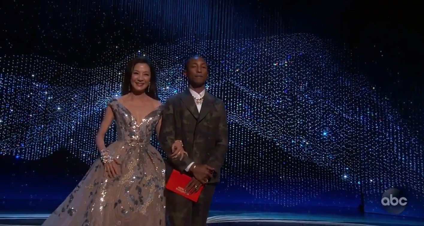
The design also relied less on on-stage LED panels, unlike previous telecasts.


tags
Awards Shows, David Korins, Goodnight & Co., Oscars
categories
Awards Show Graphics Design, Awards Shows Production Design, Broadcast Design, Broadcast Industry News, Featured, Heroes, TV Show Production Design