
‘GMA’ goes with circle motif — much like its main rival — in graphics redesign
Weekly insights on the technology, production and business decisions shaping media and broadcast. Free to access. Independent coverage. Unsubscribe anytime.
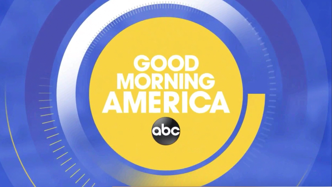
ABC News‘ “Good Morning America” introduced a new graphics package Tuesday, Feb. 26, 2019, that introduces circular rings — which have some interesting parallels to its arch rival.
The new “GMA” graphics are, quite literally, centered on an updated alternate logo, which features the those three letters in a simple circle, which, in turn, is similar to the ABC “globe” logo. In the full logotype with the show name spelled out, meanwhile, the swish below the stacked words has been removed.
With the new icon-like logo serving as both a bug and centerpiece of the new graphics, the rest of the circular elements include thin and think lines, many of which fade out before making a complete circle — which makes the look similar but not quite the same as the “Aperture” branding package the “GMA” parent network debuted in the fall of 2018.
It’s also worth noting that the new look is similar to the look in a news promo WLS in Chicago aired during the Oscars Sunday, Feb. 24, 2019.
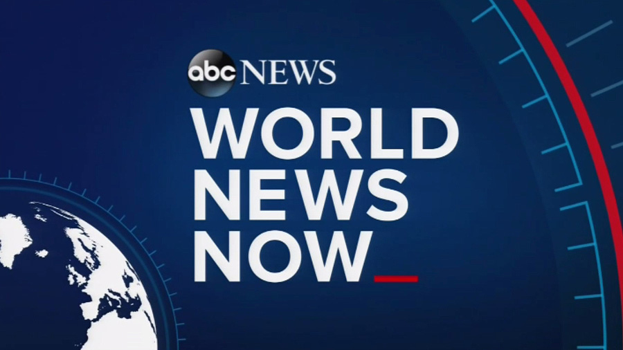
Hash marks, similar to those found in the ‘World News Now’ full screen graphics that were introduced in 2016.

For the show’s opening teases, the show still shows the headline in larger type first, complete with a colored overlay, arrow accent, diagonal textures and thin lines.

The teases then animate into a smaller, lower third style banner with the show’s new icon logo and a blue box with ring and hash accents. The color palette of the open, meanwhile, remains very similar.
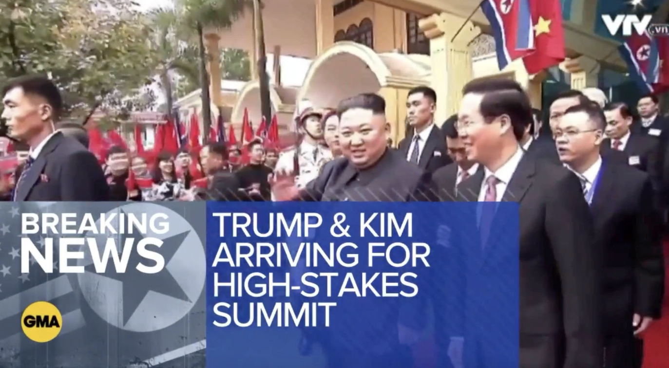
The network also has a special look for breaking news teases, which can be modified to include topical graphics, such as the flags seen here, as well as a large blue box that allows for quite a bit of text — not surprisingly given how text-heavy ABC tends to be.
In between teases, the network uses thick rings and and hashmarks that originate from the circular ‘GMA’ icon in the lower left corner.
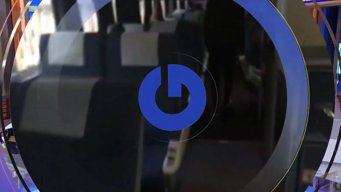
Another element that pops up in the new look is a circular, geometric ‘G’ that is rotate 90-degrees counterclockwise — but that rotate into the ‘correct’ position. In the rotated format, the ‘G’ looks a bit like what has become the universal symbol for ‘on.’
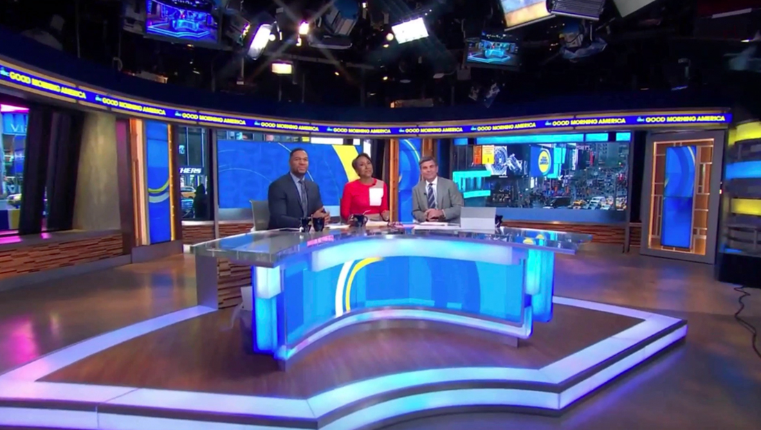
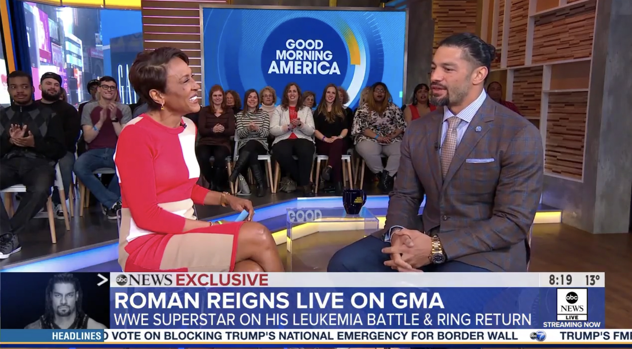
The show has also reformatted how its teases and open work, with the show’s main anchors, Robin Roberts, George Stephanopoulos and Michael Strahan, at the anchor desk greeting viewers. The show then runs a rather length series of teases before the announcer opens the show — with the hosts’ names removed and no longer displayed on the LED ribbons that wrap the exterior of the show’s Times Square Studios. The on-set monitors around home base have new looks — with arcs and rings used in some as well as a subtle checkerboard-style layout with the circular GMA logo.
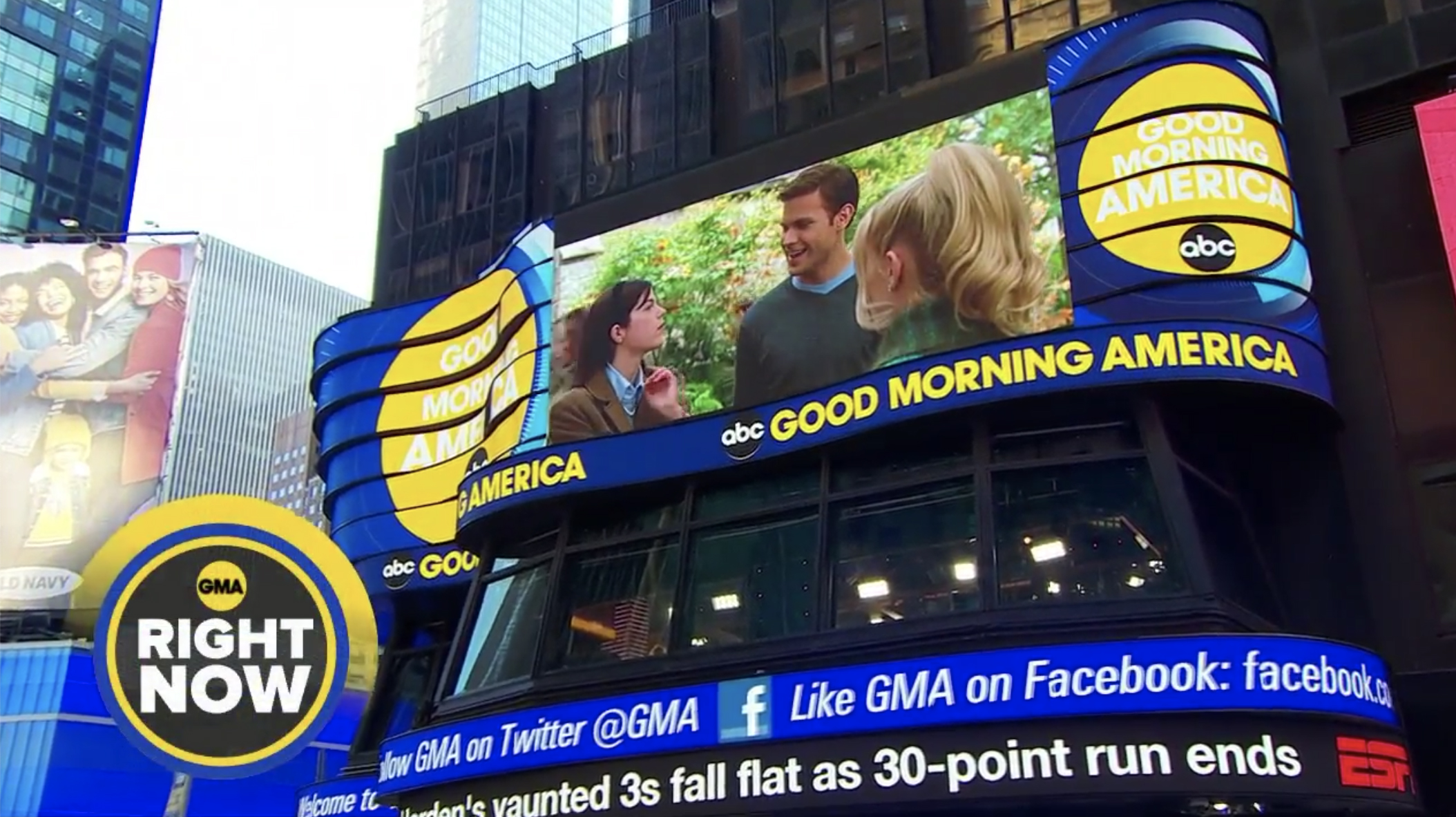
The ribbons, meanwhile, are also sporting updated graphics that match the new look. The show has also updated the graphics it uses on ‘walk and wander’ and ‘video on video’ shots for the ‘Right Now’ segment, as well as the sponsored weather interstitial that airs right before local weather cut-ins.
The network’s lower thirds have retained a similar look as before, with some slight adjustments to colors and the topical graphic on the left. The bug, meanwhile, now rotates between the ‘GMA’ logo with a rotating gradient ring, an app icon style promo for the network’s streaming news channel as well as the network’s logo with GoodMorningAmerica.com below it.
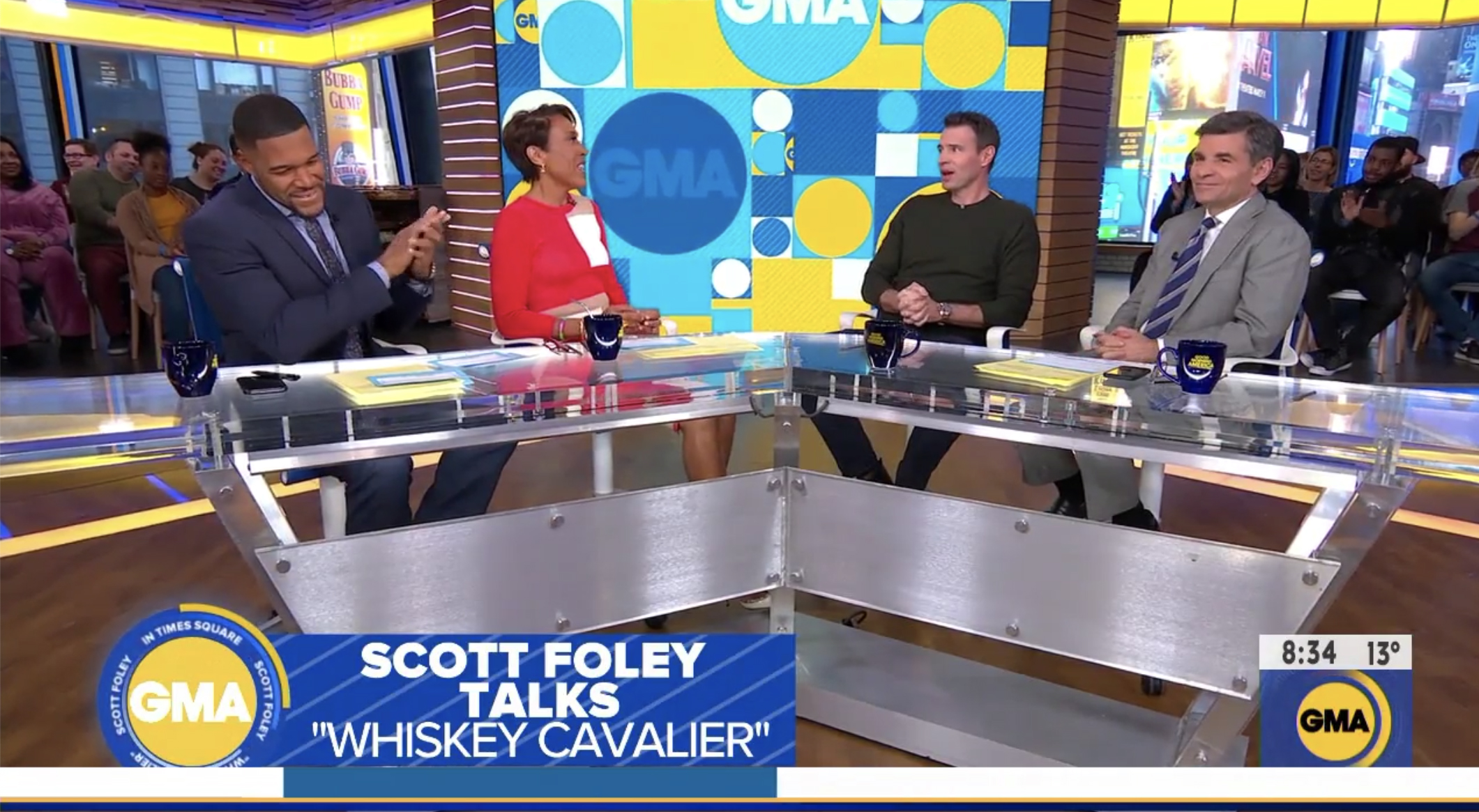
Later in the show, when the anchors move upstairs, the graphics become even more fun — with a retro-style polka-dot and box background now fed to the on-set video wall. Alternative redesigned lower thirds here include a ‘GMA’ logo ringed with rotating text that read ‘In Times Square’ alongside an approximately half screen headline graphic.

tags
ABC News, George Stephanopoulos, GMA, Good Morning America, Michael Strahan, NBC News, Robin Roberts, Today, Today Show
categories
Branding, Broadcast Design, Graphics, Heroes, Network Morning Shows