
BBC overhauls on-air design with new type, focus on clarity
Weekly insights on the technology, production and business decisions shaping media and broadcast. Free to access. Independent coverage. Unsubscribe anytime.
BBC News has launched a comprehensive rebrand that simplifies its presentation while bringing clarity on-air to its storytelling.
The changes can be seen across BBC’s channels such as BBC World News, BBC News Channel and its national and regional news bulletins in the United Kingdom.
Driven by Type
At the center of the change is BBC Reith, the network’s bespoke typeface commissioned from London firm Dalton Maag, which replaced Gill Sans.
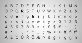
The contemporary humanist typeface is designed with legibility in mind while still having a unique visual tonality that immediately associates it with the BBC.
Named after the BBC’s founder John Reith, the typeface includes serif, sans serif and condensed versions across a variety of weights and is digitally optimized for use online and on-air.
BBC Reith first rolled out to BBC Sport, BBC Weather and BBC News Online.
Bringing Clarity to the News

BBC has had the same insert graphics for its news channels and bulletins since 2012, launching alongside the network’s move to Broadcasting House and HD.
The new design, which first appeared on-air Monday, July 15, 2019, limits the overall color palette and uses a simplified design in an attempt to be accessible to a wider audience.
BBC notes that the new look was focus-grouped and the respondents found the new design clearer and easier to read.
“Helping our audiences understand the news, through clear and compelling storytelling, is at the heart of everything we do at BBC News. We live in an increasingly complex world, and it’s clear our viewers and readers really appreciate the role visual design can play in helping them to understand developing stories and give clarity to the issues,” writes Paula Thompson, design director of BBC News.
A Global Change for the BBC
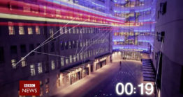
From the second the countdown first begins, the change to BBC Reith is noticeable, as the various show opens have been updated with the new typeface.
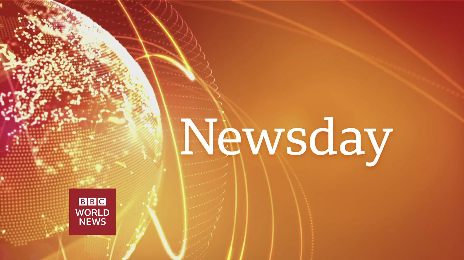
Shows like “Newsday,” “Beyond 100 Days,” and “BBC Breakfast” all feature a tweaked opening with the new typeface while keeping their existing show design and branding.
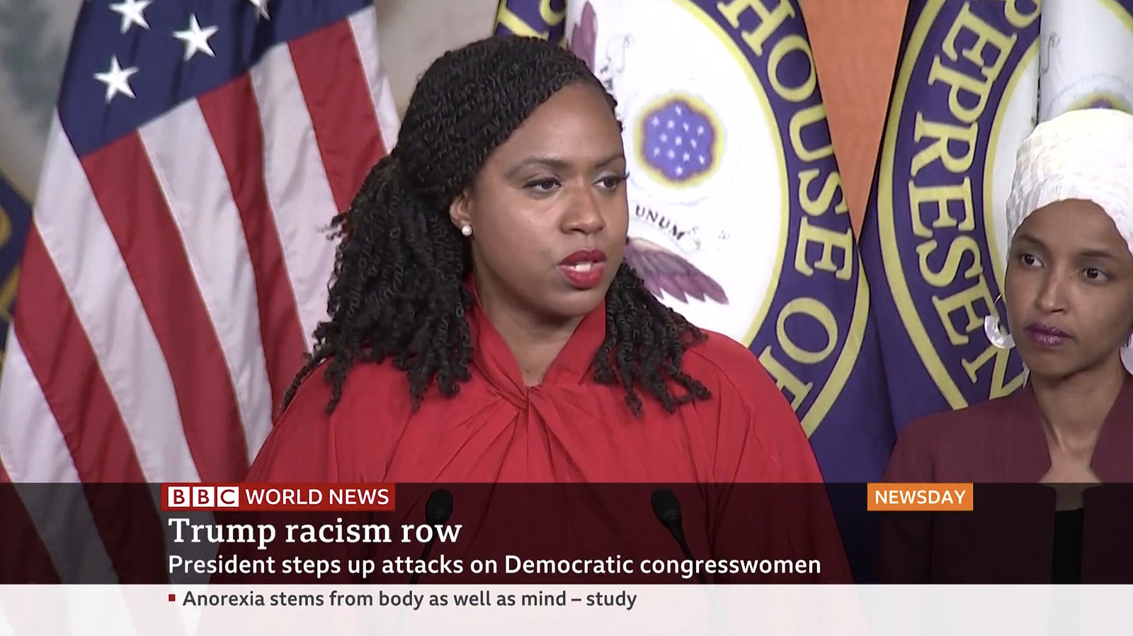
Across the board, BBC News has also changed how it presents news headlines, using a simplified gradient overlay on video with the headlines in the serif version of BBC Reith.

In show, the lower third has now inverted from its previous white color to a black overlay with a pop of color for show and network branding. The L3 mixes the serif version of the typeface for headlines while the sans-serif provides context or details.
The ticker has also been replaced by a flipper, displaying one headline at a time, mirroring the opacity effects of the L3.
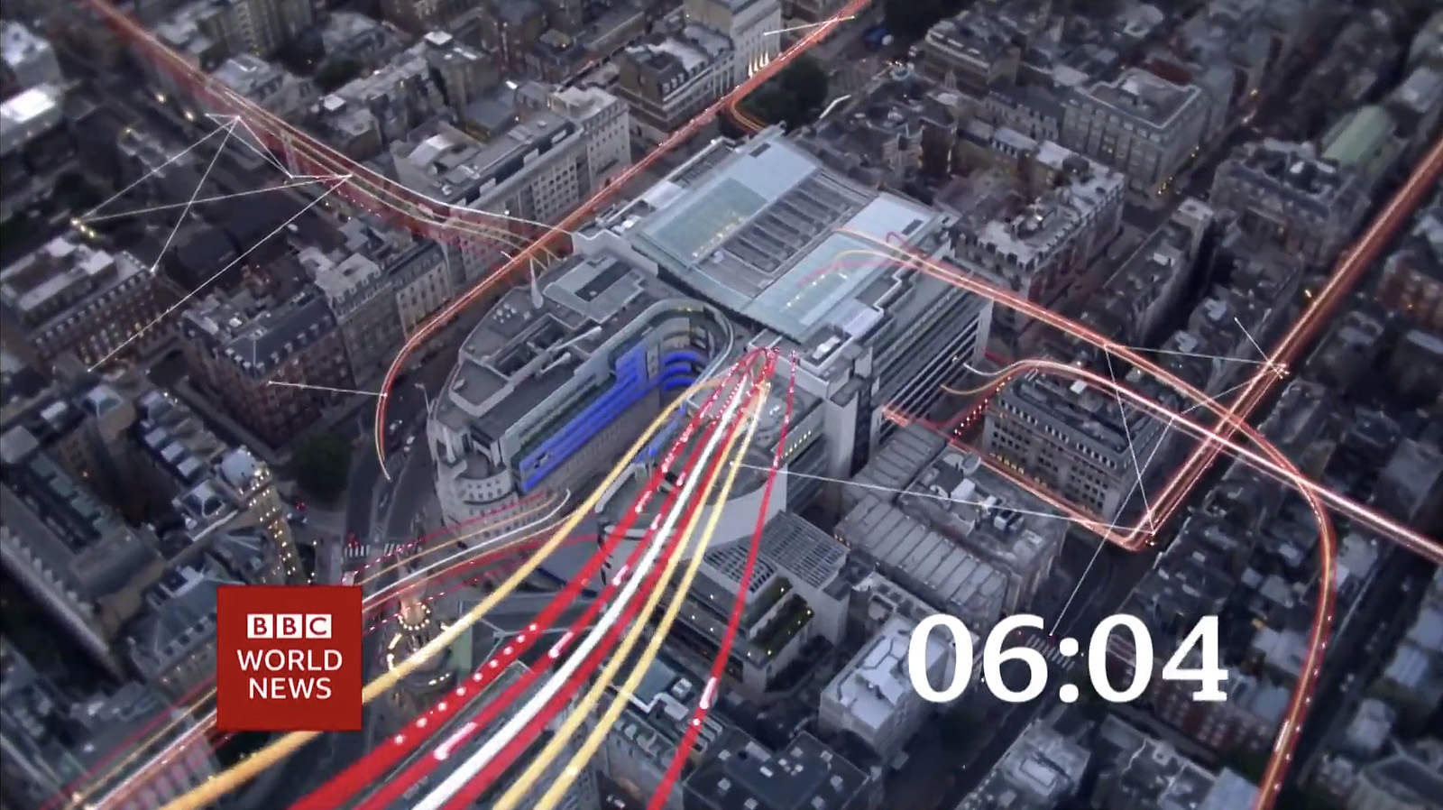
For the regional newscasts, such as the news bulletins on “BBC News London” or “BBC North West Tonight,” a new open has debuted featuring a new take on the network’s globe animation.
These opens include new drone video shots and end with bold red title slides.

tags
BBC, BBC News, BBC Newsday, BBC Reith, BBC World News, Beyond, Dalton Maag, newsday, Paula Thompson
categories
Branding, Broadcast Design, Broadcast Industry News, Graphics, Heroes, Real-Time Graphics, TV News Graphics Design, TV News Graphics Package, TV News Motion Graphics Design