
CNBC ‘heat map’ goes really, really into the red
Subscribe to NCS for the latest news, project case studies and product announcements in broadcast technology, creative design and engineering delivered to your inbox.
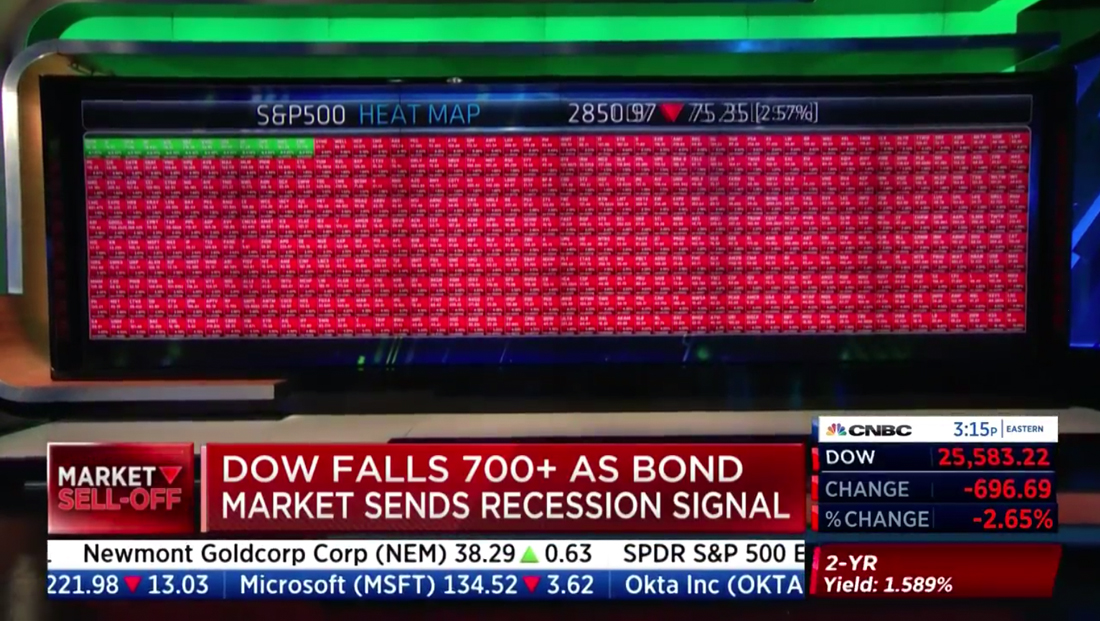
A CNBC “heat map” graphic was pretty hot all around — creating a dizzying array of nearly 500 red boxes on one of its in-studio video walls.
The network, which has been using the “heat map” graphic for years — despite some mixed reaction — showcased how the big market selloff was affecting the markets, including the S&P 500, on Wednesday, Aug. 14, 2019 after reports of a yield curve inversion sent Wall Street in a frenzy.
As its name suggests, the S&P index includes 500 large companies.
To get the index value, a weighted formula is used to take market capitalizations into account, so it’s not a straight average of all of the component companies’ current trading value.
CNBC’s graphic, meanwhile, uses small boxes that are red if a particular company’s stock price is down, green if it’s up — with boxes grouped by coloring.
The idea is that a viewer can get an “at a glance” look at how stocks are doing based on how much red there is vs. how much green.
During Wednesday’s “Closing Bell” when the S&P heat map was used, it appeared only a dozen companies were in the green.
CNBC has different versions of the heat map for different indices and sectors, some of which have larger boxes.

It also uses the heat map approach to show the current trending status of major indices themselves.
Subscribe to NCS for the latest news, project case studies and product announcements in broadcast technology, creative design and engineering delivered to your inbox.

tags
CNBC, Video Walls
categories
Broadcast Design, Broadcast Industry News, Cable News, Featured, Video Walls