HBO Max switches logos

Subscribe to NCS for the latest news, project case studies and product announcements in broadcast technology, creative design and engineering delivered to your inbox.
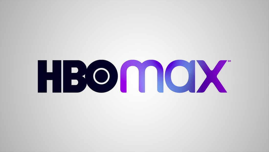
Along with pricing and a debut date, HBO Max also showed off a different logo design during its big “WarnerMedia Day” reveal.
Back in July, when WarnerMedia announced it had picked the HBO brand has the base for its new streaming service, it also debuted a logo design.
That design was replaced, however, by a new look shown off at the announcement event from agency Trollbäck+Company.
The new look takes the “Max” name much less literally — shedding the exaggerated “X” in the original design.
Instead, the new approach is a hand drawn logotype that has nods to both the broad curves and sharp corners in the HBO logotype, but the still all lowercase logo keeps each of its letters more proportional to each other.
In addition, many applications of the new logo keep the “Max” next to the HBO logo, though stacked versions still do exist for use on social media and other places where the more horizontal lockup wouldn’t work well.
The service also introduced a blue and violet gradient color scheme, which also appears on hbomax.com as the favicon that simplifies the logo down to just the “M.”
Subscribe to NCS for the latest news, project case studies and product announcements in broadcast technology, creative design and engineering delivered to your inbox.


tags
HBO Max, logo design, Trollbäck+Company, WarnerMedia
categories
Branding, Broadcast Design, Broadcast Industry News, Featured