
truTV rebrand relies on ‘happy accidents’
Weekly insights on the technology, production and business decisions shaping media and broadcast. Free to access. Independent coverage. Unsubscribe anytime.
WarnerMedia’s truTV network has a new brand.
The network retained its logo design featuring a bold “tru” with “TV” in a floating circle, which itself is a variation of the logo the network used since its 2008 launch under the truTV name.
Prior to 2008, truTV was named Court TV; that name has since been revived for a digital over-the-air channel owned by Scripps’ Katz Broadcasting that bought the logo and programming from WarnerMedia (which was known as Turner Broadcasting during the time it owned Court TV).
For the new look, Block & Tackle created a look centered around the idea that “humans are not perfect” and is full of “happy accidents,” both messages that align with the creator-driven programming that launched in 2014 as a network for “funseekers.”
The network shifted away from all-reality programming and daytime blocks of trial coverage under the name “In Session.” That has slowly faded down to a two-hour block of archived footage since the name change.
Now focusing more on a docucomedies, semi-scripted programming and sketch and competition shows, the new branding created a bright and bold look accented with a slightly retro feel.
![]()
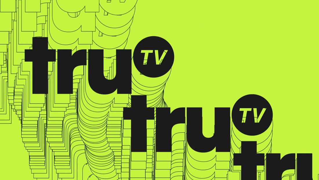
Included are animations that, in some ways, are similar to screensaver effects — the logo bounces, winds and staggers around the screen while leaving a “trail” of itself in the form of thin outlines.

![]()
The logo can also be used as a short of “eraser” that moves in a seemingly random path across a bold colored background while its trail leaves a “window” into imagery behind it — an effect that is used as both a box element and with show logos.
Another element uses slices of video or stills that repeat the same image either in small segments, larger ones or ones that repeat disparate parts of the image in question.
In addition, the network’s logo is often “scattered” around the screen as if by accident. In reality, this is a carefully planned effect.
The logo can also be colored one of the three bright colors—a blue, green and red—dictated by the brand guidelines. (Interestingly, the first four characters of the green’s hex code, BAEB21, could be read as “baby,” as in the in phrase “bae,” an acronym for “before anyone else.”)
A pale gray and nearly full black are also included as options.
For typography, the new brand case study calls for Neue Plak Extended Black, a wide and bold typeface.
That’s the only font — as the brand website reads: “Layout are never fussy. We keep it simple.” The standards also called for a 2:1 ratio when determining text hierarchy, with the added direction of “Keep it BIG,” a good tip given that the font size reduces by half for every tier that’s added.

tags
Block & Tackle, Branding, network, truTV
categories
Branding, Entertainment, Heroes, Network Branding, Networks