
MSNBC’s ‘The ReidOut’ peels back the curtain on its look
Weekly insights on the technology, production and business decisions shaping media and broadcast. Free to access. Independent coverage. Unsubscribe anytime.
MSNBC’s has been sharing images of what turned out to be the logo design for “The ReidOut,” the new primetime show anchored by Joy Reid that will replace “Hardball” July 20, 2020 at 7 p.m. eastern.
The design, as featured on social media and on the network, includes a white and violet color palette.
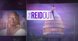
In versions posted online, the logo is backed with a stylized image of the Capitol in Washington, D.C., where the show will be based.
Within the logo, the show title is displayed in a condensed sans serif font against a rectangle that has a “page curl” effect on the right side and the word “The” turned on its side.
![]()
There is at least one other version of key art and logo design for the show that continues to be used on streaming platform user interfaces, a design that used an American flag inspired design with the red and white stripes peeled back to reveal a blue box for the title.
In this iteration, the show title was set in a serif typeface.
It’s not immediately clear if this design is based on an abandoned look or who created it.

However, it is not uncommon for new TV shows to go through multiple iterations of looks prior to launch as the production team and executives tweak all aspects of the show.
It is also possible the look will change again between now and the show’s debut.
MSNBC has been promoting the new show’s debut ahead of its launch.

tags
joy reid, logo design, MSNBC, The ReidOut
categories
Branding, Broadcast Design, Broadcast Industry News, Cable News, Featured