Commission on Presidential Debates gets new brand identity

Subscribe to NCS for the latest news, project case studies and product announcements in broadcast technology, creative design and engineering delivered to your inbox.
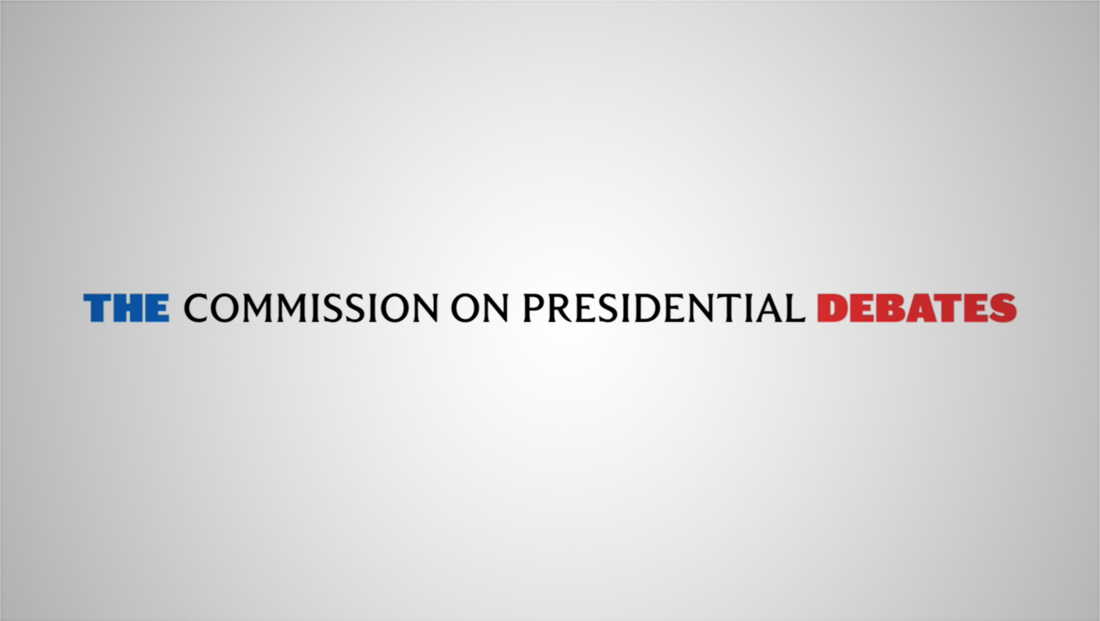
While the Commission on Presidential Debates‘ branding has always been purposefully low key, the nonpartisan organization tapped Pentagram to redesign its logo and identity for the 2020 election cycle.
It’s important to note that while the commission produces the debates, most major networks don’t include anything other than the verbal mention of the organization on their feeds, instead coming up with their own unique logos and graphic elements that are used during the debates as well as in promos.
In addition, each host location has its own distinct logo designs for the actual event.
How networks are promoting first presidential debate coverage https://t.co/qD2NkOK2AC #TVNews #BroadcastNews
— TVNewsMix (@TVNewsMix) September 28, 2020
One of the reasons behind CPD wanting more prominent branding is the increase of streaming as a way to watch debates, where more of the commission’s graphical elements tend to be displayed on traditional networks, according to Pentagram’s Instagram post about the new look.
Pentagram combined the bold, distinctive sans serif Caslon Doric from Commercial Type with a font known as Trust Serif from MCKL (though it’s referred to as “TrustHalf” in the commission’s website CSS).
Trust Serif has visual similarities to some other “chiseled” typefaces including Penumbra Half Serif, Monotype Albertus, Trajan and Friz Quadrata.
Typefaces like these are often said to be inspired by carved lettering on classical architectural facades such as government buildings, so it’s a natural pick.
Albertus is notably used by the former ABC legal drama “How to Get Away with Murder” in both its opening credits and the logotype of the fictional Middleton University featured in the show.
Friz Quadrata, meanwhile, is perhaps most widely recognized as the “Law & Order” font, another example of how typefaces like this are used to represent government and the law.
Caslon Doric, meanwhile, conveys both the idea of strength and power while also blending well with the letterforms of Trust Serif, such as a distinct “leg” on the capital “R.”

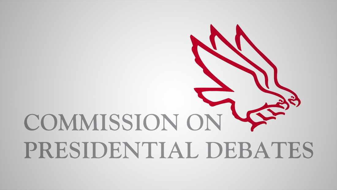
Old logo design
The new look replaces the commission’s old logo, featuring the profiles of two eagles.
The new logo will make its first official appearance Tuesday, Sept. 29, 2020, on the large panels on the left and right side of the debate set built in Cleveland, Ohio.
First look inside #PresidentialDebates live tomorrow night @cspan and @cspanradio Case Western Reserve University pic.twitter.com/qYypm71N0L
— Steve Scully (@SteveScully) September 28, 2020
The debate stage is being built in an atrium inside the Cleveland Clinic and Case Western Reserve University’s Health Education Campus.
Subscribe to NCS for the latest news, project case studies and product announcements in broadcast technology, creative design and engineering delivered to your inbox.


tags
2020 Election, Branding, Commission on Presidential Debates, debates, logo design, Pentagram
categories
Branding, Broadcast Design, Broadcast Industry News, Elections, Heroes