
CNBC debuts ‘The News with Shepard Smith’ with clean, refined graphics — but a temp set

Weekly insights on the technology, production and business decisions shaping media and broadcast. Free to access. Independent coverage. Unsubscribe anytime.
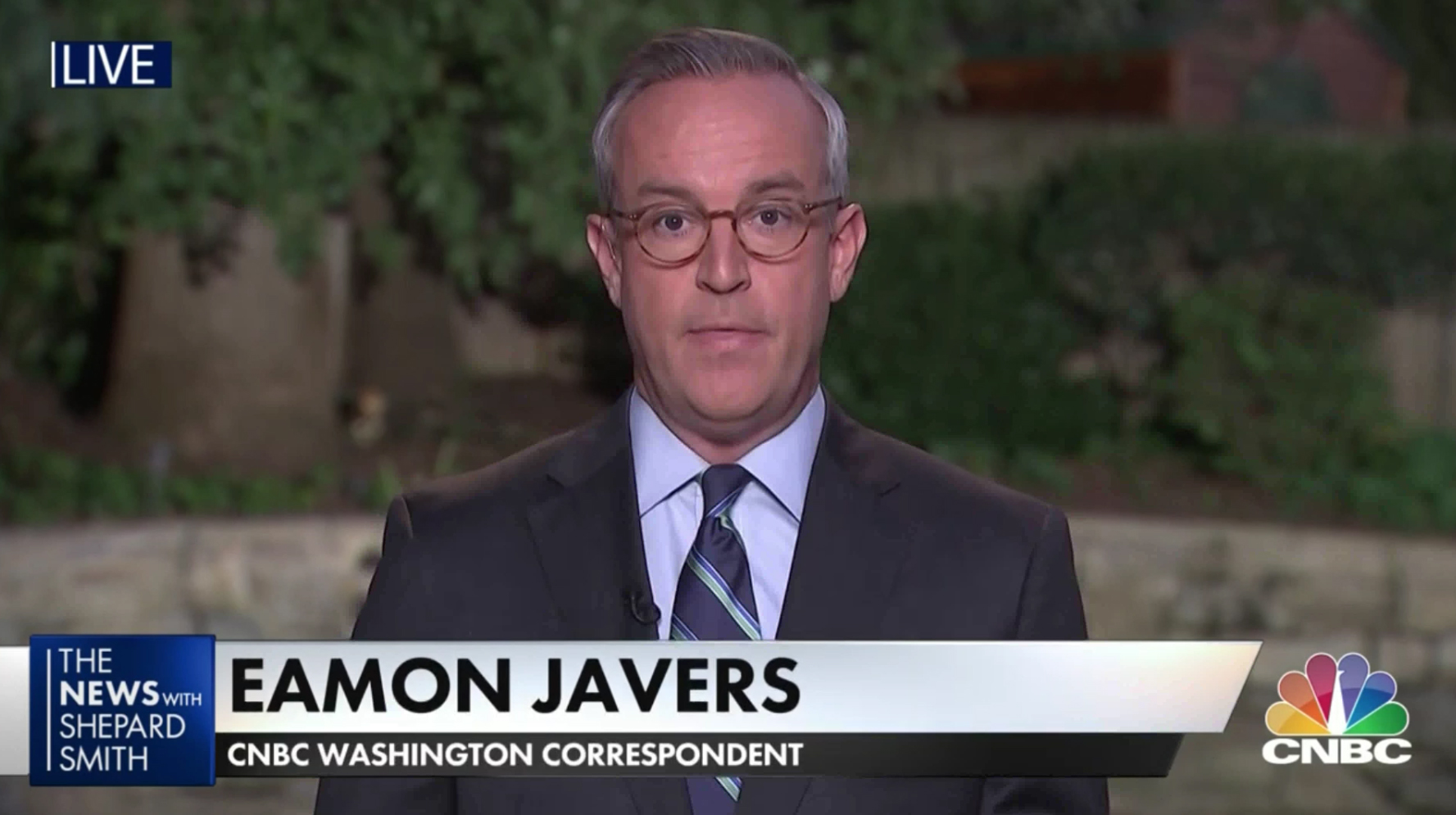
Former Fox anchor Shepard Smith’s debut on CNBC kicked off with a “cold open” paired with a somber outline of the current state of the news.
Smith, who abruptly left Fox in 2019, noted that the show will normally have fancy graphics and music along with headline teases.
However, Smith opted to use that time Sept. 30, 2020 to tout to show’s goal of delivering “The facts. The truth.” and its importance given the current state of the country that was summed up, in a sense, by the first presidential debate of 2020 the night before “The News with Shepard Smith” debuted.
“The News,” which was announced in July 2020, is calling CNBC’s global headquarters in Englewood Cliffs, New Jersey, its home and teams are hard at work on a dedicated studio for the show.
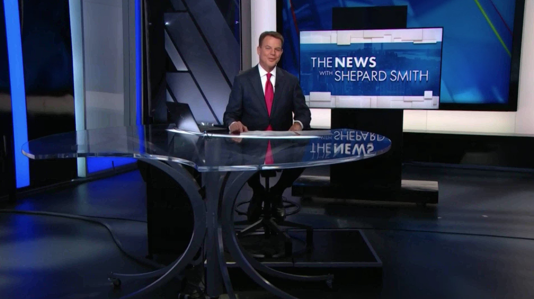
However, for the time being, the show is using a small portion of CNBC’s Studio A that’s been sort of “boxed” off with a mix of movable glassy and video panels as well as the space’s more permanent structural elements.
Smith himself sits at a glass topped table with a monitor behind him for much of the broadcast.

In addition, “The News” also leveraged the large video wall in Studio A that is sometimes used for augmented reality segments.

Meanwhile, another, smaller video panel situated in a corner was used as both an alternative anchor location as well as a way to display graphics and video using the “walk and wander” floating camera approach.
Although the show didn’t air its official open Sept. 30, the show’s look was slowly revealed as the broadcast went on.
The design centers around a cube concept along with angular accents.
A glassy blue cube is used as a show logo or topical bug in the lower left of the screen, though it does not remain on screen at all times.
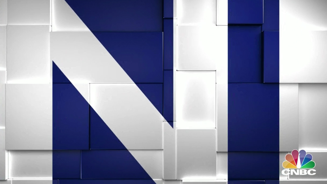
More cubes and 3D rectangles also appear as a background pattern — with each of them at slightly different depths, a technique that adds a structural, textured feel.
The show does not use the network’s blue and white ticker or normal bug — instead featuring a larger, simple rendition of the CNBC logo in the lower right of the screen.
Lower third banners are white and black with a slight burst of light and angle on the right side that allows them to “tuck in” nicely against the shape of the NBC peacock atop the CNBC logotype in the network bug.
Typography is bold and clear — using a solid geometric sans that, interestingly, appears to be a very close match to the primary one used in Fox’s lower third banners.
Angled elements are also used as headers for fullscreen graphics and maps, while two box templates feature dark gray outlined with white corner accents.

In this live shot toss, the ‘invisible’ angle formed by the logotype is emphasized with the diagonal white elements above and below it.Diagon
The angles also appear in a show logo graphic that uses a lockup of the logotype that itself has the suggestion of an angle along the left side.
Diagonal shapes, albeit at a slightly different angle, are also part of the permanent look of Studio A that appears primarily across the network’s dayside programming.
While blue, white and black denominate the graphics package, “The News” blends in other colors as appropriate, including orange for a “Developing News” stinger.

For its world news summary segment, dubbed “Around the World in 80 Seconds,” a glossy globe with text curved above it is used as both a stinger and wipe.
It’s worth noting that the extruded approach is used on both the lettering and globe itself.

tags
CNBC, shepard smith, The News with Shepard Smith
categories
Branding, Broadcast Design, Cable News, Graphics, Heroes